
imgui.core module
-
class
imgui.core._IO¶ Main ImGui I/O context class used for ImGui configuration.
This class is not intended to be instantiated by user (thus _ name prefix). It should be accessed through obtained with
get_io()function.Example:
import imgui

io = imgui.get_io()
-
__reduce__()¶ _IO.__reduce_cython__(self)
-
__setstate__()¶ _IO.__setstate_cython__(self, __pyx_state)
-
add_input_character(self, ImWchar c)
-
config_cursor_blink
-
config_mac_osx_behaviors
-
config_resize_windows_from_edges
-
delta_time
-
display_fb_scale
-
display_size
-
display_visible_max
-
display_visible_min
-
font_allow_user_scaling
-
font_global_scale
-
fonts
-
framerate
-
ini_saving_rate
-
key_alt
-
key_ctrl
-
key_map
-
key_repeat_delay
-
key_repeat_rate
-
key_shift
-
key_super
-
keys_down
-
log_file_name
-
metrics_active_windows
-
metrics_render_vertices
-
mouse_double_click_max_distance
-
mouse_double_click_time
-
mouse_down
-
mouse_drag_threshold
-
mouse_draw_cursor
-
mouse_pos
-
mouse_wheel
-
want_capture_keyboard
-
want_capture_mouse
-
want_save_ini_setting
-
want_set_mouse_pos
-
want_text_input
-
-
class
imgui.core._FontAtlas¶ Font atlas object responsible for controling and loading fonts.
This class is not intended to be instantiated by user (thus _ name prefix). It should be accessed through
_IO.fontsattribute of_IOobtained withget_io()function.Example:
import imgui

io = imgui.get_io()
io.fonts.add_font_default()
-
__reduce__()¶ _FontAtlas.__reduce_cython__(self)
-
__setstate__()¶ _FontAtlas.__setstate_cython__(self, __pyx_state)
-
add_font_default(self)
-
add_font_from_file_ttf(self, str filename, float size_pixels, _StaticGlyphRanges glyph_ranges=None)
-
clear(self)
-
clear_fonts(self)
-
clear_input_data(self)
-
clear_tex_data(self)
-
get_glyph_ranges_chinese(self)
-
get_glyph_ranges_chinese_full(self)
-
get_glyph_ranges_cyrillic(self)
-
get_glyph_ranges_default(self)
-
get_glyph_ranges_japanese(self)
-
get_glyph_ranges_korean(self)
-
get_glyph_ranges_latin(self)
-
get_tex_data_as_alpha8(self)
-
get_tex_data_as_rgba32(self)
-
texture_id¶ Note – difference in mapping (maps actual TexID and not TextureID)
Note: texture ID type is implementation dependent. It is usually integer (at least for OpenGL).
-
Todo
consider inlining every occurence of _cast_args_ImVecX (profile)
-
class
imgui.core.GuiStyle¶ Container for ImGui style information
-
__eq__¶ x.__eq__(y) <==> x==y
-
__ge__¶ x.__ge__(y) <==> x>=y
-
__gt__¶ x.__gt__(y) <==> x>y
-
__le__¶ x.__le__(y) <==> x<=y
-
__lt__¶ x.__lt__(y) <==> x<y
-
__ne__¶ x.__ne__(y) <==> x!=y
-
__reduce__()¶ GuiStyle.__reduce_cython__(self)
-
__setstate__()¶ GuiStyle.__setstate_cython__(self, __pyx_state)
-
alpha¶ Global alpha blending parameter for windows
Returns: float
-
anti_aliased_fill
-
anti_aliased_lines
-
child_border_size
-
child_rounding
-
color(self, ImGuiCol variable)
-
columns_min_spacing
-
static
create()
-
curve_tessellation_tolerance
-
display_safe_area_padding
-
display_window_padding
-
frame_border_size
-
frame_padding
-
frame_rounding
-
grab_min_size
-
grab_rounding
-
indent_spacing
-
item_inner_spacing
-
item_spacing
-
mouse_cursor_scale
-
popup_border_size
-
popup_rounding
-
scrollbar_rounding
-
scrollbar_size
-
touch_extra_padding
-
window_border_size
-
window_min_size
-
window_padding
-
window_rounding
-
window_title_align
-
-
exception
imgui.core.ImGuiError
-
imgui.core.begin(str label, closable=False, ImGuiWindowFlags flags=0)¶ Begin a window.
Example:
imgui.begin("Example: empty window")
imgui.end()
Outputs: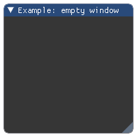
Parameters: - label (str) – label of the window.
- closable (bool) – define if window is closable.
- flags – Window flags. See: list of available flags.
Returns: tuple –
(expanded, opened)tuple of bools. If window is collapsedexpanded==True. The value ofopenedis always True for non-closable and open windows but changes state to False on close button click for closable windows.Wraps API:
Begin(
    const char* name,
    bool* p_open = NULL,
    ImGuiWindowFlags flags = 0
)
-
imgui.core.begin_child¶ Begin a scrolling region.
Note: sizing of child region allows for three modes: *
0.0- use remaining window size *>0.0- fixed size *<0.0- use remaining window size minus abs(size)Example:
imgui.begin("Example: child region")

imgui.begin_child("region", 150, -50, border=True)
imgui.text("inside region")
imgui.end_child()

imgui.text("outside region")
imgui.end()
Outputs: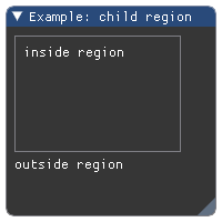
Parameters: - label (str or int) – Child region identifier.
- width (float) – Region width. See note about sizing.
- height (float) – Region height. See note about sizing.
- border (bool) – True if should display border. Defaults to False.
- flags – Window flags. See: list of available flags.
Returns: bool – True if region is visible
Wraps API:
bool BeginChild(
    const char* str_id,
    const ImVec2& size = ImVec2(0,0),
    bool border = false,
    ImGuiWindowFlags flags = 0
)

bool BeginChild(
    ImGuiID id,
    const ImVec2& size = ImVec2(0,0),
    bool border = false,
    ImGuiWindowFlags flags = 0
)
-
imgui.core.begin_group()¶ Start item group and lock its horizontal starting position.
Captures group bounding box into one “item”. Thanks to this you can use
is_item_hovered()or layout primitives such assame_line()on whole group, etc.Example:
imgui.begin("Example: item groups")

imgui.begin_group()
imgui.text("First group (buttons):")
imgui.button("Button A")
imgui.button("Button B")
imgui.end_group()

imgui.same_line(spacing=50)

imgui.begin_group()
imgui.text("Second group (text and bullet texts):")
imgui.bullet_text("Bullet A")
imgui.bullet_text("Bullet B")
imgui.end_group()

imgui.end()
Outputs: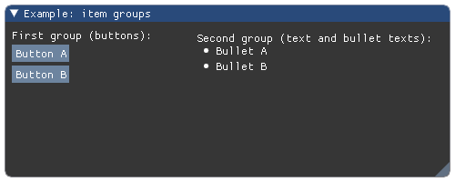
Wraps API:
void BeginGroup()
Create new full-screen menu bar.
Only callend_main_menu_bar()if this function returnsTrue!Example:
if imgui.begin_main_menu_bar():
    # first menu dropdown
    if imgui.begin_menu('File', True):
        imgui.menu_item('New', 'Ctrl+N', False, True)
        imgui.menu_item('Open ...', 'Ctrl+O', False, True)

        # submenu
        if imgui.begin_menu('Open Recent', True):
            imgui.menu_item('doc.txt', None, False, True)
            imgui.end_menu()

        imgui.end_menu()

    imgui.end_main_menu_bar()
Outputs: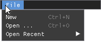
Returns: bool – True if main menu bar is displayed (opened). Wraps API:
bool BeginMainMenuBar()
Create new expandable menu in current menu bar.
Only call
end_menu()if this returnsTrue!For practical example how to use this function, please see documentation of
begin_main_menu_bar()orbegin_menu_bar().Parameters: - label (str) – label of the menu.
- enabled (bool) – define if menu is enabled or disabled.
Returns: bool – True if the menu is displayed (opened).
Wraps API:
bool BeginMenu(
    const char* label,
    bool enabled
)
Append new menu menu bar to current window.
This function is different from
begin_main_menu_bar(), as this is child-window specific. Only callend_menu_bar()if this returnsTrue!Note: this requires WINDOW_MENU_BAR flag to be set for the current window. Without this flag set the
begin_menu_bar()function will always returnFalse.Example:
flags = imgui.WINDOW_MENU_BAR

imgui.begin("Child Window - File Browser", flags=flags)

if imgui.begin_menu_bar():
    if imgui.begin_menu('File'):
        imgui.menu_item('Close')
        imgui.end_menu()

    imgui.end_menu_bar()

imgui.end()
Outputs: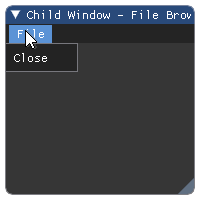
Returns: bool – True if menu bar is displayed (opened). Wraps API:
bool BeginMenuBar()
-
imgui.core.begin_popup(str label, ImGuiWindowFlags flags=0)¶ Open a popup window.
Returns
Trueif the popup is open and you can start outputting content to it. Only callend_popup()ifbegin_popup()returned true.Example:
imgui.begin("Example: simple popup")

if imgui.button("select"):
    imgui.open_popup("select-popup")

imgui.same_line()

if imgui.begin_popup("select-popup"):
    imgui.text("Select one")
    imgui.separator()
    imgui.selectable("One")
    imgui.selectable("Two")
    imgui.selectable("Three")
    imgui.end_popup()

imgui.end()
Outputs: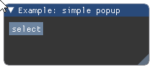
Parameters: label (str) – label of the modal window. Returns: opened (bool) – True if popup is opened. Wraps API:
bool BeginPopup(
    const char* str_id,
    ImGuiWindowFlags flags = 0
)
-
imgui.core.begin_popup_context_item(str label=None, int mouse_button=1)¶ This is a helper function to handle the most simple case of associating one named popup to one given widget.
Example:
imgui.begin("Example: popup context view")
imgui.text("Right-click to set value.")
if imgui.begin_popup_context_item("Item Context Menu", mouse_button=0):
    imgui.selectable("Set to Zero")
    imgui.end_popup()
imgui.end()
Outputs: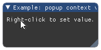
Parameters: - label (str) – label of item.
- mouse_button (int) – mouse button identifier: 0 - left button, 1 - right button, 2 - middle button
Returns: opened (bool) – opened can be False when the popup is completely clipped (e.g. zero size display).
Wraps API:
bool BeginPopupContextItem(
    const char* str_id = NULL,
    int mouse_button = 1
)
-
imgui.core.begin_popup_context_window(str label=None, bool also_over_items=True, int mouse_button=1)¶ Helper function to open and begin popup when clicked on current window.
As all popup functions it should end with
end_popup().Example:
imgui.begin("Example: popup context window")
if imgui.begin_popup_context_window(mouse_button=0):
    imgui.selectable("Clear")
    imgui.end_popup()
imgui.end()
Outputs: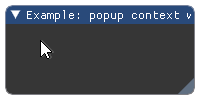
Parameters: - label (str) – label of the window
- also_over_items (bool) – display on top of widget.
- mouse_button (int) – mouse button identifier: 0 - left button 1 - right button 2 - middle button
Returns: opened (bool) – if the context window is opened.
Wraps API:
bool BeginPopupContextWindow(
    const char* str_id = NULL,
    bool also_over_items = true,
    int mouse_button = 1
)
-
imgui.core.begin_popup_modal(str title, visible=None, ImGuiWindowFlags flags=0)¶ Begin pouring popup contents.
Differes from
begin_popup()with its modality - meaning it opens up on top of every other window.Example:
imgui.begin("Example: simple popup modal")

if imgui.button("Open Modal popup"):
    imgui.open_popup("select-popup")

imgui.same_line()

if imgui.begin_popup_modal("select-popup")[0]:
    imgui.text("Select an option:")
    imgui.separator()
    imgui.selectable("One")
    imgui.selectable("Two")
    imgui.selectable("Three")
    imgui.end_popup()

imgui.end()
Outputs: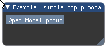
Parameters: - title (str) – label of the modal window.
- visible (bool) – define if popup is visible or not.
- flags – Window flags. See: list of available flags.
Returns: tuple –
(opened, visible)tuple of bools. opened can beFalsewhen the popup is completely clipped (e.g. zero size display).Wraps API:
bool BeginPopupModal(
    const char* name,
    bool* p_open = NULL,
    ImGuiWindowFlags extra_flags = 0
)
-
imgui.core.begin_tooltip()¶ Use to create full-featured tooltip windows that aren’t just text.
Example:
imgui.begin("Example: tooltip")
imgui.button("Click me!")
if imgui.is_item_hovered():
    imgui.begin_tooltip()
    imgui.text("This button is clickable.")
    imgui.text("This button has full window tooltip.")
    texture_id = imgui.get_io().fonts.texture_id
    imgui.image(texture_id, 512, 64, border_color=(1, 0, 0, 1))
    imgui.end_tooltip()
imgui.end()
Outputs: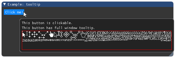
Wraps API:
void BeginTooltip()
-
imgui.core.bullet()¶ Display a small circle and keep the cursor on the same line.
Example:
imgui.begin("Example: bullets")

for i in range(10):
    imgui.bullet()

imgui.end()
Outputs: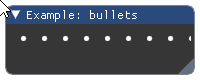
Wraps API:
void Bullet()
-
imgui.core.bullet_text(str text)¶ Display bullet and text.
This is shortcut for:
imgui.bullet()
imgui.text(text)
Example:
imgui.begin("Example: bullet text")
imgui.bullet_text("Bullet 1")
imgui.bullet_text("Bullet 2")
imgui.bullet_text("Bullet 3")
imgui.end()
Outputs: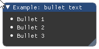
Parameters: text (str) – text to display. Wraps API:
void BulletText(const char* fmt, ...)
Display button.
Example:
imgui.begin("Example: button")
imgui.button("Button 1")
imgui.button("Button 2")
imgui.end()
Outputs: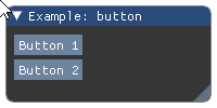
Parameters: - label (str) – button label.
- width (float) – button width.
- height (float) – button height.
Returns: bool – True if clicked.
Wraps API:
bool Button(const char* label, const ImVec2& size = ImVec2(0,0))
-
imgui.core.calculate_item_width()¶ Calculate and return the current item width.
Returns: float – calculated item width. Wraps API:
float CalcItemWidth()
-
imgui.core.checkbox(str label, bool state)¶ Display checkbox widget.
Example:
# note: these should be initialized outside of the main interaction
#       loop
checkbox1_enabled = True
checkbox2_enabled = False

imgui.new_frame()
imgui.begin("Example: checkboxes")

# note: first element of return two-tuple notifies if there was a click
#       event in currently processed frame and second element is actual
#       checkbox state.
_, checkbox1_enabled = imgui.checkbox("Checkbox 1", checkbox1_enabled)
_, checkbox2_enabled = imgui.checkbox("Checkbox 2", checkbox2_enabled)

imgui.text("Checkbox 1 state value: {}".format(checkbox1_enabled))
imgui.text("Checkbox 2 state value: {}".format(checkbox2_enabled))

imgui.end()
Outputs: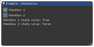
Parameters: - label (str) – text label for checkbox widget.
- state (bool) – current (desired) state of the checkbox. If it has to change, the new state will be returned as a second item of the return value.
Returns: tuple – a
(clicked, state)two-tuple indicating click event and the current state of the checkbox.Wraps API:
bool Checkbox(const char* label, bool* v)
-
imgui.core.checkbox_flags(str label, unsigned int flags, unsigned int flags_value)¶ Display checkbox widget that handle integer flags (bit fields).
It is useful for handling window/style flags or any kind of flags implemented as integer bitfields.
Example:
flags = imgui.WINDOW_NO_RESIZE | imgui.WINDOW_NO_MOVE

imgui.begin("Example: checkboxes for flags", flags=flags)

clicked, flags = imgui.checkbox_flags(
    "No resize", flags, imgui.WINDOW_NO_RESIZE
)
clicked, flags = imgui.checkbox_flags(
    "No move", flags, imgui.WINDOW_NO_MOVE
)
clicked, flags = imgui.checkbox_flags(
    "No collapse", flags, imgui.WINDOW_NO_COLLAPSE
)
# note: it also allows to use multiple flags at once
clicked, flags = imgui.checkbox_flags(
    "No resize & no move", flags,
    imgui.WINDOW_NO_RESIZE | imgui.WINDOW_NO_MOVE
)
imgui.text("Current flags value: {0:b}".format(flags))
imgui.end()
Outputs: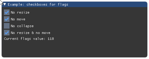
Parameters: - label (str) – text label for checkbox widget.
- flags (int) – current state of the flags associated with checkbox.
Actual state of checkbox (toggled/untoggled) is calculated from
this argument and
flags_valueargument. If it has to change, the new state will be returned as a second item of the return value. - flags_value (int) – values of flags this widget can toggle. Represents bitmask in flags bitfield. Allows multiple flags to be toggled at once (specify using bit OR operator |, see example above).
Returns: tuple – a
(clicked, flags)two-tuple indicating click event and the current state of the flags controlled with this checkbox.Wraps API:
bool CheckboxFlags(
    const char* label, unsigned int* flags,
    unsigned int flags_value
)
-
imgui.core.close_current_popup()¶ Close the current popup window begin-ed directly above this call. Clicking on a
menu_item()orselectable()automatically close the current popup.For practical example how to use this function, please see documentation of
open_popup().Wraps API:
void CloseCurrentPopup()
-
imgui.core.collapsing_header(str text, visible=None, ImGuiTreeNodeFlags flags=0)¶ Collapsable/Expandable header view.
Returns ‘true’ if the header is open. Doesn’t indent or push to stack, so no need to call any pop function.
Example:
visible = True

imgui.begin("Example: collapsing header")
expanded, visible = imgui.collapsing_header("Expand me!", visible)

if expanded:
    imgui.text("Now you see me!")
imgui.end()
Outputs: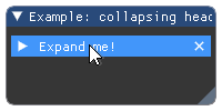
Parameters: - text (str) – Tree node label
- visible (bool or None) – Force visibility of a header. If set to True shows additional (X) close button. If set to False header is not visible at all. If set to None header is always visible and close button is not displayed.
- flags – TreeNode flags. See: list of available flags.
Returns: tuple – a
(expanded, visible)two-tuple indicating if item was expanded and whether the header is visible or not (only ifvisibleinput argument is True/False).Wraps API:
bool CollapsingHeader(const char* label, ImGuiTreeNodeFlags flags = 0)

bool CollapsingHeader(
    const char* label,
    bool* p_open,
    ImGuiTreeNodeFlags flags = 0
)
Display colored button.
Example:
imgui.begin("Example: color button")
imgui.color_button("Button 1", 1, 0, 0, 1, 0, 10, 10)
imgui.color_button("Button 2", 0, 1, 0, 1, 0, 10, 10)
imgui.color_button("Wide Button", 0, 0, 1, 1, 0, 20, 10)
imgui.color_button("Tall Button", 1, 0, 1, 1, 0, 10, 20)
imgui.end()
Outputs: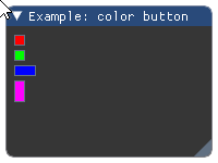
Parameters: - #r (float) – red color intensity.
- #g (float) – green color intensity.
- #b (float) – blue color instensity.
- #a (float) – alpha intensity.
- #ImGuiColorEditFlags – Color edit flags. Zero for none.
- #width (float) – Width of the color button
- #height (float) – Height of the color button
Returns: bool – True if button is clicked.
Wraps API:
bool ColorButton(
    const char* desc_id,
    const ImVec4& col,
    ImGuiColorEditFlags flags,
    ImVec2 size
)
-
imgui.core.color_edit3(str label, float r, float g, float b)¶ Display color edit widget for color without alpha value.
Example:
# note: the variable that contains the color data, should be initialized
#       outside of the main interaction loop
color_1 = 1., .0, .5
color_2 = 0., .8, .3

imgui.begin("Example: color edit without alpha")

# note: first element of return two-tuple notifies if the color was changed
#       in currently processed frame and second element is current value
#       of color
changed, color_1 = imgui.color_edit3("Color 1", *color_1)
changed, color_2 = imgui.color_edit3("Color 2", *color_2)

imgui.end()
Outputs: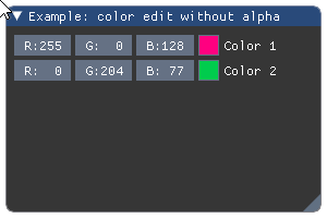
Parameters: - label (str) – color edit label.
- r (float) – red color intensity.
- g (float) – green color intensity.
- b (float) – blue color instensity.
Returns: tuple – a
(bool changed, float color[3])tuple that contains indicator of color change and current value of colorWraps API:
bool ColorEdit3(const char* label, float col[3])
-
imgui.core.color_edit4(str label, float r, float g, float b, float a, bool show_alpha=True)¶ Display color edit widget for color with alpha value.
Example:
# note: the variable that contains the color data, should be initialized
#       outside of the main interaction loop
color = 1., .0, .5, 1.

imgui.begin("Example: color edit with alpha")

# note: first element of return two-tuple notifies if the color was changed
#       in currently processed frame and second element is current value
#       of color and alpha
_, color = imgui.color_edit4("Alpha", *color, show_alpha=True)
_, color = imgui.color_edit4("No alpha", *color, show_alpha=False)

imgui.end()
Outputs: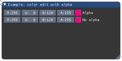
Parameters: - label (str) – color edit label.
- r (float) – red color intensity.
- g (float) – green color intensity.
- b (float) – blue color instensity.
- a (float) – alpha intensity.
- show_alpha (bool) – if set to True wiget allows to modify alpha
Returns: tuple – a
(bool changed, float color[4])tuple that contains indicator of color change and current value of color and alphaWraps API:
ColorEdit4(
    const char* label, float col[4], bool show_alpha = true
)
-
imgui.core.columns(int count=1, str identifier=None, bool border=True)¶ Setup number of columns. Use an identifier to distinguish multiple column sets. close with
columns(1).Example:
imgui.begin("Example: Columns - File list")
imgui.columns(4, 'fileLlist')
imgui.separator()
imgui.text("ID")
imgui.next_column()
imgui.text("File")
imgui.next_column()
imgui.text("Size")
imgui.next_column()
imgui.text("Last Modified")
imgui.next_column()
imgui.separator()
imgui.set_column_offset(1, 40)

imgui.next_column()
imgui.text('FileA.txt')
imgui.next_column()
imgui.text('57 Kb')
imgui.next_column()
imgui.text('12th Feb, 2016 12:19:01')
imgui.next_column()

imgui.next_column()
imgui.text('ImageQ.png')
imgui.next_column()
imgui.text('349 Kb')
imgui.next_column()
imgui.text('1st Mar, 2016 06:38:22')
imgui.next_column()

imgui.columns(1)
imgui.end()
Outputs: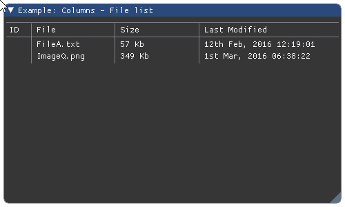
Parameters: - count (int) – Columns count.
- identifier (str) – Table identifier.
- border (bool) – Display border, defaults to
True.
Wraps API:
void Columns(
    int count = 1,
    const char* id = NULL,
    bool border = true
)
-
imgui.core.combo(str label, int current, list items, int height_in_items=-1)¶ Display combo widget.
Example:
current = 2
imgui.begin("Example: combo widget")

clicked, current = imgui.combo(
    "combo", current, ["first", "second", "third"]
)

imgui.end()
Outputs: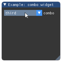
Parameters: - label (str) – combo label.
- current (int) – index of selected item.
- items (list) – list of string labels for items.
- height_in_items (int) – height of dropdown in items. Defaults to -1 (autosized).
Returns: tuple – a
(changed, current)tuple indicating change of selection and current index of selected item.Wraps API:
bool Combo(
    const char* label, int* current_item,
    const char* items_separated_by_zeros,
    int height_in_items = -1
)
-
imgui.core.create_context(_FontAtlas shared_font_atlas=None)¶ CreateContext
Todo
Add an example
Wraps API:
ImGuiContext* CreateContext(
        # note: optional
        ImFontAtlas* shared_font_atlas = NULL);
)
-
imgui.core.destroy_context(_ImGuiContext ctx=None)¶ DestroyContext
Wraps API:
DestroyContext(
        # note: optional
        ImGuiContext* ctx = NULL);
-
imgui.core.drag_float(str label, float value, float change_speed=1.0, float min_value=0.0, float max_value=0.0, str format='%.3f', float power=1.)¶ Display float drag widget.
Todo
Consider replacing
formatwith something that allows for safer way to specify display format without loosing the functionality of wrapped function.Example:
value = 42.0

imgui.begin("Example: drag float")
changed, value = imgui.drag_float(
    "Default", value,
)
changed, value = imgui.drag_float(
    "Less precise", value, format="%.1f"
)
imgui.text("Changed: %s, Value: %s" % (changed, value))
imgui.end()
Outputs: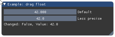
Parameters: - label (str) – widget label.
- value (float) – drag values,
- change_speed (float) – how fast values change on drag.
- min_value (float) – min value allowed by widget.
- max_value (float) – max value allowed by widget.
- format (str) – display format string as C-style
printfformat string. Warning: Highly unsafe when used without care. May lead to segmentation faults and other memory violation issues. - power (float) – index of the power function applied to the value.
Returns: tuple – a
(changed, value)tuple that contains indicator of widget state change and the current drag value.Wraps API:
bool DragFloat(
    const char* label,
    float* v,
    float v_speed = 1.0f,
    float v_min = 0.0f,
    float v_max = 0.0f,
    const char* format = "%.3f",
    float power = 1.0f
)
-
imgui.core.drag_float2(str label, float value0, float value1, float change_speed=1.0, float min_value=0.0, float max_value=0.0, str format='%.3f', float power=1.)¶ Display float drag widget with 2 values.
Example:
values = 88.0, 42.0

imgui.begin("Example: drag float")
changed, values = imgui.drag_float2(
    "Default", *values
)
changed, values = imgui.drag_float2(
    "Less precise", *values, format="%.1f"
)
imgui.text("Changed: %s, Values: %s" % (changed, values))
imgui.end()
Outputs: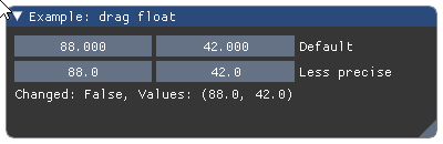
Parameters: - label (str) – widget label.
- value0, value1 (float) – drag values.
- change_speed (float) – how fast values change on drag.
- min_value (float) – min value allowed by widget.
- max_value (float) – max value allowed by widget.
- format (str) – display format string as C-style
printfformat string. Warning: highly unsafe. Seedrag_float(). - power (float) – index of the power function applied to the value.
Returns: tuple – a
(changed, values)tuple that contains indicator of widget state change and the tuple of current drag values.Wraps API:
bool DragFloat2(
    const char* label,
    float v[2],
    float v_speed = 1.0f,
    float v_min = 0.0f,
    float v_max = 0.0f,
    const char* format = "%.3f",
    float power = 1.0f
)
-
imgui.core.drag_float3(str label, float value0, float value1, float value2, float change_speed=1.0, float min_value=0.0, float max_value=0.0, str format='%.3f', float power=1.)¶ Display float drag widget with 3 values.
Example:
values = 88.0, 42.0, 69.0

imgui.begin("Example: drag float")
changed, values = imgui.drag_float3(
    "Default", *values
)
changed, values = imgui.drag_float3(
    "Less precise", *values, format="%.1f"
)
imgui.text("Changed: %s, Values: %s" % (changed, values))
imgui.end()
Outputs: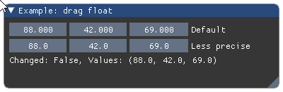
Parameters: - label (str) – widget label.
- value0, value1, value2 (float) – drag values.
- change_speed (float) – how fast values change on drag.
- min_value (float) – min value allowed by widget.
- max_value (float) – max value allowed by widget.
- format (str) – display format string as C-style
printfformat string. Warning: highly unsafe. Seedrag_float(). - power (float) – index of the power function applied to the value.
Returns: tuple – a
(changed, values)tuple that contains indicator of widget state change and the tuple of current drag values.Wraps API:
bool DragFloat3(
    const char* label,
    float v[3],
    float v_speed = 1.0f,
    float v_min = 0.0f,
    float v_max = 0.0f,
    const char* format = "%.3f",
    float power = 1.0f
)
-
imgui.core.drag_float4(str label, float value0, float value1, float value2, float value3, float change_speed=1.0, float min_value=0.0, float max_value=0.0, str format='%.3f', float power=1.)¶ Display float drag widget with 4 values.
Example:
values = 88.0, 42.0, 69.0, 0.0

imgui.begin("Example: drag float")
changed, values = imgui.drag_float4(
    "Default", *values
)
changed, values = imgui.drag_float4(
    "Less precise", *values, format="%.1f"
)
imgui.text("Changed: %s, Values: %s" % (changed, values))
imgui.end()
Outputs: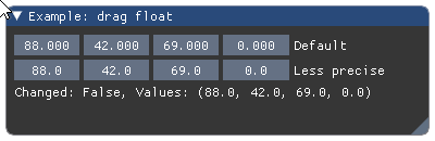
Parameters: - label (str) – widget label.
- value0, value1, value2, value3 (float) – drag values.
- change_speed (float) – how fast values change on drag.
- min_value (float) – min value allowed by widget.
- max_value (float) – max value allowed by widget.
- format (str) – display format string as C-style
printfformat string. Warning: highly unsafe. Seedrag_float(). - power (float) – index of the power function applied to the value.
Returns: tuple – a
(changed, values)tuple that contains indicator of widget state change and the tuple of current drag values.Wraps API:
bool DragFloat4(
    const char* label,
    float v[4],
    float v_speed = 1.0f,
    float v_min = 0.0f,
    float v_max = 0.0f,
    const char* format = "%.3f",
    float power = 1.0f
)
-
imgui.core.drag_int(str label, int value, float change_speed=1.0, int min_value=0, int max_value=0, str format='%d')¶ Display int drag widget.
Todo
Consider replacing
formatwith something that allows for safer way to specify display format without loosing the functionality of wrapped function.Example:
value = 42

imgui.begin("Example: drag int")
changed, value = imgui.drag_int("drag int", value,)
imgui.text("Changed: %s, Value: %s" % (changed, value))
imgui.end()
Outputs: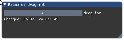
Parameters: - label (str) – widget label.
- value (int) – drag value,
- change_speed (float) – how fast values change on drag.
- min_value (int) – min value allowed by widget.
- max_value (int) – max value allowed by widget.
- format (str) – display format string as C-style
printfformat string. Warning: Highly unsafe when used without care. May lead to segmentation faults and other memory violation issues.
Returns: tuple – a
(changed, value)tuple that contains indicator of widget state change and the current drag value.Wraps API:
bool DragInt(
    const char* label,
    int* v,
    float v_speed = 1.0f,
    int v_min = 0.0f,
    int v_max = 0.0f,
    const char* format = "%d",
)
-
imgui.core.drag_int2(str label, int value0, int value1, float change_speed=1.0, int min_value=0, int max_value=0, str format='%d')¶ Display int drag widget with 2 values.
Example:
values = 88, 42

imgui.begin("Example: drag int")
changed, values = imgui.drag_int2(
    "drag ints", *values
)
imgui.text("Changed: %s, Values: %s" % (changed, values))
imgui.end()
Outputs: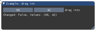
Parameters: - label (str) – widget label.
- value0, value1 (int) – drag values.
- change_speed (float) – how fast values change on drag.
- min_value (int) – min value allowed by widget.
- max_value (int) – max value allowed by widget.
- format (str) – display format string as C-style
printfformat string. Warning: highly unsafe. Seedrag_int().
Returns: tuple – a
(changed, values)tuple that contains indicator of widget state change and the tuple of current drag values.Wraps API:
bool DragInt2(
    const char* label,
    int v[2],
    float v_speed = 1.0f,
    int v_min = 0.0f,
    int v_max = 0.0f,
    const char* format = "%d",
)
-
imgui.core.drag_int3(str label, int value0, int value1, int value2, float change_speed=1.0, int min_value=0, int max_value=0, str format='%d')¶ Display int drag widget with 3 values.
Example:
values = 88, 42, 69

imgui.begin("Example: drag int")
changed, values = imgui.drag_int3(
    "drag ints", *values
)
imgui.text("Changed: %s, Values: %s" % (changed, values))
imgui.end()
Outputs: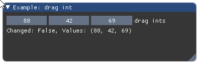
Parameters: - label (str) – widget label.
- value0, value1 (int) – drag values.
- change_speed (float) – how fast values change on drag.
- min_value (int) – min value allowed by widget.
- max_value (int) – max value allowed by widget.
- format (str) – display format string as C-style
printfformat string. Warning: highly unsafe. Seedrag_int().
Returns: tuple – a
(changed, values)tuple that contains indicator of widget state change and the tuple of current drag values.Wraps API:
bool DragInt3(
    const char* label,
    int v[3],
    float v_speed = 1.0f,
    int v_min = 0.0f,
    int v_max = 0.0f,
    const char* format = "%d",
)
-
imgui.core.drag_int4(str label, int value0, int value1, int value2, int value3, float change_speed=1.0, int min_value=0, int max_value=0, str format='%d')¶ Display int drag widget with 4 values.
Example:
values = 88, 42, 69, 0

imgui.begin("Example: drag int")
changed, values = imgui.drag_int4(
    "drag ints", *values
)
imgui.text("Changed: %s, Values: %s" % (changed, values))
imgui.end()
Outputs: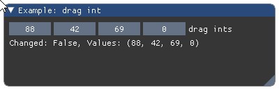
Parameters: - label (str) – widget label.
- value0, value1 (int) – drag values.
- change_speed (float) – how fast values change on drag.
- min_value (int) – min value allowed by widget.
- max_value (int) – max value allowed by widget.
- format (str) – display format string as C-style
printfformat string. Warning: highly unsafe. Seedrag_int().
Returns: tuple – a
(changed, values)tuple that contains indicator of widget state change and the tuple of current drag values.Wraps API:
bool DragInt4(
    const char* label,
    int v[4],
    float v_speed = 1.0f,
    int v_min = 0.0f,
    int v_max = 0.0f,
    const char* format = "%d",
)
-
imgui.core.dummy(width, height)¶ Add dummy element of given size.
Example:
imgui.begin("Example: dummy elements")

imgui.text("Some text with bullets:")
imgui.bullet_text("Bullet A")
imgui.bullet_text("Bullet B")

imgui.dummy(0, 50)
imgui.bullet_text("Text after dummy")

imgui.end()
Outputs: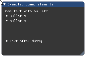
Wraps API:
void Dummy(const ImVec2& size)
-
imgui.core.end()¶ End a window.
This finishes appending to current window, and pops it off the window stack. See:
begin().Wraps API:
void End()
-
imgui.core.end_child()¶ End scrolling region.
Wraps API:
void EndChild()
-
imgui.core.end_frame()¶ End a frame.
ends the ImGui frame. automatically called by Render(), so most likely don’t need to ever call that yourself directly. If you don’t need to render you may call end_frame() but you’ll have wasted CPU already. If you don’t need to render, better to not create any imgui windows instead!
Wraps API:
void EndFrame()
-
imgui.core.end_group()¶ End group (see:
begin_group).Wraps API:
void EndGroup()
Close main menu bar context.
Only call this function if the
end_main_menu_bar()returnsTrue.For practical example how to use this function see documentation of
begin_main_menu_bar().Wraps API:
bool EndMainMenuBar()
Close menu context.
Only call this function if the
begin_menu()returnsTrue.For practical example how to use this function, please see documentation of
begin_main_menu_bar()orbegin_menu_bar().Wraps API:
void EndMenu()
Close menu bar context.
Only call this function if the
begin_menu_bar()returns true.For practical example how to use this function see documentation of
begin_menu_bar().Wraps API:
void EndMenuBar()
-
imgui.core.end_popup()¶ End a popup window.
Should be called after each XYZPopupXYZ function.
For practical example how to use this function, please see documentation of
open_popup().Wraps API:
void EndPopup()
-
imgui.core.end_tooltip()¶ End tooltip window.
See
begin_tooltip()for full usage example.Wraps API:
void EndTooltip()
-
imgui.core.get_color_u32(ImU32 col)¶ retrieve given style color with style alpha applied and optional extra alpha multiplier
Returns: ImU32 – 32-bit RGBA color Wraps API:
ImU32 GetColorU32(ImU32 col)
-
imgui.core.get_color_u32_idx(ImGuiCol idx, float alpha_mul=1.0)¶ retrieve given style color with style alpha applied and optional extra alpha multiplier
Returns: ImU32 – 32-bit RGBA color Wraps API:
ImU32 GetColorU32(ImGuiCol idx, alpha_mul)
-
imgui.core.get_color_u32_rgba(float r, float g, float b, float a)¶ retrieve given color with style alpha applied
Returns: ImU32 – 32-bit RGBA color Wraps API:
ImU32 GetColorU32(const ImVec4& col)
-
imgui.core.get_column_index()¶ Returns the current column index.
For a complete example see
columns().Returns: int – the current column index. Wraps API:
int GetColumnIndex()
-
imgui.core.get_column_offset(int column_index=-1)¶ Returns position of column line (in pixels, from the left side of the contents region). Pass -1 to use current column, otherwise 0 to
get_columns_count(). Column 0 is usually 0.0f and not resizable unless you call this method.For a complete example see
columns().Parameters: column_index (int) – index of the column to get the offset for. Returns: float – the position in pixels from the left side. Wraps API:
float GetColumnOffset(int column_index = -1)
-
imgui.core.get_column_width(int column_index=-1)¶ Return the column width.
For a complete example see
columns().Parameters: column_index (int) – index of the column to get the width for. Wraps API:
void GetColumnWidth(int column_index = -1)
-
imgui.core.get_columns_count()¶ Get count of the columns in the current table.
For a complete example see
columns().Returns: int – columns count. Wraps API:
int GetColumnsCount()
-
imgui.core.get_content_region_available()¶ Get available content region.
It is shortcut for:
Returns: Vec2 – available content region size two-tuple (width, height)Wraps API:
ImVec2 GetContentRegionMax()
-
imgui.core.get_content_region_available_width()¶ Get available content region width.
Returns: float – available content region width. Wraps API:
float GetContentRegionAvailWidth()
-
imgui.core.get_content_region_max()¶ Get current content boundaries in window coordinates.
Typically window boundaries include scrolling, or current column boundaries.
Returns: Vec2 – content boundaries two-tuple (width, height)Wraps API:
ImVec2 GetContentRegionMax()
-
imgui.core.get_current_context()¶ GetCurrentContext
Wraps API:
ImGuiContext* GetCurrentContext();
-
imgui.core.get_cursor_pos()¶ Get the cursor position.
Wraps API:
ImVec2 GetCursorPos()
-
imgui.core.get_cursor_position()¶ get_cursor_pos() Get the cursor position.
Wraps API:
ImVec2 GetCursorPos()
-
imgui.core.get_cursor_screen_pos()¶ Get the cursor position in absolute screen coordinates [0..io.DisplaySize] (useful to work with ImDrawList API)
Wraps API:
ImVec2 GetCursorScreenPos()
-
imgui.core.get_cursor_screen_position()¶ get_cursor_screen_pos() Get the cursor position in absolute screen coordinates [0..io.DisplaySize] (useful to work with ImDrawList API)
Wraps API:
ImVec2 GetCursorScreenPos()
-
imgui.core.get_cursor_start_pos()¶ Get the initial cursor position.
Wraps API:
ImVec2 GetCursorStartPos()
-
imgui.core.get_cursor_start_position()¶ get_cursor_start_pos() Get the initial cursor position.
Wraps API:
ImVec2 GetCursorStartPos()
-
imgui.core.get_draw_data()¶ Get draw data.
valid after
render()and until the next call tonew_frame(). This is what you have to render.Returns: _DrawData – draw data for all draw calls required to display gui Wraps API:
ImDrawData* GetDrawData()
-
imgui.core.get_font_size()¶ get current font size (= height in pixels) of current font with current scale applied
Returns: float – current font size (height in pixels) Wraps API:
float GetFontSize()
-
imgui.core.get_frame_height()¶ ~ FontSize + style.FramePadding.y * 2
Wraps API:
float GetFrameHeight()
float GetFrameHeightWithSpacing() except +
-
imgui.core.get_frame_height_with_spacing()¶ ~ FontSize + style.FramePadding.y * 2 + style.ItemSpacing.y (distance in pixels between 2 consecutive lines of framed widgets)
Wraps API:
float GetFrameHeightWithSpacing()
-
imgui.core.get_io()
-
imgui.core.get_item_rect_max()¶ Get bounding rect of the last item in screen space.
Returns: Vec2 – item maximum boundaries two-tuple (width, height)Wraps API:
ImVec2 GetItemRectMax()
-
imgui.core.get_item_rect_min()¶ Get bounding rect of the last item in screen space.
Returns: Vec2 – item minimum boundaries two-tuple (width, height)Wraps API:
ImVec2 GetItemRectMin()
-
imgui.core.get_item_rect_size()¶ Get bounding rect of the last item in screen space.
Returns: Vec2 – item boundaries two-tuple (width, height)Wraps API:
ImVec2 GetItemRectSize()
-
imgui.core.get_mouse_cursor()¶ Return the mouse cursor id.
Wraps API:
ImGuiMouseCursor GetMouseCursor()
-
imgui.core.get_mouse_drag_delta(int button=0, float lock_threshold=-1.0)¶ Dragging amount since clicking.
Parameters: - button (int) – mouse button index.
- lock_threshold (float) – if less than -1.0 uses io.MouseDraggingThreshold.
Returns: Vec2 – mouse position two-tuple
(x, y)Wraps API:
ImVec2 GetMouseDragDelta(int button = 0, float lock_threshold = -1.0f)
-
imgui.core.get_mouse_pos()¶ Current mouse position.
Returns: Vec2 – mouse position two-tuple (x, y)Wraps API:
ImVec2 GetMousePos()
-
imgui.core.get_mouse_position()¶ get_mouse_pos() Current mouse position.
- Returns:
- Vec2: mouse position two-tuple
(x, y)
Wraps API:
ImVec2 GetMousePos()
-
imgui.core.get_overlay_draw_list()¶ Get a special draw list that will be drawn last (over all windows).
Useful for drawing overlays.
Returns: ImDrawList* Wraps API:
ImDrawList* GetWindowDrawList()
-
imgui.core.get_scroll_max_x()¶ get maximum scrolling amount ~~ ContentSize.X - WindowSize.X
Returns: float – the maximum scroll X amount Wraps API:
int GetScrollMaxX()
-
imgui.core.get_scroll_max_y()¶ get maximum scrolling amount ~~ ContentSize.X - WindowSize.X
Returns: float – the maximum scroll Y amount Wraps API:
int GetScrollMaxY()
-
imgui.core.get_scroll_x()¶ get scrolling amount [0..GetScrollMaxX()]
Returns: float – the current scroll X value Wraps API:
int GetScrollX()
-
imgui.core.get_scroll_y()¶ get scrolling amount [0..GetScrollMaxY()]
Returns: float – the current scroll Y value Wraps API:
int GetScrollY()
-
imgui.core.get_style()
-
imgui.core.get_style_color_name(int index)¶ Get the style color name for a given ImGuiCol index.
Wraps API:
const char* GetStyleColorName(ImGuiCol idx)
-
imgui.core.get_text_line_height()¶ Get text line height.
Returns: int – text line height. Wraps API:
void GetTextLineHeight()
-
imgui.core.get_text_line_height_with_spacing()¶ Get text line height, with spacing.
Returns: int – text line height, with spacing. Wraps API:
void GetTextLineHeightWithSpacing()
-
imgui.core.get_time()¶ Seconds since program start.
Returns: float – the time (seconds since program start) Wraps API:
float GetTime()
-
imgui.core.get_version()¶ Get the version of Dear ImGui.
Wraps API:
void GetVersion()
-
imgui.core.get_window_content_region_max()¶ Get maximal current window content boundaries in window coordinates.
It translates roughly to:
(0, 0) + Size - ScrollReturns: Vec2 – content boundaries two-tuple (width, height)Wraps API:
ImVec2 GetWindowContentRegionMin()
-
imgui.core.get_window_content_region_min()¶ Get minimal current window content boundaries in window coordinates.
It translates roughly to:
(0, 0) - ScrollReturns: Vec2 – content boundaries two-tuple (width, height)Wraps API:
ImVec2 GetWindowContentRegionMin()
-
imgui.core.get_window_content_region_width()¶ Get available current window content region width.
Returns: float – available content region width. Wraps API:
float GetWindowContentRegionWidth()
-
imgui.core.get_window_draw_list()¶ Get the draw list associated with the window, to append your own drawing primitives
It may be useful if you want to do your own drawing via the DrawList api.
Example:
pos_x = 10
pos_y = 10
sz = 20

draw_list = imgui.get_window_draw_list()

for i in range(0, imgui.COLOR_COUNT):
    name = imgui.get_style_color_name(i);
    draw_list.add_rect_filled(pos_x, pos_y, pos_x+sz, pos_y+sz, imgui.get_color_u32_idx(i));
    imgui.dummy(sz, sz);
    imgui.same_line();

rgba_color = imgui.get_color_u32_rgba(1, 1, 0, 1);
draw_list.add_rect_filled(pos_x, pos_y, pos_x+sz, pos_y+sz, rgba_color);
Outputs:
Returns: ImDrawList* Wraps API:
ImDrawList* GetWindowDrawList()
-
imgui.core.get_window_height()¶ Get current window height.
Returns: float – height of current window. Wraps API:
float GetWindowHeight()
-
imgui.core.get_window_position()¶ Get current window position.
It may be useful if you want to do your own drawing via the DrawList api.
Returns: Vec2 – two-tuple of window coordinates in screen space. Wraps API:
ImVec2 GetWindowPos()
-
imgui.core.get_window_size()¶ Get current window size.
Returns: Vec2 – two-tuple of window dimensions. Wraps API:
ImVec2 GetWindowSize()
-
imgui.core.get_window_width()¶ Get current window width.
Returns: float – width of current window. Wraps API:
float GetWindowWidth()
-
imgui.core.image(texture_id, float width, float height, tuple uv0=(0, 0), tuple uv1=(1, 1), tuple tint_color=(1, 1, 1, 1), tuple border_color=(0, 0, 0, 0))¶ Display image.
Example:
texture_id = imgui.get_io().fonts.texture_id

imgui.begin("Example: image display")
imgui.image(texture_id, 512, 64, border_color=(1, 0, 0, 1))
imgui.end()
Outputs: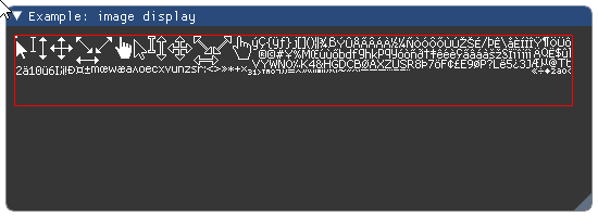
Parameters: - texture_id (object) – user data defining texture id. Argument type is implementation dependent. For OpenGL it is usually an integer.
- size (Vec2) – image display size two-tuple.
- uv0 (Vec2) – UV coordinates for 1st corner (lower-left for OpenGL).
Defaults to
(0, 0). - uv1 (Vec2) – UV coordinates for 2nd corner (upper-right for OpenGL).
Defaults to
(1, 1). - tint_color (Vec4) – Image tint color. Defaults to white.
- border_color (Vec4) – Image border color. Defaults to transparent.
Wraps API:
void Image(
    ImTextureID user_texture_id,
    const ImVec2& size,
    const ImVec2& uv0 = ImVec2(0,0),
    const ImVec2& uv1 = ImVec2(1,1),
    const ImVec4& tint_col = ImVec4(1,1,1,1),
    const ImVec4& border_col = ImVec4(0,0,0,0)
)
Display image.
Todo
add example with some preconfigured image
Parameters: - texture_id (object) – user data defining texture id. Argument type is implementation dependent. For OpenGL it is usually an integer.
- size (Vec2) – image display size two-tuple.
- uv0 (Vec2) – UV coordinates for 1st corner (lower-left for OpenGL).
Defaults to
(0, 0). - uv1 (Vec2) – UV coordinates for 2nd corner (upper-right for OpenGL).
Defaults to
(1, 1). - tint_color (Vec4) – Image tint color. Defaults to white.
- border_color (Vec4) – Image border color. Defaults to transparent.
- frame_padding (int) – Frame padding (
0: no padding,<0default padding).
Returns: bool – True if clicked.
Wraps API:
bool ImageButton(
    ImTextureID user_texture_id,
    const ImVec2& size,
    const ImVec2& uv0 = ImVec2(0,0),
    const ImVec2& uv1 = ImVec2(1,1),
    int frame_padding = -1,
    const ImVec4& bg_col = ImVec4(0,0,0,0),
    const ImVec4& tint_col = ImVec4(1,1,1,1)
)
-
imgui.core.indent(float width=0.0)¶ Move content to right by indent width.
Example:
imgui.begin("Example: item indenting")

imgui.text("Some text with bullets:")

imgui.bullet_text("Bullet A")
imgui.indent()
imgui.bullet_text("Bullet B (first indented)")
imgui.bullet_text("Bullet C (indent continues)")
imgui.unindent()
imgui.bullet_text("Bullet D (indent cleared)")

imgui.end()
Outputs: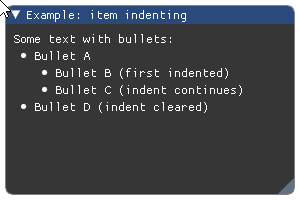
Parameters: width (float) – fixed width of indent. If less or equal 0 it defaults to global indent spacing or value set using style value stack (see push_style_var).Wraps API:
void Indent(float indent_w = 0.0f)
-
imgui.core.input_double(str label, int value, int step=1, int step_fast=100, str format='%.6f', ImGuiInputTextFlags flags=0)¶ Display integer input widget.
Example:
double_val = 3.14159265358979323846
imgui.begin("Example: integer input")
changed, double_val = imgui.input_double('Type multiplier:', double_val)
imgui.text('You wrote: %i' % double_val)
imgui.end()
Outputs:
Parameters: - label (str) – widget label.
- value (int) – textbox value
- step (int) – incremental step
- step_fast (int) – fast incremental step
- format = (str) – format string
- flags – InputText flags. See: list of available flags.
Returns: tuple – a
(changed, value)tuple that contains indicator of textbox state change and the current textbox content.Wraps API:
bool InputInt(
    const char* label,
    int* v,
    int step = 1,
    int step_fast = 100,
    _bytes(format),
    ImGuiInputTextFlags extra_flags = 0
)
-
imgui.core.input_float(str label, float value, float step=0.0, float step_fast=0.0, str format='%.3f', ImGuiInputTextFlags flags=0)¶ Display float input widget.
Example:
float_val = 0.4
imgui.begin("Example: float input")
changed, float_val = imgui.input_float('Type coefficient:', float_val)
imgui.text('You wrote: %f' % float_val)
imgui.end()
Outputs: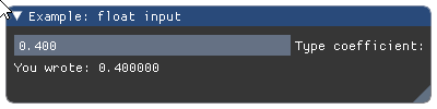
Parameters: - label (str) – widget label.
- value (float) – textbox value
- step (float) – incremental step
- step_fast (float) – fast incremental step
- format = (str) – format string
- flags – InputText flags. See: list of available flags.
Returns: tuple – a
(changed, value)tuple that contains indicator of textbox state change and the current textbox content.Wraps API:
bool InputFloat(
    const char* label,
    float* v,
    float step = 0.0f,
    float step_fast = 0.0f,
    const char* format = "%.3f",
    ImGuiInputTextFlags extra_flags = 0
)
-
imgui.core.input_float2(str label, float value0, float value1, str format='%.3f', ImGuiInputTextFlags flags=0)¶ Display two-float input widget.
Example:
values = 0.4, 3.2
imgui.begin("Example: two float inputs")
changed, values = imgui.input_float2('Type here:', *values)
imgui.text("Changed: %s, Values: %s" % (changed, values))
imgui.end()
Outputs: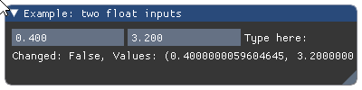
Parameters: - label (str) – widget label.
- value0, value1 (float) – input values.
- format = (str) – format string
- flags – InputText flags. See: list of available flags.
Returns: tuple – a
(changed, values)tuple that contains indicator of textbox state change and the tuple of current values.Wraps API:
bool InputFloat2(
    const char* label,
    float v[2],
    const char* format = "%.3f",
    ImGuiInputTextFlags extra_flags = 0
)
-
imgui.core.input_float3(str label, float value0, float value1, float value2, str format='%.3f', ImGuiInputTextFlags flags=0)¶ Display three-float input widget.
Example:
values = 0.4, 3.2, 29.3
imgui.begin("Example: three float inputs")
changed, values = imgui.input_float3('Type here:', *values)
imgui.text("Changed: %s, Values: %s" % (changed, values))
imgui.end()
Outputs: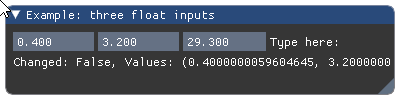
Parameters: - label (str) – widget label.
- value0, value1, value2 (float) – input values.
- format = (str) – format string
- flags – InputText flags. See: list of available flags.
Returns: tuple – a
(changed, values)tuple that contains indicator of textbox state change and the tuple of current values.Wraps API:
bool InputFloat3(
    const char* label,
    float v[3],
    const char* format = "%.3f",
    ImGuiInputTextFlags extra_flags = 0
)
-
imgui.core.input_float4(str label, float value0, float value1, float value2, float value3, str format='%.3f', ImGuiInputTextFlags flags=0)¶ Display four-float input widget.
Example:
values = 0.4, 3.2, 29.3, 12.9
imgui.begin("Example: four float inputs")
changed, values = imgui.input_float4('Type here:', *values)
imgui.text("Changed: %s, Values: %s" % (changed, values))
imgui.end()
Outputs: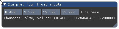
Parameters: - label (str) – widget label.
- value0, value1, value2, value3 (float) – input values.
- format = (str) – format string
- flags – InputText flags. See: list of available flags.
Returns: tuple – a
(changed, values)tuple that contains indicator of textbox state change and the tuple of current values.Wraps API:
bool InputFloat4(
    const char* label,
    float v[4],
    const char* format = "%.3f",
    ImGuiInputTextFlags extra_flags = 0
)
-
imgui.core.input_int(str label, int value, int step=1, int step_fast=100, ImGuiInputTextFlags flags=0)¶ Display integer input widget.
Example:
int_val = 3
imgui.begin("Example: integer input")
changed, int_val = imgui.input_int('Type multiplier:', int_val)
imgui.text('You wrote: %i' % int_val)
imgui.end()
Outputs: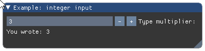
Parameters: - label (str) – widget label.
- value (int) – textbox value
- step (int) – incremental step
- step_fast (int) – fast incremental step
- flags – InputText flags. See: list of available flags.
Returns: tuple – a
(changed, value)tuple that contains indicator of textbox state change and the current textbox content.Wraps API:
bool InputInt(
    const char* label,
    int* v,
    int step = 1,
    int step_fast = 100,
    ImGuiInputTextFlags extra_flags = 0
)
-
imgui.core.input_int2(str label, int value0, int value1, ImGuiInputTextFlags flags=0)¶ Display two-integer input widget.
Example:
values = 4, 12
imgui.begin("Example: two int inputs")
changed, values = imgui.input_int2('Type here:', *values)
imgui.text("Changed: %s, Values: %s" % (changed, values))
imgui.end()
Outputs: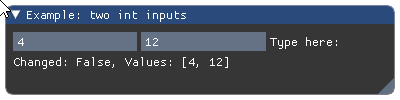
Parameters: - label (str) – widget label.
- value0, value1 (int) – textbox values
- flags – InputText flags. See: list of available flags.
Returns: tuple – a
(changed, value)tuple that contains indicator of textbox state change and the current textbox content.Wraps API:
bool InputInt2(
    const char* label,
    int v[2],
    ImGuiInputTextFlags extra_flags = 0
)
-
imgui.core.input_int3(str label, int value0, int value1, int value2, ImGuiInputTextFlags flags=0)¶ Display three-integer input widget.
Example:
values = 4, 12, 28
imgui.begin("Example: three int inputs")
changed, values = imgui.input_int3('Type here:', *values)
imgui.text("Changed: %s, Values: %s" % (changed, values))
imgui.end()
Outputs: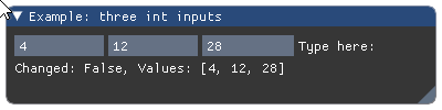
Parameters: - label (str) – widget label.
- value0, value1, value2 (int) – textbox values
- flags – InputText flags. See: list of available flags.
Returns: tuple – a
(changed, value)tuple that contains indicator of textbox state change and the current textbox content.Wraps API:
bool InputInt3(
    const char* label,
    int v[3],
    ImGuiInputTextFlags extra_flags = 0
)
-
imgui.core.input_int4(str label, int value0, int value1, int value2, int value3, ImGuiInputTextFlags flags=0)¶ Display four-integer input widget.
Example:
values = 4, 12, 28, 73
imgui.begin("Example: four int inputs")
changed, values = imgui.input_int4('Type here:', *values)
imgui.text("Changed: %s, Values: %s" % (changed, values))
imgui.end()
Outputs: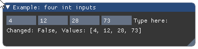
Parameters: - label (str) – widget label.
- value0, value1, value2, value3 (int) – textbox values
- flags – InputText flags. See: list of available flags.
Returns: tuple – a
(changed, value)tuple that contains indicator of textbox state change and the current textbox content.Wraps API:
bool InputInt4(
    const char* label,
    int v[4],
    ImGuiInputTextFlags extra_flags = 0
)
-
imgui.core.input_text(str label, str value, int buffer_length, ImGuiInputTextFlags flags=0)¶ Display text input widget.
buffer_lengthis the maximum allowed length of the content.Example:
text_val = 'Please, type the coefficient here.'
imgui.begin("Example: text input")
changed, text_val = imgui.input_text(
    'Amount:',
    text_val,
    256
)
imgui.text('You wrote:')
imgui.same_line()
imgui.text(text_val)
imgui.end()
Outputs: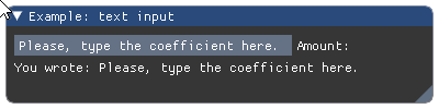
Parameters: - label (str) – widget label.
- value (str) – textbox value
- buffer_length (int) – length of the content buffer
- flags – InputText flags. See: list of available flags.
Returns: tuple – a
(changed, value)tuple that contains indicator of textbox state change and the current text contents.Wraps API:
bool InputText(
    const char* label,
    char* buf,
    size_t buf_size,
    ImGuiInputTextFlags flags = 0,
    ImGuiInputTextCallback callback = NULL,
    void* user_data = NULL
)
-
imgui.core.input_text_multiline(str label, str value, int buffer_length, float width=0, float height=0, ImGuiInputTextFlags flags=0)¶ Display multiline text input widget.
buffer_lengthis the maximum allowed length of the content.Example:
text_val = 'Type the your message here.'
imgui.begin("Example: text input")
changed, text_val = imgui.input_text_multiline(
    'Message:',
    text_val,
    2056
)
imgui.text('You wrote:')
imgui.same_line()
imgui.text(text_val)
imgui.end()
Outputs: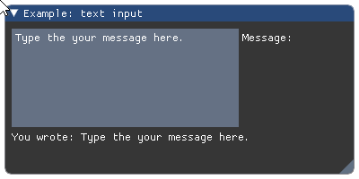
Parameters: - label (str) – widget label.
- value (str) – textbox value
- buffer_length (int) – length of the content buffer
- width (float) – width of the textbox
- height (float) – height of the textbox
- flags – InputText flags. See: list of available flags.
Returns: tuple – a
(changed, value)tuple that contains indicator of textbox state change and the current text contents.Wraps API:
bool InputTextMultiline(
    const char* label,
    char* buf,
    size_t buf_size,
    const ImVec2& size = ImVec2(0,0),
    ImGuiInputTextFlags flags = 0,
    ImGuiInputTextCallback callback = NULL,
    void* user_data = NULL
)
Create invisible button.
Example:
imgui.begin("Example: invisible button :)")
imgui.invisible_button("Button 1", 200, 200)
imgui.small_button("Button 2")
imgui.end()
Outputs: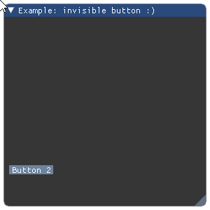
Parameters: - identifier (str) – Button identifier. Like label on
button()but it is not displayed. - width (float) – button width.
- height (float) – button height.
Returns: bool – True if button is clicked.
Wraps API:
bool InvisibleButton(const char* str_id, const ImVec2& size)
- identifier (str) – Button identifier. Like label on
-
imgui.core.is_any_item_active()¶ Was any of the items active.
Returns: bool – True if any item is active, otherwise False. Wraps API:
bool IsAnyItemActive()
-
imgui.core.is_any_item_focused()¶ Is any of the items focused.
Returns: bool – True if any item is focused, otherwise False. Wraps API:
bool IsAnyItemFocused()
-
imgui.core.is_any_item_hovered()¶ Was any of the items hovered.
Returns: bool – True if any item is hovered, otherwise False. Wraps API:
bool IsAnyItemHovered()
-
imgui.core.is_item_active()¶ Was the last item active? For ex. button being held or text field being edited. Items that don’t interact will always return false.
Returns: bool – True if item is active, otherwise False. Wraps API:
bool IsItemActive()
-
imgui.core.is_item_clicked(int mouse_button=0)¶ Was the last item clicked? For ex. button or node that was just being clicked on.
Returns: bool – True if item is clicked, otherwise False. Wraps API:
bool IsItemClicked(int mouse_button = 0)
-
imgui.core.is_item_focused()¶ Check if the last item is focused
Returns: bool – True if item is focused, otherwise False. Wraps API:
bool IsItemFocused()
-
imgui.core.is_item_hovered(ImGuiHoveredFlags flags=0)¶ Check if the last item is hovered by mouse.
Returns: bool – True if item is hovered by mouse, otherwise False. Wraps API:
bool IsItemHovered(ImGuiHoveredFlags flags = 0)
-
imgui.core.is_item_visible()¶ Was the last item visible? Aka not out of sight due to clipping/scrolling.
Returns: bool – True if item is visible, otherwise False. Wraps API:
bool IsItemVisible()
-
imgui.core.is_mouse_clicked(int button=0, bool repeat=False)¶ Returns if the mouse was clicked this frame.
Parameters: - button (int) – mouse button index.
- repeat (float)
Returns: bool – if the mouse was clicked this frame.
Wraps API:
bool IsMouseClicked(int button, bool repeat = false)
-
imgui.core.is_mouse_double_clicked(int button=0)¶ Return True if mouse was double-clicked.
Note: A double-click returns false in IsMouseClicked().
Parameters: button (int) – mouse button index. Returns: bool – if mouse is double clicked. Wraps API:
bool IsMouseDoubleClicked(int button);
-
imgui.core.is_mouse_down(int button=0)¶ Returns if the mouse is down.
Parameters: button (int) – mouse button index. Returns: bool – if the mouse is down. Wraps API:
bool IsMouseDown(int button)
-
imgui.core.is_mouse_dragging(int button=0, float lock_threshold=-1.0)¶ Returns if mouse is dragging.
Parameters: - button (int) – mouse button index.
- lock_threshold (float) – if less than -1.0 uses io.MouseDraggingThreshold.
Returns: bool – if mouse is dragging.
Wraps API:
bool IsMouseDragging(int button = 0, float lock_threshold = -1.0f)
-
imgui.core.is_mouse_hovering_rect(float r_min_x, float r_min_y, float r_max_x, float r_max_y, bool clip=True)¶ Test if mouse is hovering rectangle with given coordinates.
Parameters: - r_min_x, r_min_y (float) – x,y coordinate of the upper-left corner
- r_max_x, r_max_y (float) – x,y coordinate of the lower-right corner
Returns: bool – True if mouse is hovering the rectangle.
Wraps API:
bool IsMouseHoveringRect(
    const ImVec2& r_min,
    const ImVec2& r_max,
    bool clip = true
)
-
imgui.core.is_mouse_released(int button=0)¶ Returns if the mouse was released this frame.
Parameters: button (int) – mouse button index. Returns: bool – if the mouse was released this frame. Wraps API:
bool IsMouseReleased(int button)
-
imgui.core.is_rect_visible(float size_width, float size_height)¶ Test if a rectangle of the given size, starting from the cursor position is visible (not clipped).
Parameters: - size_width (float) – width of the rect
- size_height (float) – height of the rect
Returns: bool – True if rect is visible, otherwise False.
Wraps API:
bool IsRectVisible(const ImVec2& size)
-
imgui.core.is_window_appearing()¶ Check if current window is appearing.
Returns: bool – True if window is appearing
-
imgui.core.is_window_collapsed()¶ Check if current window is collapsed.
Returns: bool – True if window is collapsed
-
imgui.core.is_window_focused(ImGuiHoveredFlags flags=0)¶ Is current window focused.
Returns: bool – True if current window is on focus, otherwise False. Wraps API:
bool IsWindowFocused(ImGuiFocusedFlags flags = 0)
-
imgui.core.is_window_hovered(ImGuiHoveredFlags flags=0)¶ Is current window hovered and hoverable (not blocked by a popup). Differentiate child windows from each others.
Returns: bool – True if current window is hovered, otherwise False. Wraps API:
bool IsWindowHovered(ImGuiFocusedFlags flags = 0)
-
imgui.core.label_text(str label, str text)¶ Display text+label aligned the same way as value+label widgets.
Example:
imgui.begin("Example: text with label")
imgui.label_text("my label", "my text")
imgui.end()
Outputs: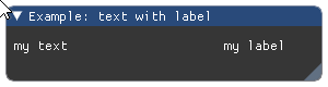
Parameters: - label (str) – label to display.
- text (str) – text to display.
Wraps API:
void LabelText(const char* label, const char* fmt, ...)
-
imgui.core.listbox(str label, int current, list items, int height_in_items=-1)¶ Show listbox widget.
Example:
current = 2
imgui.begin("Example: listbox widget")

clicked, current = imgui.listbox(
    "List", current, ["first", "second", "third"]
)

imgui.end()
Outputs: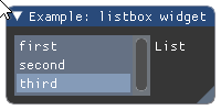
Parameters: - label (str) – The label.
- current (int) – index of selected item.
- items (list) – list of string labels for items.
- height_in_items (int) – height of dropdown in items. Defaults to -1 (autosized).
Returns: tuple – a
(changed, current)tuple indicating change of selection and current index of selected item.Wraps API:
bool ListBox(
    const char* label,
    int* current_item,
    const char* items[],
    int items_count,
    int height_in_items = -1
)
Closing the listbox, previously opened by
listbox_header().See
listbox_header()for usage example.Wraps API:
void ListBoxFooter()
-
imgui.core.listbox_header(str label, width=0, height=0)¶ For use if you want to reimplement
listbox()with custom data or interactions. You need to calllistbox_footer()at the end.Example:
imgui.begin("Example: custom listbox")

imgui.listbox_header("List", 200, 100)

imgui.selectable("Selected", True)
imgui.selectable("Not Selected", False)

imgui.listbox_footer()

imgui.end()
Outputs: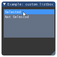
Parameters: - label (str) – The label.
- width (float) – button width.
- height (float) – button height.
Returns: opened (bool) – If the item is opened or closed.
Wraps API:
bool ListBoxHeader(
    const char* label,
    const ImVec2& size = ImVec2(0,0)
)
Create a menu item.
Item shortcuts are displayed for convenience but not processed by ImGui at the moment. Using
selectedarguement it is possible to show and trigger a check mark next to the menu item label.For practical example how to use this function, please see documentation of
begin_main_menu_bar()orbegin_menu_bar().Parameters: - label (str) – label of the menu item.
- shortcut (str) – shortcut text of the menu item.
- selected (bool) – define if menu item is selected.
- enabled (bool) – define if menu item is enabled or disabled.
Returns: tuple – a
(clicked, state)two-tuple indicating if item was clicked by the user and the current state of item (visibility of the check mark).Wraps API:
MenuItem(
    const char* label,
    const char* shortcut,
    bool* p_selected,
    bool enabled = true
)
-
imgui.core.new_frame()¶ Start a new frame.
After calling this you can submit any command from this point until next
new_frame()orrender().Wraps API:
void NewFrame()
-
imgui.core.new_line()¶ Undo
same_line()call.Wraps API:
void NewLine()
-
imgui.core.next_column()¶ Move to the next column drawing.
For a complete example see
columns().Wraps API:
void NextColumn()
-
imgui.core.open_popup(str label)¶ Open a popup window.
Marks a popup window as open. Popups are closed when user click outside, or activate a pressable item, or
close_current_popup()is called within abegin_popup()/end_popup()block. Popup identifiers are relative to the current ID-stack (soopen_popup()andbegin_popup()needs to be at the same level).Example:
imgui.begin("Example: simple popup")
if imgui.button('Toggle..'):
    imgui.open_popup("toggle")
if imgui.begin_popup("toggle"):
    if imgui.begin_menu('Sub-menu'):
        _, _ = imgui.menu_item('Click me')
        imgui.end_menu()
    imgui.end_popup()
imgui.end()
Outputs: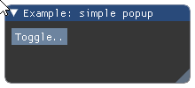
Parameters: label (str) – label of the modal window. Wraps API:
void OpenPopup(
    const char* str_id
)
-
imgui.core.plot_histogram(str label, __Pyx_memviewslice values, int values_count=-1, int values_offset=0, str overlay_text=None, float scale_min=FLT_MAX, float scale_max=FLT_MAX, graph_size=(0, 0), int stride=<???>)¶ Plot a histogram of float values.
Parameters: - label (str) – A plot label that will be displayed on the plot’s right
side. If you want the label to be invisible, add
"##"before the label’s text:"my_label" -> "##my_label" - values (array of floats) – the y-values. It must be a type that supports Cython’s Memoryviews, (See: http://docs.cython.org/en/latest/src/userguide/memoryviews.html) for example a numpy array.
- overlay_text (str or None, optional) – Overlay text.
- scale_min (float, optional) – y-value at the bottom of the plot.
- scale_max (float, optional) – y-value at the top of the plot.
- graph_size (tuple of two floats, optional) – plot size in pixels.
Note: In ImGui 1.49, (-1,-1) will NOT auto-size the plot.
To do that, use
get_content_region_available()and pass in the right size.
Note: These low-level parameters are exposed if needed for performance:
values_offset (int): Index of first element to display
- values_count (int): Number of values to display. -1 will use the
entire array.
stride (int): Number of bytes to move to read next element.
Example:
from array import array
from random import random

# NOTE: this example will not work under py27 due do incompatible
# implementation of array and memmory view.
histogram_values = array('f', [random() for _ in range(20)])

imgui.begin("Plot example")
imgui.plot_histogram("histogram(random())", histogram_values)
imgui.end()
Outputs: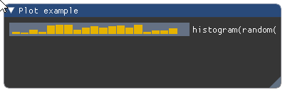
Wraps API:
void PlotHistogram(
    const char* label, const float* values, int values_count,
    # note: optional
    int values_offset,
    const char* overlay_text,
    float scale_min,
    float scale_max,
    ImVec2 graph_size,
    int stride
)
- label (str) – A plot label that will be displayed on the plot’s right
side. If you want the label to be invisible, add
-
imgui.core.plot_lines(str label, __Pyx_memviewslice values, int values_count=-1, int values_offset=0, str overlay_text=None, float scale_min=FLT_MAX, float scale_max=FLT_MAX, graph_size=(0, 0), int stride=<???>)¶ Plot a 1D array of float values.
Parameters: - label (str) – A plot label that will be displayed on the plot’s right
side. If you want the label to be invisible, add
"##"before the label’s text:"my_label" -> "##my_label" - values (array of floats) – the y-values. It must be a type that supports Cython’s Memoryviews, (See: http://docs.cython.org/en/latest/src/userguide/memoryviews.html) for example a numpy array.
- overlay_text (str or None, optional) – Overlay text.
- scale_min (float, optional) – y-value at the bottom of the plot.
- scale_max (float, optional) – y-value at the top of the plot.
- graph_size (tuple of two floats, optional) – plot size in pixels.
Note: In ImGui 1.49, (-1,-1) will NOT auto-size the plot.
To do that, use
get_content_region_available()and pass in the right size.
Note: These low-level parameters are exposed if needed for performance:
values_offset (int): Index of first element to display
- values_count (int): Number of values to display. -1 will use the
entire array.
stride (int): Number of bytes to move to read next element.
Example:
from array import array
from math import sin
# NOTE: this example will not work under py27 due do incompatible
# implementation of array and memmory view.
plot_values = array('f', [sin(x * 0.1) for x in range(100)])

imgui.begin("Plot example")
imgui.plot_lines("Sin(t)", plot_values)
imgui.end()
Outputs: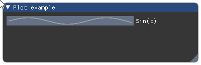
Wraps API:
void PlotLines(
    const char* label, const float* values, int values_count,

    int values_offset = 0,
    const char* overlay_text = NULL,
    float scale_min = FLT_MAX,
    float scale_max = FLT_MAX,
    ImVec2 graph_size = ImVec2(0,0),
    int stride = sizeof(float)
)
- label (str) – A plot label that will be displayed on the plot’s right
side. If you want the label to be invisible, add
-
imgui.core.pop_font()¶ Pop font on a stack.
For example usage see
push_font().Parameters: font (_Font) – font object retrieved from add_font_from_file_ttf.Wraps API:
void PopFont()
-
imgui.core.pop_item_width()¶ Reset width back to the default width.
Note: This implementation guards you from segfaults caused by redundant stack pops (raises exception if this happens) but generally it is safer and easier to use
styled()oristyled()context managers. See:push_item_width().Wraps API:
void PopItemWidth()
-
imgui.core.pop_style_color(unsigned int count=1)¶ Pop style color from stack.
Note: This implementation guards you from segfaults caused by redundant stack pops (raises exception if this happens) but generally it is safer and easier to use
styled()oristyled()context managers. See:push_style_color().Parameters: count (int) – number of variables to pop from style color stack. Wraps API:
void PopStyleColor(int count = 1)
-
imgui.core.pop_style_var(unsigned int count=1)¶ Pop style variables from stack.
Note: This implementation guards you from segfaults caused by redundant stack pops (raises exception if this happens) but generally it is safer and easier to use
styled()oristyled()context managers. See:push_style_var().Parameters: count (int) – number of variables to pop from style variable stack. Wraps API:
void PopStyleVar(int count = 1)
-
imgui.core.pop_text_wrap_pos()¶ Pop the text wrapping position from the stack.
Note: This implementation guards you from segfaults caused by redundant stack pops (raises exception if this happens) but generally it is safer and easier to use
styled()oristyled()context managers. See:push_text_wrap_pos().Wraps API:
void PopTextWrapPos()
-
imgui.core.pop_text_wrap_position()¶ pop_text_wrap_pos() Pop the text wrapping position from the stack.
Note: This implementation guards you from segfaults caused by redundant stack pops (raises exception if this happens) but generally it is safer and easier to use
styled()oristyled()context managers. See:push_text_wrap_pos().Wraps API:
void PopTextWrapPos()
-
imgui.core.push_font(_Font font)¶ Push font on a stack.
Example:
io = imgui.get_io()

new_font = io.fonts.add_font_from_file_ttf(
    "DroidSans.ttf", 20,
)
impl.refresh_font_texture()

# later in frame code

imgui.begin("Default Window")

imgui.text("Text displayed using default font")

imgui.push_font(new_font)
imgui.text("Text displayed using custom font")
imgui.pop_font()

imgui.end()
Outputs: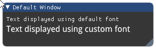
Note: Pushed fonts should be poped with
pop_font()within the same frame. In order to avoid manual push/pop functions you can use thefont()context manager.Parameters: font (_Font) – font object retrieved from add_font_from_file_ttf.Wraps API:
void PushFont(ImFont*)
-
imgui.core.push_item_width(float item_width)¶ Push item width in the stack.
Note: sizing of child region allows for three modes:
0.0- default to ~2/3 of windows width>0.0- width in pixels<0.0- align xx pixels to the right of window (so -1.0f always align width to the right side)
Note: width pushed on stack need to be poped using
pop_item_width()or it will be applied to all subsequent children components.Example:
imgui.begin("Example: item width")

# custom width
imgui.push_item_width(imgui.get_window_width() * 0.33)
imgui.text('Lorem Ipsum ...')
imgui.slider_float('float slider', 10.2, 0.0, 20.0, '%.2f', 1.0)
imgui.pop_item_width()

# default width
imgui.text('Lorem Ipsum ...')
imgui.slider_float('float slider', 10.2, 0.0, 20.0, '%.2f', 1.0)

imgui.end()
Outputs: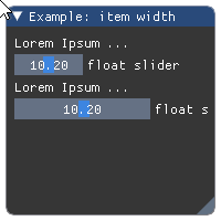
Parameters: item_width (float) – width of the component Wraps API:
void PushItemWidth(float item_width)
-
imgui.core.push_style_color(ImGuiCol variable, float r, float g, float b, float a=1.)¶ Push style color on stack.
Note: variables pushed on stack need to be popped using
pop_style_color()until the end of current frame. This implementation guards you from segfaults caused by redundant stack pops (raises exception if this happens) but generally it is safer and easier to usestyled()oristyled()context managers.Example:
imgui.begin("Example: Color variables")
imgui.push_style_color(imgui.COLOR_TEXT, 1.0, 0.0, 0.0)
imgui.text("Colored text")
imgui.pop_style_color(1)
imgui.end()
Outputs: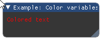
Parameters: - variable – imgui style color constant
- r (float) – red color intensity.
- g (float) – green color intensity.
- b (float) – blue color instensity.
- a (float) – alpha intensity.
Wraps API:
PushStyleColor(ImGuiCol idx, const ImVec4& col)
-
imgui.core.push_style_var(ImGuiStyleVar variable, value)¶ Push style variable on stack.
This function accepts both float and float two-tuples as
valueargument. ImGui core implementation will verify if passed value has type compatibile with given style variable. If not, it will raise exception.Note: variables pushed on stack need to be poped using
pop_style_var()until the end of current frame. This implementation guards you from segfaults caused by redundant stack pops (raises exception if this happens) but generally it is safer and easier to usestyled()oristyled()context managers.Example:
imgui.begin("Example: style variables")
imgui.push_style_var(imgui.STYLE_ALPHA, 0.2)
imgui.text("Alpha text")
imgui.pop_style_var(1)
imgui.end()
Outputs: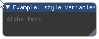
Parameters: - variable – imgui style variable constant
- value (float or two-tuple) – style variable value
Wraps API:
PushStyleVar(ImGuiStyleVar idx, float val)
-
imgui.core.push_text_wrap_pos(float wrap_pos_x=0.0)¶ Word-wrapping function for text*() commands.
Note: wrapping position allows these modes: *
0.0- wrap to end of window (or column) *>0.0- wrap at ‘wrap_pos_x’ position in window local space *<0.0- no wrappingParameters: wrap_pos_x (float) – calculated item width. Wraps API:
float PushTextWrapPos(float wrap_pos_x = 0.0f)
-
imgui.core.push_text_wrap_position()¶ push_text_wrap_pos(float wrap_pos_x=0.0) Word-wrapping function for text*() commands.
Note: wrapping position allows these modes: *
0.0- wrap to end of window (or column) *>0.0- wrap at ‘wrap_pos_x’ position in window local space *<0.0- no wrapping- Args:
- wrap_pos_x (float): calculated item width.
Wraps API:
float PushTextWrapPos(float wrap_pos_x = 0.0f)
Display radio button widget
Example:
# note: the variable that contains the state of the radio_button, should be initialized
#       outside of the main interaction loop
radio_active = True

imgui.begin("Example: radio buttons")

if imgui.radio_button("Radio button", radio_active):
    radio_active = not radio_active

imgui.end()
Outputs: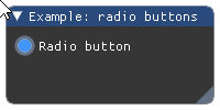
Parameters: - label (str) – button label.
- active (bool) – state of the radio button.
Returns: bool – True if clicked.
Wraps API:
bool RadioButton(const char* label, bool active)
-
imgui.core.render()¶ Finalize frame, set rendering data, and run render callback (if set).
Wraps API:
void Render()
-
imgui.core.reset_mouse_drag_delta(int button=0)¶ Reset the mouse dragging delta.
Parameters: button (int) – mouse button index. Wraps API:
void ResetMouseDragDelta(int button = 0)
-
imgui.core.same_line(float position=0.0, float spacing=-1.0)¶ Call between widgets or groups to layout them horizontally.
Example:
imgui.begin("Example: same line widgets")

imgui.text("same_line() with defaults:")
imgui.button("yes"); imgui.same_line()
imgui.button("no")

imgui.text("same_line() with fixed position:")
imgui.button("yes"); imgui.same_line(position=50)
imgui.button("no")

imgui.text("same_line() with spacing:")
imgui.button("yes"); imgui.same_line(spacing=50)
imgui.button("no")

imgui.end()
Outputs: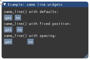
Parameters: - position (float) – fixed horizontal position position.
- spacing (float) – spacing between elements.
Wraps API:
void SameLine(float pos_x = 0.0f, float spacing_w = -1.0f)
-
imgui.core.selectable(str label, selected=False, ImGuiTreeNodeFlags flags=0, width=0, height=0)¶ Selectable text. Returns ‘true’ if the item is pressed.
Width of 0.0 will use the available width in the parent container. Height of 0.0 will use the available height in the parent container.
Example:
selected = [False, False]
imgui.begin("Example: selectable")
_, selected[0] = imgui.selectable(
    "1. I am selectable", selected[0]
)
_, selected[1] = imgui.selectable(
    "2. I am selectable too", selected[1]
)
imgui.text("3. I am not selectable")
imgui.end()
Outputs: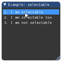
Parameters: - label (str) – The label.
- selected (bool) – defines if item is selected or not.
- flags – Selectable flags. See: list of available flags.
- width (float) – button width.
- height (float) – button height.
Returns: tuple – a
(opened, selected)two-tuple indicating if item was clicked by the user and the current state of item.Wraps API:
bool Selectable(
    const char* label,
    bool selected = false,
    ImGuiSelectableFlags flags = 0,
    const ImVec2& size = ImVec2(0,0)
)

bool Selectable(
    const char* label,
    bool* selected,
    ImGuiSelectableFlags flags = 0,
    const ImVec2& size = ImVec2(0,0)
)
-
imgui.core.separator()¶ Add vertical line as a separator beween elements.
Example:
imgui.begin("Example: separators")

imgui.text("Some text with bullets")
imgui.bullet_text("Bullet A")
imgui.bullet_text("Bullet A")

imgui.separator()

imgui.text("Another text with bullets")
imgui.bullet_text("Bullet A")
imgui.bullet_text("Bullet A")

imgui.end()
Outputs: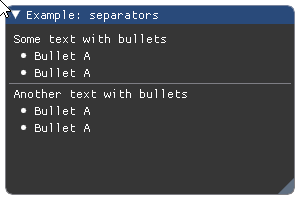
Wraps API:
void Separator()
-
imgui.core.set_column_offset(int column_index, float offset_x)¶ Set the position of column line (in pixels, from the left side of the contents region). Pass -1 to use current column.
For a complete example see
columns().Parameters: - column_index (int) – index of the column to get the offset for.
- offset_x (float) – offset in pixels.
Wraps API:
void SetColumnOffset(int column_index, float offset_x)
-
imgui.core.set_column_width(int column_index, float width)¶ Set the position of column line (in pixels, from the left side of the contents region). Pass -1 to use current column.
For a complete example see
columns().Parameters: - column_index (int) – index of the column to set the width for.
- width (float) – width in pixels.
Wraps API:
void SetColumnWidth(int column_index, float width)
-
imgui.core.set_current_context(_ImGuiContext ctx)¶ SetCurrentContext
Wraps API:
SetCurrentContext(
        ImGuiContext *ctx);
-
imgui.core.set_cursor_pos(local_pos)¶ Set the cursor position in local coordinates [0..<window size>] (useful to work with ImDrawList API)
Wraps API:
ImVec2 SetCursorScreenPos(const ImVec2& screen_pos)
-
imgui.core.set_cursor_position()¶ set_cursor_pos(local_pos) Set the cursor position in local coordinates [0..<window size>] (useful to work with ImDrawList API)
Wraps API:
ImVec2 SetCursorScreenPos(const ImVec2& screen_pos)
-
imgui.core.set_cursor_screen_pos(screen_pos)¶ Set the cursor position in absolute screen coordinates [0..io.DisplaySize] (useful to work with ImDrawList API)
Wraps API:
ImVec2 SetCursorScreenPos(const ImVec2& screen_pos)
-
imgui.core.set_cursor_screen_position()¶ set_cursor_screen_pos(screen_pos) Set the cursor position in absolute screen coordinates [0..io.DisplaySize] (useful to work with ImDrawList API)
Wraps API:
ImVec2 SetCursorScreenPos(const ImVec2& screen_pos)
-
imgui.core.set_item_allow_overlap()¶ Allow last item to be overlapped by a subsequent item. Sometimes useful with invisible buttons, selectables, etc. to catch unused area.
Wraps API:
void SetItemAllowOverlap()
-
imgui.core.set_item_default_focus()¶ Make last item the default focused item of a window. Please use instead of “if (is_window_appearing()) set_scroll_here()” to signify “default item”.
Wraps API:
void SetItemDefaultFocus()
-
imgui.core.set_keyboard_focus_here(int offset=0)¶ Focus keyboard on the next widget. Use positive ‘offset’ to access sub components of a multiple component widget. Use -1 to access previous widget.
Wraps API:
void SetKeyboardFocusHere(int offset = 0)
-
imgui.core.set_mouse_cursor(ImGuiMouseCursor mouse_cursor_type)¶ Set the mouse cursor id.
Parameters: mouse_cursor_type (ImGuiMouseCursor) – mouse cursor type. Wraps API:
void SetMouseCursor(ImGuiMouseCursor type)
-
imgui.core.set_next_window_bg_alpha(float alpha)¶ set next window background color alpha. helper to easily modify ImGuiCol_WindowBg/ChildBg/PopupBg.
Wraps API:
void SetNextWindowBgAlpha(float)
-
imgui.core.set_next_window_collapsed(bool collapsed, ImGuiCond condition=ALWAYS)¶ Set next window collapsed state.
Example:
imgui.set_next_window_collapsed(True)
imgui.begin("Example: collapsed window")
imgui.end()
Outputs: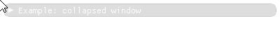
Parameters: - collapsed (bool) – set to True if window has to be collapsed.
- condition (condition flag) – defines on
which condition value should be set. Defaults to
imgui.ALWAYS.
Wraps API:
void SetNextWindowCollapsed(
    bool collapsed, ImGuiCond cond = 0
)
-
imgui.core.set_next_window_focus()¶ Set next window to be focused (most front).
Wraps API:
void SetNextWindowFocus()
-
imgui.core.set_next_window_position(float x, float y, ImGuiCond condition=ALWAYS, float pivot_x=0, float pivot_y=0)¶ Set next window position.
Call before
begin().Parameters: - x (float) – x window coordinate
- y (float) – y window coordinate
- condition (condition flag) – defines on which
condition value should be set. Defaults to
imgui.ALWAYS. - pivot_x (float) – pivot x window coordinate
- pivot_y (float) – pivot y window coordinate
Example:
imgui.set_next_window_size(20, 20)

for index in range(5):
    imgui.set_next_window_position(index * 40, 5)
    imgui.begin(str(index))
    imgui.end()
Outputs: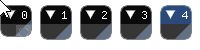
Wraps API:
void SetNextWindowPos(
    const ImVec2& pos,
    ImGuiCond cond = 0,
    const ImVec2& pivot = ImVec2(0,0)
)
-
imgui.core.set_next_window_size(float width, float height, ImGuiCond condition=ALWAYS)¶ Set next window size.
Call before
begin().Parameters: - width (float) – window width. Value 0.0 enables autofit.
- height (float) – window height. Value 0.0 enables autofit.
- condition (condition flag) – defines on which
condition value should be set. Defaults to
imgui.ALWAYS.
Example:
imgui.set_next_window_position(io.display_size.x * 0.5, io.display_size.y * 0.5, 1, pivot_x = 0.5, pivot_y = 0.5)

imgui.set_next_window_size(80, 180)
imgui.begin("High")
imgui.end()
Outputs: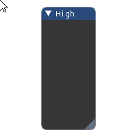
Wraps API:
void SetNextWindowSize(
    const ImVec2& size, ImGuiCond cond = 0
)
-
imgui.core.set_scroll_from_pos_y(float pos_y, float center_y_ratio=0.5)¶ Set scroll from position Y
adjust scrolling amount to make given position valid. use GetCursorPos() or GetCursorStartPos()+offset to get valid positions.
Parameters: - float pos_y
- float center_y_ratio = 0.5f
Wraps API:
void SetScrollFromPosY(float pos_y, float center_y_ratio = 0.5f)
-
imgui.core.set_scroll_here(float center_y_ratio=0.5)¶ Set scroll here.
adjust scrolling amount to make current cursor position visible. center_y_ratio=0.0: top, 0.5: center, 1.0: bottom. When using to make a “default/current item” visible, consider using SetItemDefaultFocus() instead.
Parameters: float center_y_ratio = 0.5f Wraps API:
void SetScrollHere(float center_y_ratio = 0.5f)
-
imgui.core.set_scroll_x(float scroll_x)¶ set scrolling amount [0..SetScrollMaxX()]
Wraps API:
int SetScrollX(float)
-
imgui.core.set_scroll_y(float scroll_y)¶ set scrolling amount [0..SetScrollMaxY()]
Wraps API:
int SetScrollY(flot)
-
imgui.core.set_tooltip(str text)¶ Set tooltip under mouse-cursor.
Usually used with
is_item_hovered(). For a complex tooltip window seebegin_tooltip().Example:
imgui.begin("Example: tooltip")
imgui.button("Hover me!")
if imgui.is_item_hovered():
    imgui.set_tooltip("Please?")
imgui.end()
Outputs: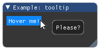
Wraps API:
void SetTooltip(const char* fmt, ...)
-
imgui.core.set_window_focus()¶ Set window to be focused
Wraps API:
void SetWindowFocus()
-
imgui.core.set_window_font_scale(float scale)¶ Adjust per-window font scale for current window.
Function should be called inside window context so after calling
begin().Note: use
get_io().font_global_scaleif you want to scale all windows.Example:
imgui.begin("Example: font scale")
imgui.set_window_font_scale(2.0)
imgui.text("Bigger font")
imgui.end()
Outputs: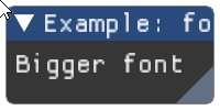
Parameters: scale (float) – font scale Wraps API:
void SetWindowFontScale(float scale)
-
imgui.core.show_demo_window(closable=False)¶ Show ImGui demo window.
Example:
imgui.show_demo_window()
Outputs:
Parameters: closable (bool) – define if window is closable. Returns: bool – True if window is not closed (False trigerred by close button). Wraps API:
void ShowDemoWindow(bool* p_open = NULL)
-
imgui.core.show_font_selector(str label)
-
imgui.core.show_metrics_window(closable=False)¶ Show ImGui metrics window.
Example:
imgui.show_metrics_window()
Outputs:
Parameters: closable (bool) – define if window is closable. Returns: bool – True if window is not closed (False trigerred by close button). Wraps API:
void ShowMetricsWindow(bool* p_open = NULL)
-
imgui.core.show_style_editor(GuiStyle style=None)¶ Show ImGui style editor.
Example:
imgui.begin("Example: my style editor")
imgui.show_style_editor()
imgui.end()
Outputs: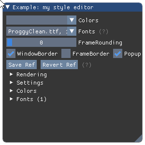
Parameters: style (GuiStyle) – style editor state container. Wraps API:
void ShowStyleEditor(ImGuiStyle* ref = NULL)
-
imgui.core.show_style_selector(str label)
-
imgui.core.show_test_window()¶ Show ImGui demo window.
Example:
imgui.show_test_window()
Outputs: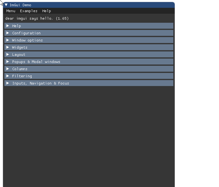
Wraps API:
void ShowDemoWindow()
-
imgui.core.show_user_guide()¶ Show ImGui user guide editor.
Example:
imgui.begin("Example: user guide")
imgui.show_user_guide()
imgui.end()
Outputs: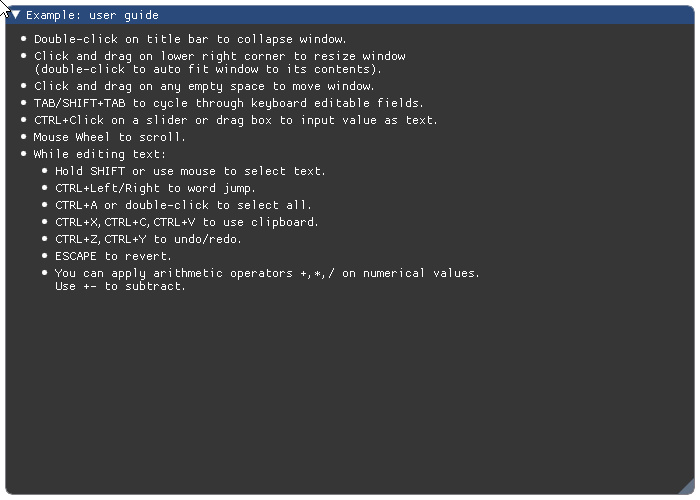
Wraps API:
void ShowUserGuide()
-
imgui.core.slider_float(str label, float value, float min_value, float max_value, str format='%.3f', float power=1.0)¶ Display float slider widget. Use power different from 1.0 for logarithmic sliders.
Example:
value = 88.2

imgui.begin("Example: slider float")
changed, value = imgui.slider_float(
    "slide floats", value,
    min_value=0.0, max_value=100.0,
    format="%.0f",
    power=1.0
)
imgui.text("Changed: %s, Value: %s" % (changed, value))
imgui.end()
Outputs: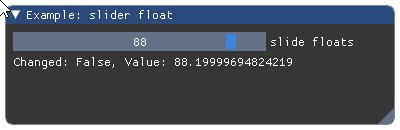
Parameters: - label (str) – widget label.
- value (float) – slider values.
- min_value (float) – min value allowed by widget.
- max_value (float) – max value allowed by widget.
- format (str) – display format string as C-style
printfformat string. Warning: highly unsafe. Seeslider_float(). - power (float) – how fast values changes on slide.
Returns: tuple – a
(changed, values)tuple that contains indicator of widget state change and the current slider value.Wraps API:
bool SliderFloat(
    const char* label,
    float v,
    float v_min,
    float v_max,
    const char* format = "%.3f",
    float power = 1.0f
)
-
imgui.core.slider_float2(str label, float value0, float value1, float min_value, float max_value, str format='%.3f', float power=1.0)¶ Display float slider widget with 2 values. Use power different from 1.0 for logarithmic sliders.
Example:
values = 88.2, 42.6

imgui.begin("Example: slider float2")
changed, values = imgui.slider_float2(
    "slide floats", *values,
    min_value=0.0, max_value=100.0,
    format="%.0f",
    power=1.0
)
imgui.text("Changed: %s, Values: %s" % (changed, values))
imgui.end()
Outputs: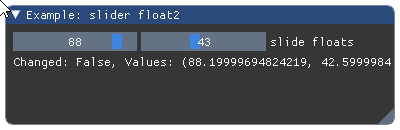
Parameters: - label (str) – widget label.
- value0, value1 (float) – slider values.
- min_value (float) – min value allowed by widget.
- max_value (float) – max value allowed by widget.
- format (str) – display format string as C-style
printfformat string. Warning: highly unsafe. Seeslider_float(). - power (float) – how fast values changes on slide.
Returns: tuple – a
(changed, values)tuple that contains indicator of widget state change and the tuple of current slider values.Wraps API:
bool SliderFloat2(
    const char* label,
    float v[2],
    float v_min,
    float v_max,
    const char* format = "%.3f",
    float power = 1.0f
)
-
imgui.core.slider_float3(str label, float value0, float value1, float value2, float min_value, float max_value, str format='%.3f', float power=1.0)¶ Display float slider widget with 3 values. Use power different from 1.0 for logarithmic sliders.
Example:
values = 88.2, 42.6, 69.1

imgui.begin("Example: slider float3")
changed, values = imgui.slider_float3(
    "slide floats", *values,
    min_value=0.0, max_value=100.0,
    format="%.0f",
    power=1.0
)
imgui.text("Changed: %s, Values: %s" % (changed, values))
imgui.end()
Outputs: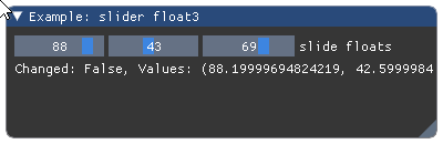
Parameters: - label (str) – widget label.
- value0, value1, value2 (float) – slider values.
- min_value (float) – min value allowed by widget.
- max_value (float) – max value allowed by widget.
- format (str) – display format string as C-style
printfformat string. Warning: highly unsafe. Seeslider_float(). - power (float) – how fast values changes on slide.
Returns: tuple – a
(changed, values)tuple that contains indicator of widget state change and the tuple of current slider values.Wraps API:
bool SliderFloat3(
    const char* label,
    float v[3],
    float v_min,
    float v_max,
    const char* format = "%.3f",
    float power = 1.0f
)
-
imgui.core.slider_float4(str label, float value0, float value1, float value2, float value3, float min_value, float max_value, str format='%.3f', float power=1.0)¶ Display float slider widget with 4 values. Use power different from 1.0 for logarithmic sliders.
Example:
values = 88.2, 42.6, 69.1, 0.3

imgui.begin("Example: slider float4")
changed, values = imgui.slider_float4(
    "slide floats", *values,
    min_value=0.0, max_value=100.0,
    format="%.0f",
    power=1.0
)
imgui.text("Changed: %s, Values: %s" % (changed, values))
imgui.end()
Outputs: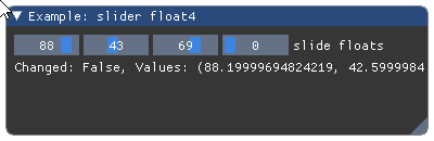
Parameters: - label (str) – widget label.
- value0, value1, value2, value3 (float) – slider values.
- min_value (float) – min value allowed by widget.
- max_value (float) – max value allowed by widget.
- format (str) – display format string as C-style
printfformat string. Warning: highly unsafe. Seeslider_float(). - power (float) – how fast values changes on slide.
Returns: tuple – a
(changed, values)tuple that contains indicator of widget state change and the tuple of current slider values.Wraps API:
bool SliderFloat4(
    const char* label,
    float v[4],
    float v_min,
    float v_max,
    const char* format = "%.3f",
    float power = 1.0f
)
-
imgui.core.slider_int(str label, int value, int min_value, int max_value, str format='%.f')¶ Display int slider widget
Example:
value = 88

imgui.begin("Example: slider int")
changed, values = imgui.slider_int(
    "slide ints", value,
    min_value=0, max_value=100,
    format="%d"
)
imgui.text("Changed: %s, Values: %s" % (changed, value))
imgui.end()
Outputs: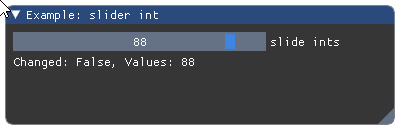
Parameters: - label (str) – widget label.
- value (int) – slider value.
- min_value (int) – min value allowed by widget.
- max_value (int) – max value allowed by widget.
- format (str) – display format string as C-style
printfformat string. Warning: highly unsafe. Seeslider_int().
Returns: tuple – a
(changed, value)tuple that contains indicator of widget state change and the slider value.Wraps API:
bool SliderInt(
    const char* label,
    int v,
    int v_min,
    int v_max,
    const char* format = "%.3f"
)
-
imgui.core.slider_int2(str label, int value0, int value1, int min_value, int max_value, str format='%.f')¶ Display int slider widget with 2 values.
Example:
values = 88, 27

imgui.begin("Example: slider int2")
changed, values = imgui.slider_int2(
    "slide ints2", *values,
    min_value=0, max_value=100,
    format="%d"
)
imgui.text("Changed: %s, Values: %s" % (changed, values))
imgui.end()
Outputs: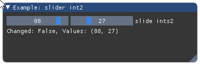
Parameters: - label (str) – widget label.
- value0, value1 (int) – slider values.
- min_value (int) – min value allowed by widget.
- max_value (int) – max value allowed by widget.
- format (str) – display format string as C-style
printfformat string. Warning: highly unsafe. Seeslider_int().
Returns: tuple – a
(changed, values)tuple that contains indicator of widget state change and the tuple of current slider values.Wraps API:
bool SliderInt2(
    const char* label,
    int v[2],
    int v_min,
    int v_max,
    const char* format = "%.3f"
)
-
imgui.core.slider_int3(str label, int value0, int value1, int value2, int min_value, int max_value, str format='%.f')¶ Display int slider widget with 3 values.
Example:
values = 88, 27, 3

imgui.begin("Example: slider int3")
changed, values = imgui.slider_int3(
    "slide ints3", *values,
    min_value=0, max_value=100,
    format="%d"
)
imgui.text("Changed: %s, Values: %s" % (changed, values))
imgui.end()
Outputs: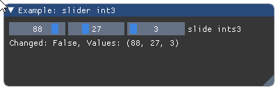
Parameters: - label (str) – widget label.
- value0, value1, value2 (int) – slider values.
- min_value (int) – min value allowed by widget.
- max_value (int) – max value allowed by widget.
- format (str) – display format string as C-style
printfformat string. Warning: highly unsafe. Seeslider_int().
Returns: tuple – a
(changed, values)tuple that contains indicator of widget state change and the tuple of current slider values.Wraps API:
bool SliderInt3(
    const char* label,
    int v[3],
    int v_min,
    int v_max,
    const char* format = "%.3f"
)
-
imgui.core.slider_int4(str label, int value0, int value1, int value2, int value3, int min_value, int max_value, str format='%.f')¶ Display int slider widget with 4 values.
Example:
values = 88, 42, 69, 0

imgui.begin("Example: slider int4")
changed, values = imgui.slider_int4(
    "slide ints", *values,
    min_value=0, max_value=100, format="%d"
)
imgui.text("Changed: %s, Values: %s" % (changed, values))
imgui.end()
Outputs: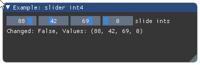
Parameters: - label (str) – widget label.
- value0, value1, value2, value3 (int) – slider values.
- min_value (int) – min value allowed by widget.
- max_value (int) – max value allowed by widget.
- format (str) – display format string as C-style
printfformat string. Warning: highly unsafe. Seeslider_int().
Returns: tuple – a
(changed, values)tuple that contains indicator of widget state change and the tuple of current slider values.Wraps API:
bool SliderInt4(
    const char* label,
    int v[4],
    int v_min,
    int v_max,
    const char* format = "%.3f"
)
Display small button (with 0 frame padding).
Example:
imgui.begin("Example: button")
imgui.small_button("Button 1")
imgui.small_button("Button 2")
imgui.end()
Outputs: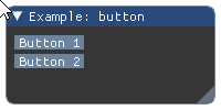
Parameters: label (str) – button label. Returns: bool – True if clicked. Wraps API:
bool SmallButton(const char* label)
-
imgui.core.spacing()¶ Add vertical spacing beween elements.
Example:
imgui.begin("Example: vertical spacing")

imgui.text("Some text with bullets:")
imgui.bullet_text("Bullet A")
imgui.bullet_text("Bullet A")

imgui.spacing(); imgui.spacing()

imgui.text("Another text with bullets:")
imgui.bullet_text("Bullet A")
imgui.bullet_text("Bullet A")

imgui.end()
Outputs: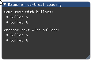
Wraps API:
void Spacing()
-
imgui.core.style_colors_classic(GuiStyle dst=None)¶ Set the style to Classic.
classic imgui style.Wraps API:
void StyleColorsClassic(ImGuiStyle* dst = NULL)
-
imgui.core.style_colors_dark(GuiStyle dst=None)¶ Set the style to Dark.
new, recommended style (default)Wraps API:
void StyleColorsDark(ImGuiStyle* dst = NULL)
-
imgui.core.style_colors_light(GuiStyle dst=None)¶ Set the style to Light.
best used with borders and a custom, thicker fontWraps API:
void StyleColorsLight(ImGuiStyle* dst = NULL)
-
imgui.core.text(str text)¶ Add text to current widget stack.
Example:
imgui.begin("Example: simple text")
imgui.text("Simple text")
imgui.end()
Outputs: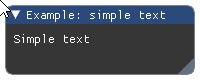
Parameters: text (str) – text to display. Wraps API:
Text(const char* fmt, ...)
-
imgui.core.text_colored(str text, float r, float g, float b, float a=1.)¶ Add colored text to current widget stack.
It is a shortcut for:
imgui.push_style_color(imgui.COLOR_TEXT, r, g, b, a)
imgui.text(text)
imgui.pop_style_color()
Example:
imgui.begin("Example: colored text")
imgui.text_colored("Colored text", 1, 0, 0)
imgui.end()
Outputs: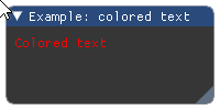
Parameters: - text (str) – text to display.
- r (float) – red color intensity.
- g (float) – green color intensity.
- b (float) – blue color instensity.
- a (float) – alpha intensity.
Wraps API:
TextColored(const ImVec4& col, const char* fmt, ...)
-
imgui.core.text_unformatted(str text)¶ Big area text display - the size is defined by it’s container. Recommended for long chunks of text.
Example:
imgui.begin("Example: unformatted text")
imgui.text_unformatted("Really ... long ... text")
imgui.end()
Outputs: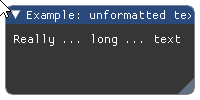
Parameters: text (str) – text to display. Wraps API:
TextUnformatted(const char* text, const char* text_end = NULL)
-
imgui.core.tree_node(str text, ImGuiTreeNodeFlags flags=0)¶ Draw a tree node.
Returns ‘true’ if the node is drawn, call
tree_pop()to finish.Example:
imgui.begin("Example: tree node")
if imgui.tree_node("Expand me!", imgui.TREE_NODE_DEFAULT_OPEN):
    imgui.text("Lorem Ipsum")
    imgui.tree_pop()
imgui.end()
Outputs: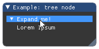
Parameters: - text (str) – Tree node label
- flags – TreeNode flags. See: list of available flags.
Returns: bool – True if tree node is displayed (opened).
Wraps API:
bool TreeNode(const char* label)
bool TreeNodeEx(const char* label, ImGuiTreeNodeFlags flags = 0)
-
imgui.core.tree_pop()¶ Called to clear the tree nodes stack and return back the identation.
Same as calls to
unindent()andpop_id(). For a tree example seetree_node().Wraps API:
void TreePop()
-
imgui.core.unindent(float width=0.0)¶ Move content to left by indent width.
Example:
imgui.begin("Example: item unindenting")

imgui.text("Some text with bullets:")

imgui.bullet_text("Bullet A")
imgui.unindent(10)
imgui.bullet_text("Bullet B (first unindented)")
imgui.bullet_text("Bullet C (unindent continues)")
imgui.indent(10)
imgui.bullet_text("Bullet C (unindent cleared)")

imgui.end()
Outputs: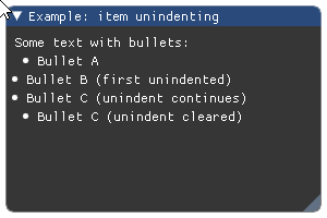
Parameters: width (float) – fixed width of indent. If less or equal 0 it defaults to global indent spacing or value set using style value stack (see push_style_var).Wraps API:
void Unindent(float indent_w = 0.0f)
-
imgui.core.v_slider_float(str label, float width, float height, float value, float min_value, float max_value, str format='%.f', float power=1.0)¶ Display vertical float slider widget with the specified width and height.
Example:
width = 20
height = 100
value = 88

imgui.begin("Example: vertical slider float")
changed, values = imgui.v_slider_float(
    "vertical slider float",
    width, height, value,
    min_value=0, max_value=100,
    format="%0.3f", power = 1.0
)
imgui.text("Changed: %s, Values: %s" % (changed, values))
imgui.end()
Outputs: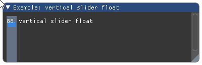
Parameters: - label (str) – widget label.
- value (float) – slider value.
- min_value (float) – min value allowed by widget.
- max_value (float) – max value allowed by widget.
- format (str) – display format string as C-style
printfformat string. Warning: highly unsafe. Seeslider_float(). - power (float) – how fast values changes on slide.
Returns: tuple – a
(changed, value)tuple that contains indicator of widget state change and the slider value.Wraps API:
bool VSliderFloat(
    const char* label,
    const ImVec2& size,
    float v,
    float v_min,
    floatint v_max,
    const char* format = "%.3f",
    float power=1.0
)
-
imgui.core.v_slider_int(str label, float width, float height, int value, int min_value, int max_value, str format='%d')¶ Display vertical int slider widget with the specified width and height.
Example:
width = 20
height = 100
value = 88

imgui.begin("Example: vertical slider int")
changed, values = imgui.v_slider_int(
    "vertical slider int",
    width, height, value,
    min_value=0, max_value=100,
    format="%d"
)
imgui.text("Changed: %s, Values: %s" % (changed, values))
imgui.end()
Outputs: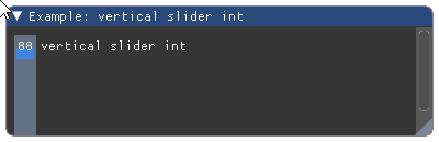
Parameters: - label (str) – widget label.
- value (int) – slider value.
- min_value (int) – min value allowed by widget.
- max_value (int) – max value allowed by widget.
- format (str) – display format string as C-style
printfformat string. Warning: highly unsafe. Seeslider_int().
Returns: tuple – a
(changed, value)tuple that contains indicator of widget state change and the slider value.Wraps API:
bool VSliderInt(
    const char* label,
    const ImVec2& size,
    int v,
    int v_min,
    int v_max,
    const char* format = "%.3f"
)