
imgui.core module
- class imgui.core._IO
Main ImGui I/O context class used for ImGui configuration.
This class is not intended to be instantiated by user (thus _ name prefix). It should be accessed through obtained with
get_io()function.Example:
import imgui

io = imgui.get_io()
- add_input_character(self, unsigned int c)
- add_input_character_utf16(self, str utf16_chars)
- add_input_characters_utf8(self, str utf8_chars)
- backend_flags
- clear_input_characters(self)
- config_cursor_blink
- config_drag_click_to_input_text
- config_flags
- config_mac_osx_behaviors
- config_memory_compact_timer
- config_windows_move_from_title_bar_only
- config_windows_resize_from_edges
- delta_time
- display_fb_scale
- display_size
- font_allow_user_scaling
- font_global_scale
- fonts
- framerate
- get_clipboard_text_fn
- ini_file_name
- ini_saving_rate
- key_alt
- key_ctrl
- key_map
- key_repeat_delay
- key_repeat_rate
- key_shift
- key_super
- keys_down
- log_file_name
- metrics_active_allocations
- metrics_active_windows
- metrics_render_indices
- metrics_render_vertices
- metrics_render_windows
- mouse_delta
- mouse_double_click_max_distance
- mouse_double_click_time
- mouse_down
- mouse_drag_threshold
- mouse_draw_cursor
- mouse_pos
- mouse_wheel
- mouse_wheel_horizontal
- set_clipboard_text_fn
- want_capture_keyboard
- want_capture_mouse
- want_save_ini_settings
- want_set_mouse_pos
- want_text_input
- class imgui.core._FontAtlas
Font atlas object responsible for controling and loading fonts.
This class is not intended to be instantiated by user (thus _ name prefix). It should be accessed through
_IO.fontsattribute of_IOobtained withget_io()function.Example:
import imgui

io = imgui.get_io()
io.fonts.add_font_default()
- add_font_default(self)
- add_font_from_file_ttf(self, str filename, float size_pixels, font_config=None, glyph_ranges=None)
- clear(self)
- clear_fonts(self)
- clear_input_data(self)
- clear_tex_data(self)
- get_glyph_ranges_chinese(self)
- get_glyph_ranges_chinese_full(self)
- get_glyph_ranges_cyrillic(self)
- get_glyph_ranges_default(self)
- get_glyph_ranges_japanese(self)
- get_glyph_ranges_korean(self)
- get_glyph_ranges_latin(self)
- get_glyph_ranges_thai(self)
- get_glyph_ranges_vietnamese(self)
- get_tex_data_as_alpha8(self)
- get_tex_data_as_rgba32(self)
- texture_desired_width
- texture_height
- texture_id
difference in mapping (maps actual TexID and not TextureID)
Note: texture ID type is implementation dependent. It is usually integer (at least for OpenGL).
- Type:
Note
- texture_width
- class imgui.core._DrawList
Low level drawing API.
_DrawList instance can be acquired by calling
get_window_draw_list().- add_bezier_cubic(self, float point1_x, float point1_y, float point2_x, float point2_y, float point3_x, float point3_y, float point4_x, float point4_y, ImU32 col, float thickness, int num_segments=0)
Add a cubic bezier curve to the list.
Example:
imgui.begin("Cubic bezier example")
draw_list = imgui.get_window_draw_list()
draw_list.add_bezier_cubic(20, 35, 90, 80, 110, 180, 145, 35, imgui.get_color_u32_rgba(1,1,0,1), 2)
imgui.end()
Outputs: 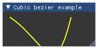
- Parameters:
point1_x (float) – X coordinate of first point
point1_y (float) – Y coordinate of first point
point2_x (float) – X coordinate of second point
point2_y (float) – Y coordinate of second point
point3_x (float) – X coordinate of third point
point3_y (float) – Y coordinate of third point
point4_x (float) – X coordinate of fourth point
point4_y (float) – Y coordinate of fourth point
col (ImU32) – RGBA color specification
thickness (float) – Line thickness
num_segments (ImU32) – Number of segments, defaults to 0 meaning auto-tesselation
Wraps API:
void ImDrawList::AddBezierCubic(
    const ImVec2& p1,
    const ImVec2& p2,
    const ImVec2& p3,
    const ImVec2& p4,
    ImU32 col,
    float thickness,
    int num_segments = 0
)
- add_bezier_quadratic(self, float point1_x, float point1_y, float point2_x, float point2_y, float point3_x, float point3_y, ImU32 col, float thickness, int num_segments=0)
Add a quadratic bezier curve to the list.
Example:
imgui.begin("Quadratic bezier example")
draw_list = imgui.get_window_draw_list()
draw_list.add_bezier_quadratic(20, 35, 90, 80, 145, 35, imgui.get_color_u32_rgba(1,1,0,1), 2)
imgui.end()
Outputs: 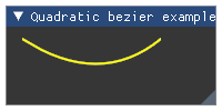
- Parameters:
point1_x (float) – X coordinate of first point
point1_y (float) – Y coordinate of first point
point2_x (float) – X coordinate of second point
point2_y (float) – Y coordinate of second point
point3_x (float) – X coordinate of third point
point3_y (float) – Y coordinate of third point
col (ImU32) – RGBA color specification
thickness (float) – Line thickness
num_segments (ImU32) – Number of segments, defaults to 0 meaning auto-tesselation
Wraps API:
void ImDrawList::AddBezierCubic(
    const ImVec2& p1,
    const ImVec2& p2,
    const ImVec2& p3,
    ImU32 col,
    float thickness,
    int num_segments = 0
)
- add_circle(self, float centre_x, float centre_y, float radius, ImU32 col, int num_segments=0, float thickness=1.0)
Add a circle to the draw list.
Example:
imgui.begin("Circle example")
draw_list = imgui.get_window_draw_list()
draw_list.add_circle(100, 60, 30, imgui.get_color_u32_rgba(1,1,0,1), thickness=3)
imgui.end()
Outputs: 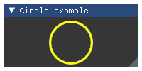
- Parameters:
centre_x (float) – circle centre coordinates
centre_y (float) – circle centre coordinates
radius (float) – circle radius
col (ImU32) – RGBA color specification
num_segments (ImU32) – Number of segments, defaults to 0 meaning auto-tesselation
thickness (float) – Line thickness
Wraps API:
void ImDrawList::AddCircle(
    const ImVec2& centre,
    float radius,
    ImU32 col,
    int num_segments = 0,
    float thickness = 1.0
)
- add_circle_filled(self, float centre_x, float centre_y, float radius, ImU32 col, ImU32 num_segments=0)
Add a filled circle to the draw list.
Example:
imgui.begin("Filled circle example")
draw_list = imgui.get_window_draw_list()
draw_list.add_circle_filled(100, 60, 30, imgui.get_color_u32_rgba(1,1,0,1))
imgui.end()
Outputs: 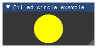
- Parameters:
centre_x (float) – circle centre coordinates
centre_y (float) – circle centre coordinates
radius (float) – circle radius
col (ImU32) – RGBA color specification
num_segments (ImU32) – Number of segments, defaults to 0 meaning auto-tesselation
Wraps API:
void ImDrawList::AddCircleFilled(
    const ImVec2& centre,
    float radius,
    ImU32 col,
    int num_segments = 0
)
- add_image(self, texture_id, tuple a, tuple b, tuple uv_a=(0, 0), tuple uv_b=(1, 1), ImU32 col=0xffffffff)
Add image to the draw list. Aspect ratio is not preserved.
Example:
imgui.begin("Image example")
texture_id = imgui.get_io().fonts.texture_id
draw_list = imgui.get_window_draw_list()
draw_list.add_image(texture_id, (20, 35), (180, 80), col=imgui.get_color_u32_rgba(0.5,0.5,1,1))
imgui.end()
Outputs: 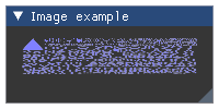
- Parameters:
texture_id (object) – ID of the texture to draw
a (tuple) – top-left image corner coordinates,
b (tuple) – bottom-right image corner coordinates,
uv_a (tuple) – UV coordinates of the top-left corner, defaults to (0, 0)
uv_b (tuple) – UV coordinates of the bottom-right corner, defaults to (1, 1)
col (ImU32) – tint color, defaults to 0xffffffff (no tint)
Wraps API:
void ImDrawList::AddImage(
    ImTextureID user_texture_id,
    const ImVec2& a,
    const ImVec2& b,
    const ImVec2& uv_a = ImVec2(0,0),
    const ImVec2& uv_b = ImVec2(1,1),
    ImU32 col = 0xFFFFFFFF
)
- add_image_rounded(self, texture_id, tuple a, tuple b, tuple uv_a=(0, 0), tuple uv_b=(1, 1), ImU32 col=0xffffffff, float rounding=0.0, ImDrawFlags flags=0)
Add rounded image to the draw list. Aspect ratio is not preserved.
Example:
imgui.begin("Image example")
texture_id = imgui.get_io().fonts.texture_id
draw_list = imgui.get_window_draw_list()
draw_list.add_image_rounded(texture_id, (20, 35), (180, 80), col=imgui.get_color_u32_rgba(0.5,0.5,1,1), rounding=10)
imgui.end()
Outputs: 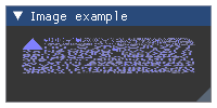
- Parameters:
texture_id (object) – ID of the texture to draw
a (tuple) – top-left image corner coordinates,
b (tuple) – bottom-right image corner coordinates,
uv_a (tuple) – UV coordinates of the top-left corner, defaults to (0, 0)
uv_b (tuple) – UV coordinates of the bottom-right corner, defaults to (1, 1)
col (ImU32) – tint color, defaults to 0xffffffff (no tint)
rounding (float) – degree of rounding, defaults to 0.0
flags (ImDrawFlags) – draw flags, defaults to 0. See: list of available flags.
Wraps API:
void ImDrawList::AddImageRounded(
    ImTextureID user_texture_id,
    const ImVec2& a,
    const ImVec2& b,
    const ImVec2& uv_a = ImVec2(0,0),
    const ImVec2& uv_b = ImVec2(1,1),
    ImU32 col = 0xFFFFFFFF,
    float rounding = 0.0f,
    ImDrawFlags flags = 0
)
- add_line(self, float start_x, float start_y, float end_x, float end_y, ImU32 col, float thickness=1.0)
Add a straight line to the draw list.
Example:
imgui.begin("Line example")
draw_list = imgui.get_window_draw_list()
draw_list.add_line(20, 35, 180, 80, imgui.get_color_u32_rgba(1,1,0,1), 3)
draw_list.add_line(180, 35, 20, 80, imgui.get_color_u32_rgba(1,0,0,1), 3)
imgui.end()
Outputs: 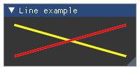
- Parameters:
start_x (float) – X coordinate of first point
start_y (float) – Y coordinate of first point
end_x (float) – X coordinate of second point
end_y (float) – Y coordinate of second point
col (ImU32) – RGBA color specification
thickness (float) – Line thickness in pixels
Wraps API:
void ImDrawList::AddLine(
    const ImVec2& a,
    const ImVec2& b,
    ImU32 col,
    float thickness = 1.0f
)
- add_ngon(self, float centre_x, float centre_y, float radius, ImU32 col, int num_segments, float thickness=1.0)
Draw a regular Ngon
- Parameters:
centre_x (float) – circle centre coordinates
centre_y (float) – circle centre coordinates
radius (float) – Distance of points to center
col (ImU32) – RGBA color specification
num_segments (int) – Number of segments
thickness (float) – Line thickness
Example:
imgui.begin("Ngon Example")
draw_list = imgui.get_window_draw_list()
draw_list.add_ngon(100, 60, 30, imgui.get_color_u32_rgba(1,1,0,1), 5)
imgui.end()
Outputs: 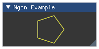
Wraps API:
void  AddNgon(
    const ImVec2& center,
    float radius,
    ImU32 col,
    int num_segments,
    float thickness = 1.0f
)
- add_ngon_filled(self, float centre_x, float centre_y, float radius, ImU32 col, int num_segments)
Draw a regular Ngon
- Parameters:
centre_x (float) – circle centre coordinates
centre_y (float) – circle centre coordinates
radius (float) – Distance of points to center
col (ImU32) – RGBA color specification
num_segments (int) – Number of segments
Example:
imgui.begin("Filled Ngon Example")
draw_list = imgui.get_window_draw_list()
draw_list.add_ngon_filled(100, 60, 30, imgui.get_color_u32_rgba(1,1,0,1), 5)
imgui.end()
Outputs: 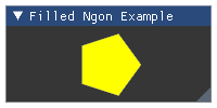
Wraps API:
void  AddNgonFilled(
    const ImVec2& center,
    float radius,
    ImU32 col,
    int num_segments
)
- add_polyline(self, list points, ImU32 col, ImDrawFlags flags=0, float thickness=1.0)
Add a optionally closed polyline to the draw list.
Example:
imgui.begin("Polyline example")
draw_list = imgui.get_window_draw_list()
draw_list.add_polyline([(20, 35), (90, 35), (55, 80)], imgui.get_color_u32_rgba(1,1,0,1), flags=imgui.DRAW_NONE, thickness=3)
draw_list.add_polyline([(110, 35), (180, 35), (145, 80)], imgui.get_color_u32_rgba(1,0,0,1), flags=imgui.DRAW_CLOSED, thickness=3)
imgui.end()
Outputs: 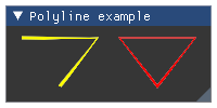
- Parameters:
points (list) – list of points
col (float) – RGBA color specification
flags (ImDrawFlags) – Drawing flags. See: list of available flags.
thickness (float) – line thickness
Wraps API:
void ImDrawList::AddPolyline(
    const ImVec2* points,
    int num_points,
    ImU32 col,
    flags flags,
    float thickness
)
- add_quad(self, float point1_x, float point1_y, float point2_x, float point2_y, float point3_x, float point3_y, float point4_x, float point4_y, ImU32 col, float thickness=1.0)
Add a quad to the list.
Example:
imgui.begin("Quad example")
draw_list = imgui.get_window_draw_list()
draw_list.add_quad(20, 35, 85, 30, 90, 80, 17, 76, imgui.get_color_u32_rgba(1,1,0,1))
draw_list.add_quad(110, 35, 177, 33, 180, 80, 112, 79, imgui.get_color_u32_rgba(1,0,0,1), 5)
imgui.end()
Outputs: 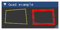
- Parameters:
point1_x (float) – X coordinate of first corner
point1_y (float) – Y coordinate of first corner
point2_x (float) – X coordinate of second corner
point2_y (float) – Y coordinate of second corner
point3_x (float) – X coordinate of third corner
point3_y (float) – Y coordinate of third corner
point4_x (float) – X coordinate of fourth corner
point4_y (float) – Y coordinate of fourth corner
col (ImU32) – RGBA color specification
thickness (float) – Line thickness
Wraps API:
void ImDrawList::AddQuad(
    const ImVec2& p1,
    const ImVec2& p2,
    const ImVec2& p3,
    const ImVec2& p4,
    ImU32 col,
    float thickness = 1.0
)
- add_quad_filled(self, float point1_x, float point1_y, float point2_x, float point2_y, float point3_x, float point3_y, float point4_x, float point4_y, ImU32 col)
Add a filled quad to the list.
Example:
imgui.begin("Filled Quad example")
draw_list = imgui.get_window_draw_list()
draw_list.add_quad_filled(20, 35, 85, 30, 90, 80, 17, 76, imgui.get_color_u32_rgba(1,1,0,1))
draw_list.add_quad_filled(110, 35, 177, 33, 180, 80, 112, 79, imgui.get_color_u32_rgba(1,0,0,1))
imgui.end()
Outputs: 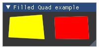
- Parameters:
point1_x (float) – X coordinate of first corner
point1_y (float) – Y coordinate of first corner
point2_x (float) – X coordinate of second corner
point2_y (float) – Y coordinate of second corner
point3_x (float) – X coordinate of third corner
point3_y (float) – Y coordinate of third corner
point4_x (float) – X coordinate of fourth corner
point4_y (float) – Y coordinate of fourth corner
col (ImU32) – RGBA color specification
Wraps API:
void ImDrawList::AddQuadFilled(
    const ImVec2& p1,
    const ImVec2& p2,
    const ImVec2& p3,
    const ImVec2& p4,
    ImU32 col
)
- add_rect(self, float upper_left_x, float upper_left_y, float lower_right_x, float lower_right_y, ImU32 col, float rounding=0.0, ImDrawFlags flags=0, float thickness=1.0)
Add a rectangle outline to the draw list.
Example:
imgui.begin("Rect example")
draw_list = imgui.get_window_draw_list()
draw_list.add_rect(20, 35, 90, 80, imgui.get_color_u32_rgba(1,1,0,1), thickness=3)
draw_list.add_rect(110, 35, 180, 80, imgui.get_color_u32_rgba(1,0,0,1), rounding=5, thickness=3)
imgui.end()
Outputs: 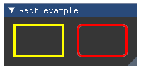
- Parameters:
upper_left_x (float) – X coordinate of top-left corner
upper_left_y (float) – Y coordinate of top-left corner
lower_right_x (float) – X coordinate of lower-right corner
lower_right_y (float) – Y coordinate of lower-right corner
col (ImU32) – RGBA color specification
rounding (float) – Degree of rounding, defaults to 0.0
flags (ImDrawFlags) – Draw flags, defaults to 0. See: list of available flags.
thickness (float) – Line thickness, defaults to 1.0
Wraps API:
void ImDrawList::AddRect(
    const ImVec2& a,
    const ImVec2& b,
    ImU32 col,
    float rounding = 0.0f,
    ImDrawFlags flags = 0,
    float thickness = 1.0f
)
- add_rect_filled(self, float upper_left_x, float upper_left_y, float lower_right_x, float lower_right_y, ImU32 col, float rounding=0.0, ImDrawFlags flags=0)
Add a filled rectangle to the draw list.
Example:
imgui.begin("Filled rect example")
draw_list = imgui.get_window_draw_list()
draw_list.add_rect_filled(20, 35, 90, 80, imgui.get_color_u32_rgba(1,1,0,1))
draw_list.add_rect_filled(110, 35, 180, 80, imgui.get_color_u32_rgba(1,0,0,1), 5)
imgui.end()
Outputs: 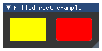
- Parameters:
upper_left_x (float) – X coordinate of top-left corner
upper_left_y (float) – Y coordinate of top-left corner
lower_right_x (float) – X coordinate of lower-right corner
lower_right_y (float) – Y coordinate of lower-right corner
col (ImU32) – RGBA color specification
rounding (float) – Degree of rounding, defaults to 0.0
flags (ImDrawFlags) – Draw flags, defaults to 0. See: list of available flags.
Wraps API:
void ImDrawList::AddRectFilled(
    const ImVec2& a,
    const ImVec2& b,
    ImU32 col,
    float rounding = 0.0f,
    ImDrawFlags flags = 0
)
- add_rect_filled_multicolor(self, float upper_left_x, float upper_left_y, float lower_right_x, float lower_right_y, ImU32 col_upr_left, ImU32 col_upr_right, ImU32 col_bot_right, ImU32 col_bot_left)
Add a multicolor filled rectangle to the draw list.
Example:
imgui.begin("Multicolored filled rect example")
draw_list = imgui.get_window_draw_list()
draw_list.add_rect_filled_multicolor(20, 35, 190, 80, imgui.get_color_u32_rgba(1,0,0,1),
    imgui.get_color_u32_rgba(0,1,0,1), imgui.get_color_u32_rgba(0,0,1,1),
    imgui.get_color_u32_rgba(1,1,1,1))
imgui.end()
Outputs: 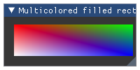
- Parameters:
upper_left_x (float) – X coordinate of top-left corner
upper_left_y (float) – Y coordinate of top-left corner
lower_right_x (float) – X coordinate of lower-right corner
lower_right_y (float) – Y coordinate of lower-right corner
col_upr_left (ImU32) – RGBA color for the top left corner
col_upr_right (ImU32) – RGBA color for the top right corner
col_bot_right (ImU32) – RGBA color for the bottom right corner
col_bot_left (ImU32) – RGBA color for the bottom left corner
Wraps API:
void ImDrawList::AddRectFilledMultiColor(
    const ImVec2& a,
    const ImVec2& b,
    ImU32 col_upr_left,
    ImU32 col_upr_right,
    ImU32 col_bot_right,
    ImU32 col_bot_left
)
- add_text(self, float pos_x, float pos_y, ImU32 col, str text)
Add text to the draw list.
Example:
imgui.begin("Text example")
draw_list = imgui.get_window_draw_list()
draw_list.add_text(20, 35, imgui.get_color_u32_rgba(1,1,0,1), "Hello!")
imgui.end()
Outputs: 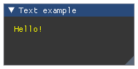
- Parameters:
pos_x (float) – X coordinate of the text’s upper-left corner
pos_y (float) – Y coordinate of the text’s upper-left corner
col (ImU32) – RGBA color specification
text (str) – text
Wraps API:
void ImDrawList::AddText(
    const ImVec2& pos,
    ImU32 col,
    const char* text_begin,
    const char* text_end = NULL
)
- add_triangle(self, float point1_x, float point1_y, float point2_x, float point2_y, float point3_x, float point3_y, ImU32 col, float thickness=1.0)
Add a triangle to the list.
Example:
imgui.begin("Triangle example")
draw_list = imgui.get_window_draw_list()
draw_list.add_triangle(20, 35, 90, 35, 55, 80, imgui.get_color_u32_rgba(1,1,0,1))
draw_list.add_triangle(110, 35, 180, 35, 145, 80, imgui.get_color_u32_rgba(1,0,0,1), 5)
imgui.end()
Outputs: 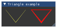
- Parameters:
point1_x (float) – X coordinate of first corner
point1_y (float) – Y coordinate of first corner
point2_x (float) – X coordinate of second corner
point2_y (float) – Y coordinate of second corner
point3_x (float) – X coordinate of third corner
point3_y (float) – Y coordinate of third corner
col (ImU32) – RGBA color specification
thickness (float) – Line thickness
Wraps API:
void ImDrawList::AddTriangle(
    const ImVec2& p1,
    const ImVec2& p2,
    const ImVec2& p3,
    ImU32 col,
    float thickness = 1.0
)
- add_triangle_filled(self, float point1_x, float point1_y, float point2_x, float point2_y, float point3_x, float point3_y, ImU32 col)
Add a filled triangle to the list.
Example:
imgui.begin("Filled triangle example")
draw_list = imgui.get_window_draw_list()
draw_list.add_triangle_filled(20, 35, 90, 35, 55, 80, imgui.get_color_u32_rgba(1,1,0,1))
draw_list.add_triangle_filled(110, 35, 180, 35, 145, 80, imgui.get_color_u32_rgba(1,0,0,1))
imgui.end()
Outputs: 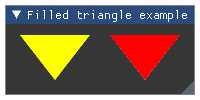
- Parameters:
point1_x (float) – X coordinate of first corner
point1_y (float) – Y coordinate of first corner
point2_x (float) – X coordinate of second corner
point2_y (float) – Y coordinate of second corner
point3_x (float) – X coordinate of third corner
point3_y (float) – Y coordinate of third corner
col (ImU32) – RGBA color specification
Wraps API:
void ImDrawList::AddTriangleFilled(
    const ImVec2& p1,
    const ImVec2& p2,
    const ImVec2& p3,
    ImU32 col
)
- channels_merge(self)
- channels_set_current(self, int idx)
- channels_split(self, int channels_count)
Use to split render into layers. By switching channels to can render out-of-order (e.g. submit FG primitives before BG primitives) Use to minimize draw calls (e.g. if going back-and-forth between multiple clipping rectangles, prefer to append into separate channels then merge at the end)
Prefer using your own persistent instance of ImDrawListSplitter as you can stack them. Using the ImDrawList::ChannelsXXXX you cannot stack a split over another.
Warning - be careful with using channels as “layers”. Child windows are always drawn after their parent, so they will paint over its channels. To paint over child windows, use OverlayDrawList.
- cmd_buffer_data
- cmd_buffer_size
- commands
- flags
- get_clip_rect_max(self)
Wraps API:
ImVec2 GetClipRectMax()
- get_clip_rect_min(self)
Wraps API:
ImVec2 GetClipRectMin()
- idx_buffer_data
- idx_buffer_size
- path_arc_to(self, float center_x, float center_y, float radius, float a_min, float a_max, ImU32 num_segments=0)
Add an arc to the path list
Example:
imgui.begin("Path arc to example")
draw_list = imgui.get_window_draw_list()
draw_list.path_clear()
draw_list.path_arc_to(55, 60, 30, 1, 5)
draw_list.path_stroke(imgui.get_color_u32_rgba(1,1,0,1), flags=0, thickness=3)
draw_list.path_clear()
draw_list.path_arc_to(155, 60, 30, -2, 2)
draw_list.path_fill_convex(imgui.get_color_u32_rgba(1,0,0,1))
imgui.end()
Outputs: 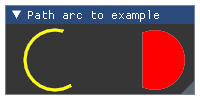
- Parameters:
center_x (float) – arc center x coordinate
center_y (float) – arc center y coordinate
radius (flaot) – radius of the arc
a_min (float) – minimum angle of the arc (in radian)
a_max (float) – maximum angle of the arc (in radian)
num_segments (ImU32) – Number of segments, defaults to 0 meaning auto-tesselation
Wraps API:
void ImDrawList::PathArcTo(
    const ImVec2& center,
    float radius,
    float a_min,
    float a_max,
    int num_segments = 0
)
- path_arc_to_fast(self, float center_x, float center_y, float radius, ImU32 a_min_of_12, ImU32 a_max_of_12)
Add an arc to the path list
Example:
imgui.begin("Path arc to fast example")
draw_list = imgui.get_window_draw_list()
draw_list.path_clear()
draw_list.path_arc_to_fast(55, 60, 30, 0, 6)
draw_list.path_stroke(imgui.get_color_u32_rgba(1,1,0,1), flags=0, thickness=3)
draw_list.path_clear()
draw_list.path_arc_to_fast(155, 60, 30, 3, 9)
draw_list.path_fill_convex(imgui.get_color_u32_rgba(1,0,0,1))
imgui.end()
Outputs: 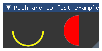
- Parameters:
center_x (float) – arc center x coordinate
center_y (float) – arc center y coordinate
radius (flaot) – radius of the arc
a_min_of_12 (ImU32) – minimum angle of the arc
a_max_of_12 (ImU32) – maximum angle of the arc
Wraps API:
void ImDrawList::PathArcToFast(
    const ImVec2& center,
    float radius,
    int a_min_of_12,
    int a_max_of_12
)
- path_clear(self)
Clear the current list of path point
Wraps API:
void ImDrawList::PathClear()
- path_fill_convex(self, ImU32 col)
Note: Filled shapes must always use clockwise winding order. The anti-aliasing fringe depends on it. Counter-clockwise shapes will have “inward” anti-aliasing.
Example:
imgui.begin("Path fill convex example")
draw_list = imgui.get_window_draw_list()
draw_list.path_clear()
draw_list.path_line_to(100, 60)
draw_list.path_arc_to(100, 60, 30, 0.5, 5.5)
draw_list.path_fill_convex(imgui.get_color_u32_rgba(1,1,0,1))
imgui.end()
Outputs: 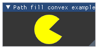
- Parameters:
col (ImU32) – color to fill the path shape with
Wraps API:
void ImDrawList::PathFillConvex(
    ImU32   col
);
- path_line_to(self, float x, float y)
Add a point to the path list
Example:
imgui.begin("Path line to example")
draw_list = imgui.get_window_draw_list()
draw_list.path_clear()
draw_list.path_line_to(20, 35)
draw_list.path_line_to(180, 80)
draw_list.path_stroke(imgui.get_color_u32_rgba(1,1,0,1), flags=0, thickness=3)
draw_list.path_clear()
draw_list.path_line_to(180, 35)
draw_list.path_line_to(20, 80)
draw_list.path_stroke(imgui.get_color_u32_rgba(1,0,0,1), flags=0, thickness=3)
imgui.end()
Outputs: 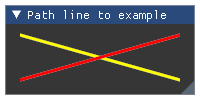
- Parameters:
x (float) – path point x coordinate
y (float) – path point y coordinate
Wraps API:
void ImDrawList::PathLineTo(
    const ImVec2& pos,
)
- path_rect(self, float point1_x, float point1_y, float point2_x, float point2_y, float rounding=0.0, ImDrawFlags flags=0)
Add a rect to the path list
Example:
imgui.begin("Path arc to fast example")
draw_list = imgui.get_window_draw_list()
draw_list.path_clear()
draw_list.path_rect(20, 35, 90, 80)
draw_list.path_stroke(imgui.get_color_u32_rgba(1,1,0,1), flags=0, thickness=3)
draw_list.path_clear()
draw_list.path_rect(110, 35, 180, 80, 5)
draw_list.path_fill_convex(imgui.get_color_u32_rgba(1,0,0,1))
imgui.end()
Outputs: 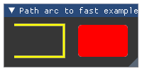
- Parameters:
point1_x (float) – point1 x coordinate
point1_y (float) – point1 y coordinate
point2_x (float) – point2 x coordinate
point2_y (float) – point2 y coordinate
rounding (flaot) – Degree of rounding, defaults to 0.0
flags (ImDrawFlags) – Draw flags, defaults to 0. See: list of available flags.
Wraps API:
void ImDrawList::PathRect(
    const ImVec2& p1,
    const ImVec2& p2,
    float rounding = 0.0,
    ImDrawFlags flags = 0
)
- path_stroke(self, ImU32 col, ImDrawFlags flags=0, float thickness=1.0)
- Parameters:
col (ImU32) – color to fill the path shape with
flags (ImDrawFlags) – draw flags, defaults to 0. See: list of available flags.
thickness (float) – Line thickness in pixels
Example:
imgui.begin("Path stroke example")
draw_list = imgui.get_window_draw_list()
draw_list.path_clear()
draw_list.path_line_to(100, 60)
draw_list.path_arc_to(100, 60, 30, 0.5, 5.5)
draw_list.path_stroke(imgui.get_color_u32_rgba(1,1,0,1), flags=imgui.DRAW_CLOSED, thickness=3)
imgui.end()
Outputs: 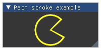
Wraps API:
void ImDrawList::PathStroke(
    ImU32 col,
    ImDrawFlags flags = 0,
    float thickness = 1.0
);
- pop_clip_rect(self)
Render-level scisoring.
Wraps API:
void PopClipRect()
- pop_texture_id(self)
Wraps API:
void PopTextureID()
- prim_quad_UV(self, float a_x, float a_y, float b_x, float b_y, float c_x, float c_y, float d_x, float d_y, float uv_a_u, float uv_a_v, float uv_b_u, float uv_b_v, float uv_c_u, float uv_c_v, float uv_d_u, float uv_d_v, ImU32 color=0xFFFFFFFF)
Custom quad (2 triangles) with custom UV coordinates. Reserve primitive space with prim_reserve() before calling prim_quad_UV(). Each call to prim_quad_UV() is 6 idx and 4 vtx. Set the texture ID using push_texture_id().
- Parameters:
a_x, a_y (float) – Point 1 coordinates
b_x, b_y (float) – Point 2 coordinates
c_x, c_y (float) – Point 3 coordinates
d_x, d_y (float) – Point 4 coordinates
uv_a_u, uv_a_v (float) – Point 1 UV coordinates
uv_b_u, uv_b_v (float) – Point 2 UV coordinates
uv_c_u, uv_c_v (float) – Point 3 UV coordinates
uv_d_u, uv_d_v (float) – Point 4 UV coordinates
color (ImU32) – Color
Wraps API:
void PrimQuadUV(const ImVec2& a, const ImVec2& b, const ImVec2& c, const ImVec2& d, const ImVec2& uv_a, const ImVec2& uv_b, const ImVec2& uv_c, const ImVec2& uv_d, ImU32 col)
- prim_rect(self, float a_x, float a_y, float b_x, float b_y, ImU32 color=0xFFFFFFFF)
Axis aligned rectangle (2 triangles) Reserve primitive space with prim_rect() before calling prim_quad_UV(). Each call to prim_rect() is 6 idx and 4 vtx.
- Parameters:
a_x, a_y (float) – First rectangle point coordinates
b_x, b_y (float) – Opposite rectangle point coordinates
color (ImU32) – Color
Wraps API:
void PrimRect(const ImVec2& a, const ImVec2& b, ImU32 col)
- prim_rect_UV(self, float a_x, float a_y, float b_x, float b_y, float uv_a_u, float uv_a_v, float uv_b_u, float uv_b_v, ImU32 color=0xFFFFFFFF)
Axis aligned rectangle (2 triangles) with custom UV coordinates. Reserve primitive space with prim_reserve() before calling prim_rect_UV(). Each call to prim_rect_UV() is 6 idx and 4 vtx. Set the texture ID using push_texture_id().
- Parameters:
a_x, a_y (float) – First rectangle point coordinates
b_x, b_y (float) – Opposite rectangle point coordinates
uv_a_u, uv_a_v (float) – First rectangle point UV coordinates
uv_b_u, uv_b_v (float) – Opposite rectangle point UV coordinates
color (ImU32) – Color
Wraps API:
void PrimRectUV(const ImVec2& a, const ImVec2& b, const ImVec2& uv_a, const ImVec2& uv_b, ImU32 col)
- prim_reserve(self, int idx_count, int vtx_count)
Reserve space for a number of vertices and indices. You must finish filling your reserved data before calling prim_reserve() again, as it may reallocate or submit the intermediate results. prim_unreserve() can be used to release unused allocations.
Drawing a quad is 6 idx (2 triangles) with 2 sharing vertices for a total of 4 vertices.
- Parameters:
idx_count (int) – Number of indices to add to IdxBuffer
vtx_count (int) – Number of verticies to add to VtxBuffer
Wraps API:
void PrimReserve(int idx_count, int vtx_count)
- prim_unreserve(self, int idx_count, int vtx_count)
Release the a number of reserved vertices/indices from the end of the last reservation made with prim_reserve().
- Parameters:
idx_count (int) – Number of indices to remove from IdxBuffer
vtx_count (int) – Number of verticies to remove from VtxBuffer
Wraps API:
void PrimUnreserve(int idx_count, int vtx_count)
- prim_vtx(self, float pos_x, float pos_y, float u, float v, ImU32 color=0xFFFFFFFF)
Write vertex with unique index
- Parameters:
pos_x, pos_y (float) – Point coordinates
u, v (float) – Point UV coordinates
color (ImU32) – Color
Wraps API:
void PrimVtx(const ImVec2& pos, const ImVec2& uv, ImU32 col)
- prim_write_idx(self, ImDrawIdx idx)
Write index
- Parameters:
idx (ImDrawIdx) – index to write
Wraps API:
void PrimWriteIdx(ImDrawIdx idx)
- prim_write_vtx(self, float pos_x, float pos_y, float u, float v, ImU32 color=0xFFFFFFFF)
Write a vertex
- Parameters:
pos_x, pos_y (float) – Point coordinates
u, v (float) – Point UV coordinates
color (ImU32) – Color
Wraps API:
void PrimWriteVtx(const ImVec2& pos, const ImVec2& uv, ImU32 col)
- push_clip_rect(self, float clip_rect_min_x, float clip_rect_min_y, float clip_rect_max_x, float clip_rect_max_y, bool intersect_with_current_clip_rect=False)
Render-level scissoring. This is passed down to your render function but not used for CPU-side coarse clipping. Prefer using higher-level
push_clip_rect()to affect logic (hit-testing and widget culling)Wraps API:
void PushClipRect(ImVec2 clip_rect_min, ImVec2 clip_rect_max, bool intersect_with_current_clip_rect = false)
- push_clip_rect_full_screen(self)
Wraps API:
void PushClipRectFullScreen()
- push_texture_id(self, texture_id)
Wraps API:
void PushTextureID(ImTextureID texture_id)
- vtx_buffer_data
- vtx_buffer_size
- class imgui.core._StaticGlyphRanges
Todo
consider inlining every occurence of _cast_args_ImVecX (profile)
- class imgui.core.FontConfig(font_no=None, size_pixels=None, oversample_h=None, oversample_v=None, pixel_snap_h=None, glyph_extra_spacing_x=None, glyph_extra_spacing_y=None, glyph_offset_x=None, glyph_offset_y=None, glyph_min_advance_x=None, glyph_max_advance_x=None, merge_mode=None, font_builder_flags=None, rasterizer_multiply=None, ellipsis_char=None)
- class imgui.core.GlyphRanges(glyph_ranges)
- class imgui.core.GuiStyle
Container for ImGui style information
- alpha
Global alpha blending parameter for windows
- Returns:
float
- anti_aliased_fill
- anti_aliased_line_use_tex
- anti_aliased_lines
- button_text_align
- cell_padding
- child_border_size
- child_rounding
- circle_segment_max_error
- circle_tessellation_max_error
- color(self, ImGuiCol variable)
- color_button_position
- colors
Retrieve and modify style colors through list-like interface.
Example:
style = imgui.get_style()
imgui.begin("Color window")
imgui.columns(4)
for color in range(0, imgui.COLOR_COUNT):
    imgui.text("Color: {}".format(color))
    imgui.color_button("color#{}".format(color), *style.colors[color])
    imgui.next_column()

imgui.end()
Outputs: 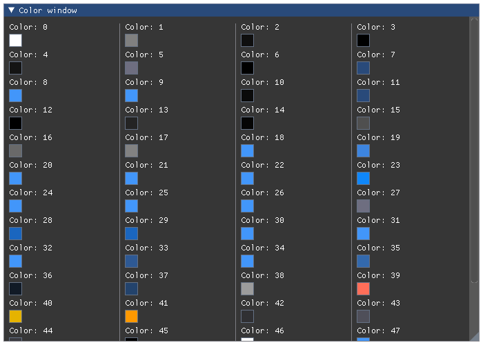
- columns_min_spacing
- static create()
- curve_tessellation_tolerance
- display_safe_area_padding
- display_window_padding
- frame_border_size
- frame_padding
- frame_rounding
- grab_min_size
- grab_rounding
- indent_spacing
- item_inner_spacing
- item_spacing
- log_slider_deadzone
- mouse_cursor_scale
- popup_border_size
- popup_rounding
- scrollbar_rounding
- scrollbar_size
- selectable_text_align
- tab_border_size
- tab_min_width_for_close_button
- tab_rounding
- touch_extra_padding
- window_border_size
- window_min_size
- window_padding
- window_rounding
- window_title_align
- exception imgui.core.ImGuiError
- imgui.core.accept_drag_drop_payload(str type, ImGuiDragDropFlags flags=0)
Get the drag and drop payload. Only call after
begin_drag_drop_target()returns True.Note: this is a beta API.
For a complete example see
begin_drag_drop_source().- Parameters:
type (str) – user defined type with maximum 32 bytes.
flags (ImGuiDragDropFlags) – DragDrop flags.
- Returns:
bytes – the payload data that was set by
set_drag_drop_payload().
Wraps API:
const ImGuiPayload* AcceptDragDropPayload(const char* type, ImGuiDragDropFlags flags = 0)
- imgui.core.align_text_to_frame_padding()
- imgui.core.arrow_button(str label, ImGuiDir direction=DIRECTION_NONE)
Display an arrow button
Example:
imgui.begin("Arrow button")
imgui.arrow_button("Button", imgui.DIRECTION_LEFT)
imgui.end()
Outputs: 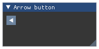
- Parameters:
label (str) – button label.
direction = imgui direction constant
- Returns:
bool – True if clicked.
Wraps API:
bool ArrowButton(const char*, ImGuiDir)
- imgui.core.begin(str label, closable=False, ImGuiWindowFlags flags=0)
Begin a window.
Example:
with imgui.begin("Example: empty window"):
    pass
Outputs: 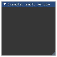
- Example::
imgui.begin(“Example: empty window”) imgui.end()
- Parameters:
label (str) – label of the window.
closable (bool) – define if window is closable.
flags – Window flags. See: list of available flags.
- Returns:
_BeginEnd –
(expanded, opened)struct of bools. If window is collapsedexpanded==True. The value ofopenedis always True for non-closable and open windows but changes state to False on close button click for closable windows. Use withwithto automatically callend()when the block ends.
Wraps API:
Begin(
    const char* name,
    bool* p_open = NULL,
    ImGuiWindowFlags flags = 0
)
- imgui.core.begin_child(signatures, args, kwargs, defaults)
Begin a scrolling region.
Note: sizing of child region allows for three modes: *
0.0- use remaining window size *>0.0- fixed size *<0.0- use remaining window size minus abs(size)Example:
with imgui.begin("Example: child region"):
    with imgui.begin_child("region", 150, -50, border=True):
        imgui.text("inside region")
    imgui.text("outside region")
Outputs: 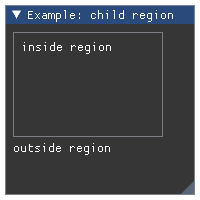
- Example::
imgui.begin(“Example: child region”)
imgui.begin_child(“region”, 150, -50, border=True) imgui.text(“inside region”) imgui.end_child()
imgui.text(“outside region”) imgui.end()
- Parameters:
label (str or int) – Child region identifier.
width (float) – Region width. See note about sizing.
height (float) – Region height. See note about sizing.
border (bool) – True if should display border. Defaults to False.
flags – Window flags. See: list of available flags.
- Returns:
_BeginEndChild – Struct with
visiblebool attribute. Use withwithto automatically callend_child()when the block ends.`
Wraps API:
bool BeginChild(
    const char* str_id,
    const ImVec2& size = ImVec2(0,0),
    bool border = false,
    ImGuiWindowFlags flags = 0
)

bool BeginChild(
    ImGuiID id,
    const ImVec2& size = ImVec2(0,0),
    bool border = false,
    ImGuiWindowFlags flags = 0
)
- imgui.core.begin_combo(str label, str preview_value, ImGuiComboFlags flags=0)
Begin a combo box with control over how items are displayed.
Example:
selected = 0
items = ["AAAA", "BBBB", "CCCC", "DDDD"]

# ...

with imgui.begin("Example: begin combo"):
    with imgui.begin_combo("combo", items[selected]) as combo:
        if combo.opened:
            for i, item in enumerate(items):
                is_selected = (i == selected)
                if imgui.selectable(item, is_selected)[0]:
                    selected = i

                # Set the initial focus when opening the combo (scrolling + keyboard navigation focus)
                if is_selected:
                    imgui.set_item_default_focus()
Outputs: 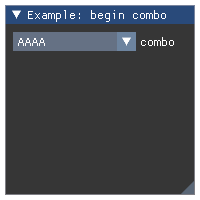
Example:
selected = 0
items = ["AAAA", "BBBB", "CCCC", "DDDD"]

# ...

imgui.begin("Example: begin combo")
if imgui.begin_combo("combo", items[selected]):
    for i, item in enumerate(items):
        is_selected = (i == selected)
        if imgui.selectable(item, is_selected)[0]:
            selected = i

        # Set the initial focus when opening the combo (scrolling + keyboard navigation focus)
        if is_selected:
            imgui.set_item_default_focus()

    imgui.end_combo()

imgui.end()
- Parameters:
label (str) – Identifier for the combo box.
preview_value (str) – String preview for currently selected item.
flags – Combo flags. See: list of available flags.
- Returns:
_BeginEndCombo – Struct with
openedbool attribute. Use withwithto automatically callend_combo()when the block ends.`
Wraps API:
bool BeginCombo(
    const char* label,
    const char* preview_value,
    ImGuiComboFlags flags = 0
)
- imgui.core.begin_drag_drop_source(ImGuiDragDropFlags flags=0)
Set the current item as a drag and drop source. If
draggingis True, you can callset_drag_drop_payload()andend_drag_drop_source(). Use withwithto automatically callend_drag_drop_source()if necessary.Note: this is a beta API.
Example:
with imgui.begin("Example: drag and drop"):

    imgui.button('source')
    with imgui.begin_drag_drop_source() as drag_drop_src:
        if drag_drop_src.dragging:
            imgui.set_drag_drop_payload('itemtype', b'payload')
            imgui.button('dragged source')

    imgui.button('dest')
    with imgui.begin_drag_drop_target() as drag_drop_dst:
        if drag_drop_dst.hovered:
            payload = imgui.accept_drag_drop_payload('itemtype')
            if payload is not None:
                print('Received:', payload)
Outputs: 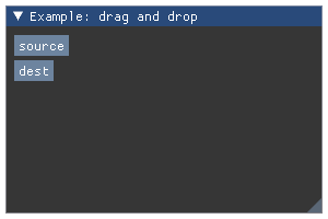
Example:
imgui.begin("Example: drag and drop")

imgui.button('source')
if imgui.begin_drag_drop_source():
    imgui.set_drag_drop_payload('itemtype', b'payload')
    imgui.button('dragged source')
    imgui.end_drag_drop_source()

imgui.button('dest')
if imgui.begin_drag_drop_target():
    payload = imgui.accept_drag_drop_payload('itemtype')
    if payload is not None:
        print('Received:', payload)
    imgui.end_drag_drop_target()

imgui.end()
- Parameters:
flags (ImGuiDragDropFlags) – DragDrop flags.
- Returns:
_BeginEndDragDropSource – Use
draggingto tell if a drag starting at this source is occurring. Only callend_drag_drop_source()ifdraggingis True. Use withwithto automatically callend_drag_drop_source()if necessary when the block ends.
Wraps API:
bool BeginDragDropSource(ImGuiDragDropFlags flags = 0)
- imgui.core.begin_drag_drop_target()
Set the current item as a drag and drop target. If
hoveredis True, you can callaccept_drag_drop_payload()andend_drag_drop_target(). Use withwithto automatically callend_drag_drop_target()if necessary.For a complete example see
begin_drag_drop_source().Note: this is a beta API.
- Returns:
_BeginEndDragDropTarget – Use
hovered` to tell if a drag hovers over the target.
Only call :func:`end_drag_drop_target` if ``hovered
is True. Use withwithto automatically callend_drag_drop_target()if necessary when the block ends.
Wraps API:
bool BeginDragDropTarget()
- imgui.core.begin_group()
Start item group and lock its horizontal starting position.
Captures group bounding box into one “item”. Thanks to this you can use
is_item_hovered()or layout primitives such assame_line()on whole group, etc.Example:
with imgui.begin("Example: item groups"):

    with imgui.begin_group():
        imgui.text("First group (buttons):")
        imgui.button("Button A")
        imgui.button("Button B")

    imgui.same_line(spacing=50)

    with imgui.begin_group():
        imgui.text("Second group (text and bullet texts):")
        imgui.bullet_text("Bullet A")
        imgui.bullet_text("Bullet B")
Outputs: 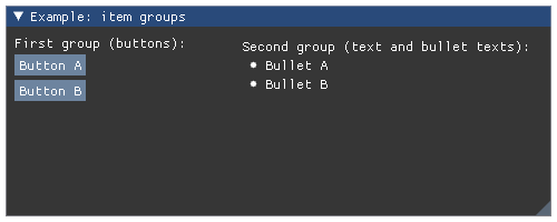
Example:
imgui.begin("Example: item groups")

imgui.begin_group()
imgui.text("First group (buttons):")
imgui.button("Button A")
imgui.button("Button B")
imgui.end_group()

imgui.same_line(spacing=50)

imgui.begin_group()
imgui.text("Second group (text and bullet texts):")
imgui.bullet_text("Bullet A")
imgui.bullet_text("Bullet B")
imgui.end_group()

imgui.end()
- Returns:
_BeginEndGrouop; use with
withto automatically callend_group()when the block ends.
Wraps API:
void BeginGroup()
- imgui.core.begin_list_box(str label, width=0, height=0)
Open a framed scrolling region.
For use if you want to reimplement
listbox()with custom data or interactions. You need to callend_list_box()at the end ifopenedis True, or usewithto do so automatically.Example:
with imgui.begin("Example: custom listbox"):
    with imgui.begin_list_box("List", 200, 100) as list_box:
        if list_box.opened:
            imgui.selectable("Selected", True)
            imgui.selectable("Not Selected", False)
Outputs: 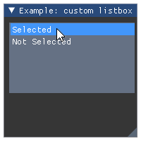
- Example::
imgui.begin(“Example: custom listbox”)
if imgui.begin_list_box(“List”, 200, 100).opened:
imgui.selectable(“Selected”, True) imgui.selectable(“Not Selected”, False)
imgui.end_list_box()
imgui.end()
- Parameters:
label (str) – The label.
width (float) – Button width. w > 0.0f: custom; w < 0.0f or -FLT_MIN: right-align; w = 0.0f (default): use current ItemWidth
height (float) – Button height. h > 0.0f: custom; h < 0.0f or -FLT_MIN: bottom-align; h = 0.0f (default): arbitrary default height which can fit ~7 items
- Returns:
_BeginEndListBox – Use
openedbool attribute to tell if the item is opened or closed. Only callend_list_box()ifopenedis True. Use withwithto automatically callend_list_box()if necessary when the block ends.
Wraps API:
bool BeginListBox(
    const char* label,
    const ImVec2& size = ImVec2(0,0)
)
Create new full-screen menu bar.
Use with
withto automatically callend_main_menu_bar()if necessary. Otherwise, only callend_main_menu_bar()ifopenedis True.Example:
with imgui.begin_main_menu_bar() as main_menu_bar:
    if main_menu_bar.opened:
        # first menu dropdown
        with imgui.begin_menu('File', True) as file_menu:
            if file_menu.opened:
                imgui.menu_item('New', 'Ctrl+N', False, True)
                imgui.menu_item('Open ...', 'Ctrl+O', False, True)

                # submenu
                with imgui.begin_menu('Open Recent', True) as open_recent_menu:
                    if open_recent_menu.opened:
                        imgui.menu_item('doc.txt', None, False, True)
Outputs: 
Example:
if imgui.begin_main_menu_bar().opened:
    # first menu dropdown
    if imgui.begin_menu('File', True).opened:
        imgui.menu_item('New', 'Ctrl+N', False, True)
        imgui.menu_item('Open ...', 'Ctrl+O', False, True)

        # submenu
        if imgui.begin_menu('Open Recent', True).opened:
            imgui.menu_item('doc.txt', None, False, True)
            imgui.end_menu()

        imgui.end_menu()

    imgui.end_main_menu_bar()
- Returns:
_BeginEndMainMenuBar – Use
openedto tell if main menu bar is displayed (opened). Only callend_main_menu_bar()ifopenedis True. Use withwithto automatically callend_main_menu_bar()if necessary when the block ends.
Wraps API:
bool BeginMainMenuBar()
Create new expandable menu in current menu bar.
Use with
withto automatically callend_menu()if necessary. Otherwise, only callend_menu()ifopenedis True.For practical example how to use this function, please see documentation of
begin_main_menu_bar()orbegin_menu_bar().- Parameters:
label (str) – label of the menu.
enabled (bool) – define if menu is enabled or disabled.
- Returns:
_BeginEndMenu – Use
openedto tell if the menu is displayed (opened). Only callend_menu()ifopenedis True. Use withwithto automatically callend_menu()if necessary when the block ends.
Wraps API:
bool BeginMenu(
    const char* label,
    bool enabled
)
Append new menu menu bar to current window.
This function is different from
begin_main_menu_bar(), as this is child-window specific. Use withwithto automatically callend_menu_bar()if necessary. Otherwise, only callend_menu_bar()ifopenedis True.Note: this requires WINDOW_MENU_BAR flag to be set for the current window. Without this flag set the
begin_menu_bar()function will always returnFalse.Example:
flags = imgui.WINDOW_MENU_BAR

with imgui.begin("Child Window - File Browser", flags=flags):
    with imgui.begin_menu_bar() as menu_bar:
        if menu_bar.opened:
            with imgui.begin_menu('File') as file_menu:
                if file_menu.opened:
                    imgui.menu_item('Close')
Outputs: 
Example:
flags = imgui.WINDOW_MENU_BAR

imgui.begin("Child Window - File Browser", flags=flags)

if imgui.begin_menu_bar().opened:
    if imgui.begin_menu('File').opened:
        imgui.menu_item('Close')
        imgui.end_menu()

    imgui.end_menu_bar()

imgui.end()
- Returns:
_BeginEndMenuBar – Use
openedto tell if menu bar is displayed (opened). Only callend_menu_bar()ifopenedis True. Use withwithto automatically callend_menu_bar()if necessary when the block ends.
Wraps API:
bool BeginMenuBar()
- imgui.core.begin_popup(str label, ImGuiWindowFlags flags=0)
Open a popup window.
The attribute
openedis True if the popup is open and you can start outputting content to it. Use withwithto automatically callend_popup()if necessary. Otherwise, only callend_popup()ifopenedis True.Example:
with imgui.begin("Example: simple popup"):
    if imgui.button("select"):
        imgui.open_popup("select-popup")

    imgui.same_line()

    with imgui.begin_popup("select-popup") as select_popup:
        if select_popup.opened:
            imgui.text("Select one")
            imgui.separator()
            imgui.selectable("One")
            imgui.selectable("Two")
            imgui.selectable("Three")
Outputs: 
Example:
imgui.begin("Example: simple popup")

if imgui.button("select"):
    imgui.open_popup("select-popup")

imgui.same_line()

if imgui.begin_popup("select-popup"):
    imgui.text("Select one")
    imgui.separator()
    imgui.selectable("One")
    imgui.selectable("Two")
    imgui.selectable("Three")
    imgui.end_popup()

imgui.end()
- Parameters:
label (str) – label of the modal window.
- Returns:
_BeginEndPopup – Use
openedbool attribute to tell if the popup is opened. Only callend_popup()ifopenedis True. Use withwithto automatically callend_popup()if necessary when the block ends.
Wraps API:
bool BeginPopup(
    const char* str_id,
    ImGuiWindowFlags flags = 0
)
- imgui.core.begin_popup_context_item(str label=None, ImGuiPopupFlags mouse_button=1)
This is a helper function to handle the most simple case of associating one named popup to one given widget.
Example:
with imgui.begin("Example: popup context view"):
    imgui.text("Right-click to set value.")
    with imgui.begin_popup_context_item("Item Context Menu", mouse_button=0) as popup:
        if popup.opened:
            imgui.selectable("Set to Zero")
Outputs: 
Example:
imgui.begin("Example: popup context view")
imgui.text("Right-click to set value.")
if imgui.begin_popup_context_item("Item Context Menu", mouse_button=0):
    imgui.selectable("Set to Zero")
    imgui.end_popup()
imgui.end()
- Parameters:
label (str) – label of item.
mouse_button – ImGuiPopupFlags
- Returns:
_BeginEndPopup – Use
openedbool attribute to tell if the popup is opened. Only callend_popup()ifopenedis True. Use withwithto automatically callend_popup()if necessary when the block ends.
Wraps API:
bool BeginPopupContextItem(
    const char* str_id = NULL,
    int mouse_button = 1
)
- imgui.core.begin_popup_context_void(str label=None, ImGuiPopupFlags popup_flags=1)
Open+begin popup when clicked in void (where there are no windows).
- Parameters:
label (str) – label of the window
popup_flags – ImGuiPopupFlags
- Returns:
_BeginEndPopup – Use
openedbool attribute to tell if the context window is opened. Only callend_popup()ifopenedis True. Use withwithto automatically callend_popup()if necessary when the block ends.
Wraps API:
bool BeginPopupContextVoid(const char* str_id = NULL, ImGuiPopupFlags popup_flags = 1)
- imgui.core.begin_popup_context_window(str label=None, ImGuiPopupFlags popup_flags=1, bool also_over_items=True)
Helper function to open and begin popup when clicked on current window.
As all popup functions it should end with
end_popup().Example:
with imgui.begin("Example: popup context window"):
    with imgui.begin_popup_context_window(popup_flags=imgui.POPUP_NONE) as context_window:
        if context_window.opened:
            imgui.selectable("Clear")
Outputs:
Example:
imgui.begin("Example: popup context window")
if imgui.begin_popup_context_window(popup_flags=imgui.POPUP_NONE):
    imgui.selectable("Clear")
    imgui.end_popup()
imgui.end()
- Parameters:
label (str) – label of the window
popup_flags – ImGuiPopupFlags
also_over_items (bool) – display on top of widget. OBSOLETED in ImGui 1.77 (from June 2020)
- Returns:
_BeginEndPopup – Use
openedbool attribute to tell if the context window is opened. Only callend_popup()ifopenedis True. Use withwithto automatically callend_popup()if necessary when the block ends.
Wraps API:
bool BeginPopupContextWindow(
    const char* str_id = NULL,
    ImGuiPopupFlags popup_flags = 1
)
- imgui.core.begin_popup_modal(str title, visible=None, ImGuiWindowFlags flags=0)
Begin pouring popup contents.
Differs from
begin_popup()with its modality - meaning it opens up on top of every other window.The attribute
openedis True if the popup is open and you can start outputting content to it. Use withwithto automatically callend_popup()if necessary. Otherwise, only callend_popup()ifopenedis True.Example:
with imgui.begin("Example: simple popup modal"):
    if imgui.button("Open Modal popup"):
        imgui.open_popup("select-popup")

    imgui.same_line()

    with imgui.begin_popup_modal("select-popup") as select_popup:
        if select_popup.opened:
            imgui.text("Select an option:")
            imgui.separator()
            imgui.selectable("One")
            imgui.selectable("Two")
            imgui.selectable("Three")
Outputs:
Example:
imgui.begin("Example: simple popup modal")

if imgui.button("Open Modal popup"):
    imgui.open_popup("select-popup")

imgui.same_line()

if imgui.begin_popup_modal("select-popup").opened:
    imgui.text("Select an option:")
    imgui.separator()
    imgui.selectable("One")
    imgui.selectable("Two")
    imgui.selectable("Three")
    imgui.end_popup()

imgui.end()
- Parameters:
title (str) – label of the modal window.
visible (bool) – define if popup is visible or not.
flags – Window flags. See: list of available flags.
- Returns:
_BeginEndPopupModal –
(opened, visible)struct of bools. Only callend_popup()ifopenedis True. Use withwithto automatically callend_popup()if necessary when the block ends. Theopenedattribute can be False when the popup is completely clipped (e.g. zero size display).
Wraps API:
bool BeginPopupModal(
    const char* name,
    bool* p_open = NULL,
    ImGuiWindowFlags extra_flags = 0
)
- imgui.core.begin_tab_bar(str identifier, ImGuiTabBarFlags flags=0)
Create and append into a TabBar
- Parameters:
identifier (str) – String identifier of the tab window
flags – ImGuiTabBarFlags flags. See: list of available flags.
- Returns:
_BeginEndTabBar – Use
openedbool attribute to tell if the Tab Bar is open. Only callend_tab_bar()ifopenedis True. Use withwithto automatically callend_tab_bar()if necessary when the block ends.
Wraps API:
bool BeginTabBar(const char* str_id, ImGuiTabBarFlags flags = 0)
- imgui.core.begin_tab_item(str label, opened=None, ImGuiTabItemFlags flags=0)
Create a Tab.
Example:
opened_state = True

#...

with imgui.begin("Example Tab Bar"):
    with imgui.begin_tab_bar("MyTabBar") as tab_bar:
        if tab_bar.opened:
            with imgui.begin_tab_item("Item 1") as item1:
                if item1.selected:
                    imgui.text("Here is the tab content!")

            with imgui.begin_tab_item("Item 2") as item2:
                if item2.selected:
                    imgui.text("Another content...")

            with imgui.begin_tab_item("Item 3", opened=opened_state) as item3:
                opened_state = item3.opened
                if item3.selected:
                    imgui.text("Hello Saylor!")
Outputs: 
Example:
opened_state = True

#...

imgui.begin("Example Tab Bar")
if imgui.begin_tab_bar("MyTabBar"):

    if imgui.begin_tab_item("Item 1").selected:
        imgui.text("Here is the tab content!")
        imgui.end_tab_item()

    if imgui.begin_tab_item("Item 2").selected:
        imgui.text("Another content...")
        imgui.end_tab_item()

    selected, opened_state = imgui.begin_tab_item("Item 3", opened=opened_state)
    if selected:
        imgui.text("Hello Saylor!")
        imgui.end_tab_item()

    imgui.end_tab_bar()
imgui.end()
- Parameters:
label (str) – Label of the tab item
removable (bool) – If True, the tab item can be removed
flags – ImGuiTabItemFlags flags. See: list of available flags.
- Returns:
_BeginEndTabItem –
(selected, opened)struct of bools. If tab item is selectedselected==True. The value ofopenedis always True for non-removable and open tab items but changes state to False on close button click for removable tab items. Only callend_tab_item()ifselectedis True. Use withwithto automatically callend_tab_item()if necessary when the block ends.
Wraps API:
bool BeginTabItem(
    const char* label,
    bool* p_open = NULL,
    ImGuiTabItemFlags flags = 0
)
- imgui.core.begin_table(str label, int column, ImGuiTableFlags flags=0, float outer_size_width=0.0, float outer_size_height=0.0, float inner_width=0.0)
- Returns:
_BeginEndPopup – Use
openedbool attribute to tell if the table is opened. Only callend_table()ifopenedis True. Use withwithto automatically callend_table()if necessary when the block ends.
Wraps API:
bool BeginTable(
    const char* str_id,
    int column,
    ImGuiTableFlags flags = 0,
    const ImVec2& outer_size = ImVec2(0.0f, 0.0f),
    float inner_width = 0.0f
)
- imgui.core.begin_tooltip()
Use to create full-featured tooltip windows that aren’t just text.
Example:
with imgui.begin("Example: tooltip"):
    imgui.button("Click me!")
    if imgui.is_item_hovered():
        with imgui.begin_tooltip():
            imgui.text("This button is clickable.")
            imgui.text("This button has full window tooltip.")
            texture_id = imgui.get_io().fonts.texture_id
            imgui.image(texture_id, 512, 64, border_color=(1, 0, 0, 1))
Outputs: 
Wraps API:
void BeginTooltip()
- Returns:
_BeginEndTooltip – Use with
withto automatically callend_tooltip()when the block ends.
- imgui.core.bullet()
Display a small circle and keep the cursor on the same line.
Example:
imgui.begin("Example: bullets")

for i in range(10):
    imgui.bullet()

imgui.end()
Outputs: 
Wraps API:
void Bullet()
- imgui.core.bullet_text(str text)
Display bullet and text.
This is shortcut for:
imgui.bullet()
imgui.text(text)
Example:
imgui.begin("Example: bullet text")
imgui.bullet_text("Bullet 1")
imgui.bullet_text("Bullet 2")
imgui.bullet_text("Bullet 3")
imgui.end()
Outputs: 
- Parameters:
text (str) – text to display.
Wraps API:
void BulletText(const char* fmt, ...)
- imgui.core.button(str label, width=0, height=0)
Display button.
Example:
imgui.begin("Example: button")
imgui.button("Button 1")
imgui.button("Button 2")
imgui.end()
Outputs: 
- Parameters:
label (str) – button label.
width (float) – button width.
height (float) – button height.
- Returns:
bool – True if clicked.
Wraps API:
bool Button(const char* label, const ImVec2& size = ImVec2(0,0))
- imgui.core.calc_text_size(str text, bool hide_text_after_double_hash=False, float wrap_width=-1.0)
Calculate text size. Text can be multi-line. Optionally ignore text after a ## marker.
Example:
imgui.begin("Text size calculation")
text_content = "This is a ##text##!"
text_size1 = imgui.calc_text_size(text_content)
imgui.text('"%s" has size %ix%i' % (text_content, text_size1[0], text_size1[1]))
text_size2 = imgui.calc_text_size(text_content, True)
imgui.text('"%s" has size %ix%i' % (text_content, text_size2[0], text_size2[1]))
text_size3 = imgui.calc_text_size(text_content, False, 30.0)
imgui.text('"%s" has size %ix%i' % (text_content, text_size3[0], text_size3[1]))
imgui.end()
Outputs: 
- Parameters:
text (str) – text
hide_text_after_double_hash (bool) – if True, text after ‘##’ is ignored
wrap_width (float) – if > 0.0 calculate size using text wrapping
Wraps API:
CalcTextSize(const char* text, const char* text_end, bool hide_text_after_double_hash, float wrap_width)
- imgui.core.calculate_item_width()
Calculate and return the current item width.
- Returns:
float – calculated item width.
Wraps API:
float CalcItemWidth()
- imgui.core.capture_mouse_from_app(bool want_capture_mouse_value=True)
Attention: misleading name! Manually override io.WantCaptureMouse flag next frame (said flag is entirely left for your application to handle).
This is equivalent to setting “io.WantCaptureMouse = want_capture_mouse_value;” after the next NewFrame() call.
Wraps API:
void CaptureMouseFromApp(bool want_capture_mouse_value = true)
- imgui.core.checkbox(str label, bool state)
Display checkbox widget.
Example:
# note: these should be initialized outside of the main interaction
#       loop
checkbox1_enabled = True
checkbox2_enabled = False

imgui.new_frame()
imgui.begin("Example: checkboxes")

# note: first element of return two-tuple notifies if there was a click
#       event in currently processed frame and second element is actual
#       checkbox state.
_, checkbox1_enabled = imgui.checkbox("Checkbox 1", checkbox1_enabled)
_, checkbox2_enabled = imgui.checkbox("Checkbox 2", checkbox2_enabled)

imgui.text("Checkbox 1 state value: {}".format(checkbox1_enabled))
imgui.text("Checkbox 2 state value: {}".format(checkbox2_enabled))

imgui.end()
Outputs: 
- Parameters:
label (str) – text label for checkbox widget.
state (bool) – current (desired) state of the checkbox. If it has to change, the new state will be returned as a second item of the return value.
- Returns:
tuple – a
(clicked, state)two-tuple indicating click event and the current state of the checkbox.
Wraps API:
bool Checkbox(const char* label, bool* v)
- imgui.core.checkbox_flags(str label, unsigned int flags, unsigned int flags_value)
Display checkbox widget that handle integer flags (bit fields).
It is useful for handling window/style flags or any kind of flags implemented as integer bitfields.
Example:
flags = imgui.WINDOW_NO_RESIZE | imgui.WINDOW_NO_MOVE

imgui.begin("Example: checkboxes for flags", flags=flags)

clicked, flags = imgui.checkbox_flags(
    "No resize", flags, imgui.WINDOW_NO_RESIZE
)
clicked, flags = imgui.checkbox_flags(
    "No move", flags, imgui.WINDOW_NO_MOVE
)
clicked, flags = imgui.checkbox_flags(
    "No collapse", flags, imgui.WINDOW_NO_COLLAPSE
)
# note: it also allows to use multiple flags at once
clicked, flags = imgui.checkbox_flags(
    "No resize & no move", flags,
    imgui.WINDOW_NO_RESIZE | imgui.WINDOW_NO_MOVE
)
imgui.text("Current flags value: {0:b}".format(flags))
imgui.end()
Outputs: 
- Parameters:
label (str) – text label for checkbox widget.
flags (int) – current state of the flags associated with checkbox. Actual state of checkbox (toggled/untoggled) is calculated from this argument and
flags_valueargument. If it has to change, the new state will be returned as a second item of the return value.flags_value (int) – values of flags this widget can toggle. Represents bitmask in flags bitfield. Allows multiple flags to be toggled at once (specify using bit OR operator |, see example above).
- Returns:
tuple – a
(clicked, flags)two-tuple indicating click event and the current state of the flags controlled with this checkbox.
Wraps API:
bool CheckboxFlags(
    const char* label, unsigned int* flags,
    unsigned int flags_value
)
- imgui.core.close_current_popup()
Close the current popup window begin-ed directly above this call. Clicking on a
menu_item()orselectable()automatically close the current popup.For practical example how to use this function, please see documentation of
open_popup().Wraps API:
void CloseCurrentPopup()
- imgui.core.collapsing_header(str text, visible=None, ImGuiTreeNodeFlags flags=0)
Collapsable/Expandable header view.
Returns ‘true’ if the header is open. Doesn’t indent or push to stack, so no need to call any pop function.
Example:
visible = True

imgui.begin("Example: collapsing header")
expanded, visible = imgui.collapsing_header("Expand me!", visible)

if expanded:
    imgui.text("Now you see me!")
imgui.end()
Outputs: 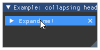
- Parameters:
text (str) – Tree node label
visible (bool or None) – Force visibility of a header. If set to True shows additional (X) close button. If set to False header is not visible at all. If set to None header is always visible and close button is not displayed.
flags – TreeNode flags. See: list of available flags.
- Returns:
tuple – a
(expanded, visible)two-tuple indicating if item was expanded and whether the header is visible or not (only ifvisibleinput argument is True/False).
Wraps API:
bool CollapsingHeader(const char* label, ImGuiTreeNodeFlags flags = 0)

bool CollapsingHeader(
    const char* label,
    bool* p_visible,
    ImGuiTreeNodeFlags flags = 0
)
- imgui.core.color_button(str desc_id, float r, float g, float b, a=1., flags=0, float width=0, float height=0)
Display colored button.
Example:
imgui.begin("Example: color button")
imgui.color_button("Button 1", 1, 0, 0, 1, 0, 10, 10)
imgui.color_button("Button 2", 0, 1, 0, 1, 0, 10, 10)
imgui.color_button("Wide Button", 0, 0, 1, 1, 0, 20, 10)
imgui.color_button("Tall Button", 1, 0, 1, 1, 0, 10, 20)
imgui.end()
Outputs: 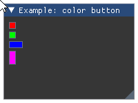
- Parameters:
#r (float) – red color intensity.
#g (float) – green color intensity.
#b (float) – blue color instensity.
#a (float) – alpha intensity.
#ImGuiColorEditFlags – Color edit flags. Zero for none.
#width (float) – Width of the color button
#height (float) – Height of the color button
- Returns:
bool – True if button is clicked.
Wraps API:
bool ColorButton(
    const char* desc_id,
    const ImVec4& col,
    ImGuiColorEditFlags flags,
    ImVec2 size
)
- imgui.core.color_convert_float4_to_u32(float r, float g, float b, float a)
Convert a set of r, g, b, a floats to unsigned int 32 color
- Parameters:
r, g, b, a (float) – Components of the color
- Returns:
ImU32 – Unsigned int 32 color format
Wraps API:
ImU32 ColorConvertFloat4ToU32(const ImVec4& in)
- imgui.core.color_convert_hsv_to_rgb(float h, float s, float v)
Convert color from HSV space to RGB space
- Parameters:
h, s, v (float) – HSV color format
- Returns:
tuple – r, g, b RGB color format
Wraps API:
void ColorConvertHSVtoRGB(float h, float s, float v, float& out_r, float& out_g, float& out_b)
- imgui.core.color_convert_rgb_to_hsv(float r, float g, float b)
Convert color from RGB space to HSV space
- Parameters:
r, g, b (float) – RGB color format
- Returns:
tuple – h, s, v HSV color format
Wraps API:
void ColorConvertRGBtoHSV(float r, float g, float b, float& out_h, float& out_s, float& out_v)
- imgui.core.color_convert_u32_to_float4(ImU32 in_)
Convert an unsigned int 32 to 4 component r, g, b, a
- Parameters:
in_ (ImU32) – Color in unsigned int 32 format
- Returns:
tuple – r, g, b, a components of the color
Wraps API:
ImVec4 ColorConvertU32ToFloat4(ImU32 in)
- imgui.core.color_edit3(str label, float r, float g, float b, ImGuiColorEditFlags flags=0)
Display color edit widget for color without alpha value.
Example:
# note: the variable that contains the color data, should be initialized
#       outside of the main interaction loop
color_1 = 1., .0, .5
color_2 = 0., .8, .3

imgui.begin("Example: color edit without alpha")

# note: first element of return two-tuple notifies if the color was changed
#       in currently processed frame and second element is current value
#       of color
changed, color_1 = imgui.color_edit3("Color 1", *color_1)
changed, color_2 = imgui.color_edit3("Color 2", *color_2)

imgui.end()
Outputs: 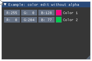
- Parameters:
label (str) – color edit label.
r (float) – red color intensity.
g (float) – green color intensity.
b (float) – blue color instensity.
flags (ImGuiColorEditFlags) – Color edit flags. Zero for none.
- Returns:
tuple – a
(bool changed, float color[3])tuple that contains indicator of color change and current value of color
Wraps API:
bool ColorEdit3(const char* label, float col[3], ImGuiColorEditFlags flags = 0)
- imgui.core.color_edit4(str label, float r, float g, float b, float a, ImGuiColorEditFlags flags=0)
Display color edit widget for color with alpha value.
Example:
# note: the variable that contains the color data, should be initialized
#       outside of the main interaction loop
color = 1., .0, .5, 1.

imgui.begin("Example: color edit with alpha")

# note: first element of return two-tuple notifies if the color was changed
#       in currently processed frame and second element is current value
#       of color and alpha
_, color = imgui.color_edit4("Alpha", *color)
_, color = imgui.color_edit4("No alpha", *color, imgui.COLOR_EDIT_NO_ALPHA)

imgui.end()
Outputs: 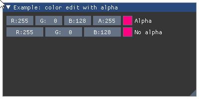
- Parameters:
label (str) – color edit label.
r (float) – red color intensity.
g (float) – green color intensity.
b (float) – blue color instensity.
a (float) – alpha intensity.
flags (ImGuiColorEditFlags) – Color edit flags. Zero for none.
- Returns:
tuple – a
(bool changed, float color[4])tuple that contains indicator of color change and current value of color and alpha
Wraps API:
ColorEdit4(
    const char* label, float col[4], ImGuiColorEditFlags flags
)
- imgui.core.columns(int count=1, str identifier=None, bool border=True)
Setup number of columns. Use an identifier to distinguish multiple column sets. close with
columns(1).Legacy Columns API (2020: prefer using Tables!)
Example:
imgui.begin("Example: Columns - File list")
imgui.columns(4, 'fileLlist')
imgui.separator()
imgui.text("ID")
imgui.next_column()
imgui.text("File")
imgui.next_column()
imgui.text("Size")
imgui.next_column()
imgui.text("Last Modified")
imgui.next_column()
imgui.separator()
imgui.set_column_offset(1, 40)

imgui.next_column()
imgui.text('FileA.txt')
imgui.next_column()
imgui.text('57 Kb')
imgui.next_column()
imgui.text('12th Feb, 2016 12:19:01')
imgui.next_column()

imgui.next_column()
imgui.text('ImageQ.png')
imgui.next_column()
imgui.text('349 Kb')
imgui.next_column()
imgui.text('1st Mar, 2016 06:38:22')
imgui.next_column()

imgui.columns(1)
imgui.end()
Outputs: 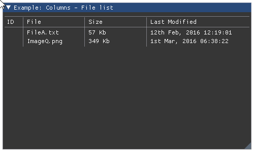
- Parameters:
count (int) – Columns count.
identifier (str) – Table identifier.
border (bool) – Display border, defaults to
True.
Wraps API:
void Columns(
    int count = 1,
    const char* id = NULL,
    bool border = true
)
- imgui.core.combo(str label, int current, list items, int height_in_items=-1)
Display combo widget.
Example:
current = 2
imgui.begin("Example: combo widget")

clicked, current = imgui.combo(
    "combo", current, ["first", "second", "third"]
)

imgui.end()
Outputs: 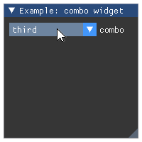
- Parameters:
label (str) – combo label.
current (int) – index of selected item.
items (list) – list of string labels for items.
height_in_items (int) – height of dropdown in items. Defaults to -1 (autosized).
- Returns:
tuple – a
(changed, current)tuple indicating change of selection and current index of selected item.
Wraps API:
bool Combo(
    const char* label, int* current_item,
    const char* items_separated_by_zeros,
    int height_in_items = -1
)
- imgui.core.create_context(_FontAtlas shared_font_atlas=None)
CreateContext
Todo
Add an example
Wraps API:
ImGuiContext* CreateContext(
        # note: optional
        ImFontAtlas* shared_font_atlas = NULL);
)
- imgui.core.destroy_context(_ImGuiContext ctx=None)
DestroyContext
Wraps API:
DestroyContext(
        # note: optional
        ImGuiContext* ctx = NULL);
- imgui.core.drag_float(str label, float value, float change_speed=1.0, float min_value=0.0, float max_value=0.0, str format='%.3f', ImGuiSliderFlags flags=0, float power=1.)
Display float drag widget.
Todo
Consider replacing
formatwith something that allows for safer way to specify display format without loosing the functionality of wrapped function.Example:
value = 42.0

imgui.begin("Example: drag float")
changed, value = imgui.drag_float(
    "Default", value,
)
changed, value = imgui.drag_float(
    "Less precise", value, format="%.1f"
)
imgui.text("Changed: %s, Value: %s" % (changed, value))
imgui.end()
Outputs: 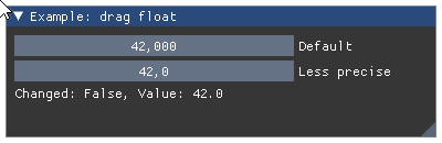
- Parameters:
label (str) – widget label.
value (float) – drag values,
change_speed (float) – how fast values change on drag.
min_value (float) – min value allowed by widget.
max_value (float) – max value allowed by widget.
format (str) – display format string as C-style
printfformat string. Warning: Highly unsafe when used without care. May lead to segmentation faults and other memory violation issues.flags – SliderFlags flags. See: list of available flags.
power (float) – OBSOLETED in ImGui 1.78 (from June 2020)
- Returns:
tuple – a
(changed, value)tuple that contains indicator of widget state change and the current drag value.
Wraps API:
bool DragFloat(
    const char* label,
    float* v,
    float v_speed = 1.0f,
    float v_min = 0.0f,
    float v_max = 0.0f,
    const char* format = "%.3f",
    ImGuiSliderFlags flags = 0
)
- imgui.core.drag_float2(str label, float value0, float value1, float change_speed=1.0, float min_value=0.0, float max_value=0.0, str format='%.3f', ImGuiSliderFlags flags=0, float power=1.)
Display float drag widget with 2 values.
Example:
values = 88.0, 42.0

imgui.begin("Example: drag float")
changed, values = imgui.drag_float2(
    "Default", *values
)
changed, values = imgui.drag_float2(
    "Less precise", *values, format="%.1f"
)
imgui.text("Changed: %s, Values: %s" % (changed, values))
imgui.end()
Outputs: 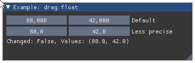
- Parameters:
label (str) – widget label.
value0, value1 (float) – drag values.
change_speed (float) – how fast values change on drag.
min_value (float) – min value allowed by widget.
max_value (float) – max value allowed by widget.
format (str) – display format string as C-style
printfformat string. Warning: highly unsafe. Seedrag_float().flags – SliderFlags flags. See: list of available flags.
power (float) – OBSOLETED in ImGui 1.78 (from June 2020)
- Returns:
tuple – a
(changed, values)tuple that contains indicator of widget state change and the tuple of current drag values.
Wraps API:
bool DragFloat2(
    const char* label,
    float v[2],
    float v_speed = 1.0f,
    float v_min = 0.0f,
    float v_max = 0.0f,
    const char* format = "%.3f",
    ImGuiSliderFlags flags = 0
)
- imgui.core.drag_float3(str label, float value0, float value1, float value2, float change_speed=1.0, float min_value=0.0, float max_value=0.0, str format='%.3f', ImGuiSliderFlags flags=0, float power=1.)
Display float drag widget with 3 values.
Example:
values = 88.0, 42.0, 69.0

imgui.begin("Example: drag float")
changed, values = imgui.drag_float3(
    "Default", *values
)
changed, values = imgui.drag_float3(
    "Less precise", *values, format="%.1f"
)
imgui.text("Changed: %s, Values: %s" % (changed, values))
imgui.end()
Outputs: 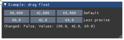
- Parameters:
label (str) – widget label.
value0, value1, value2 (float) – drag values.
change_speed (float) – how fast values change on drag.
min_value (float) – min value allowed by widget.
max_value (float) – max value allowed by widget.
format (str) – display format string as C-style
printfformat string. Warning: highly unsafe. Seedrag_float().flags – SliderFlags flags. See: list of available flags.
power (float) – OBSOLETED in ImGui 1.78 (from June 2020)
- Returns:
tuple – a
(changed, values)tuple that contains indicator of widget state change and the tuple of current drag values.
Wraps API:
bool DragFloat3(
    const char* label,
    float v[3],
    float v_speed = 1.0f,
    float v_min = 0.0f,
    float v_max = 0.0f,
    const char* format = "%.3f",
    ImGuiSliderFlags flags = 0
)
- imgui.core.drag_float4(str label, float value0, float value1, float value2, float value3, float change_speed=1.0, float min_value=0.0, float max_value=0.0, str format='%.3f', ImGuiSliderFlags flags=0, float power=1.)
Display float drag widget with 4 values.
Example:
values = 88.0, 42.0, 69.0, 0.0

imgui.begin("Example: drag float")
changed, values = imgui.drag_float4(
    "Default", *values
)
changed, values = imgui.drag_float4(
    "Less precise", *values, format="%.1f"
)
imgui.text("Changed: %s, Values: %s" % (changed, values))
imgui.end()
Outputs: 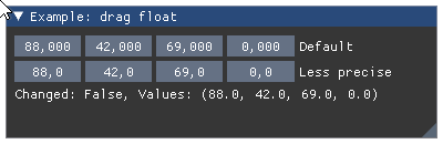
- Parameters:
label (str) – widget label.
value0, value1, value2, value3 (float) – drag values.
change_speed (float) – how fast values change on drag.
min_value (float) – min value allowed by widget.
max_value (float) – max value allowed by widget.
format (str) – display format string as C-style
printfformat string. Warning: highly unsafe. Seedrag_float().flags – SliderFlags flags. See: list of available flags.
power (float) – OBSOLETED in ImGui 1.78 (from June 2020)
- Returns:
tuple – a
(changed, values)tuple that contains indicator of widget state change and the tuple of current drag values.
Wraps API:
bool DragFloat4(
    const char* label,
    float v[4],
    float v_speed = 1.0f,
    float v_min = 0.0f,
    float v_max = 0.0f,
    const char* format = "%.3f",
    ImGuiSliderFlags flags = 0
)
- imgui.core.drag_float_range2(str label, float current_min, float current_max, float speed=1.0, float min_value=0.0, float max_value=0.0, str format='%.3f', str format_max=None, ImGuiSliderFlags flags=0)
Display drag float range widget
- Parameters:
label (str) – widget label
current_min (float) – current value of minimum
current_max (float) – current value of maximum
speed (float) – widget speed of change
min_value (float) – minimal possible value
max_value (float) – maximal possible value
format (str) – display format
format_max (str) – display format for maximum. If None,
formatparameter is used.flags – SliderFlags flags. See: list of available flags.
- Returns:
tuple –
- a (changed, current_min, current_max) tuple, where
changedindicate that the value has been updated.
- a (changed, current_min, current_max) tuple, where
Example:
vmin = 0
vmax = 100

imgui.begin("Example: drag float range")
changed, vmin, vmax = imgui.drag_float_range2( "Drag Range", vmin, vmax )
imgui.text("Changed: %s, Range: (%.2f, %.2f)" % (changed, vmin, vmax))
imgui.end()
Outputs: 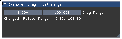
Wraps API:
bool DragFloatRange2(
    const char* label,
    float* v_current_min,
    float* v_current_max,
    float v_speed = 1.0f,
    float v_min = 0.0f,
    float v_max = 0.0f,
    const char* format = "%.3f",
    const char* format_max = NULL,
    ImGuiSliderFlags flags = 0
)
- imgui.core.drag_int(str label, int value, float change_speed=1.0, int min_value=0, int max_value=0, str format='%d', ImGuiSliderFlags flags=0)
Display int drag widget.
Todo
Consider replacing
formatwith something that allows for safer way to specify display format without loosing the functionality of wrapped function.Example:
value = 42

imgui.begin("Example: drag int")
changed, value = imgui.drag_int("drag int", value,)
imgui.text("Changed: %s, Value: %s" % (changed, value))
imgui.end()
Outputs: 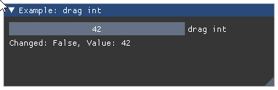
- Parameters:
label (str) – widget label.
value (int) – drag value,
change_speed (float) – how fast values change on drag.
min_value (int) – min value allowed by widget.
max_value (int) – max value allowed by widget.
format (str) – display format string as C-style
printfformat string. Warning: Highly unsafe when used without care. May lead to segmentation faults and other memory violation issues.flags – SliderFlags flags. See: list of available flags.
- Returns:
tuple – a
(changed, value)tuple that contains indicator of widget state change and the current drag value.
Wraps API:
bool DragInt(
    const char* label,
    int* v,
    float v_speed = 1.0f,
    int v_min = 0.0f,
    int v_max = 0.0f,
    const char* format = "%d",
    ImGuiSliderFlags flags = 0
)
- imgui.core.drag_int2(str label, int value0, int value1, float change_speed=1.0, int min_value=0, int max_value=0, str format='%d', ImGuiSliderFlags flags=0)
Display int drag widget with 2 values.
Example:
values = 88, 42

imgui.begin("Example: drag int")
changed, values = imgui.drag_int2(
    "drag ints", *values
)
imgui.text("Changed: %s, Values: %s" % (changed, values))
imgui.end()
Outputs: 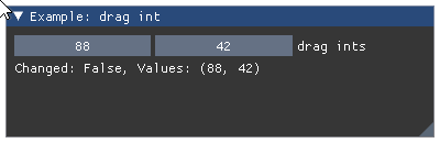
- Parameters:
label (str) – widget label.
value0, value1 (int) – drag values.
change_speed (float) – how fast values change on drag.
min_value (int) – min value allowed by widget.
max_value (int) – max value allowed by widget.
format (str) – display format string as C-style
printfformat string. Warning: highly unsafe. Seedrag_int().flags – SliderFlags flags. See: list of available flags.
- Returns:
tuple – a
(changed, values)tuple that contains indicator of widget state change and the tuple of current drag values.
Wraps API:
bool DragInt2(
    const char* label,
    int v[2],
    float v_speed = 1.0f,
    int v_min = 0.0f,
    int v_max = 0.0f,
    const char* format = "%d",
    ImGuiSliderFlags flags = 0
)
- imgui.core.drag_int3(str label, int value0, int value1, int value2, float change_speed=1.0, int min_value=0, int max_value=0, str format='%d', ImGuiSliderFlags flags=0)
Display int drag widget with 3 values.
Example:
values = 88, 42, 69

imgui.begin("Example: drag int")
changed, values = imgui.drag_int3(
    "drag ints", *values
)
imgui.text("Changed: %s, Values: %s" % (changed, values))
imgui.end()
Outputs: 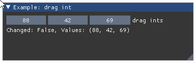
- Parameters:
label (str) – widget label.
value0, value1 (int) – drag values.
change_speed (float) – how fast values change on drag.
min_value (int) – min value allowed by widget.
max_value (int) – max value allowed by widget.
format (str) – display format string as C-style
printfformat string. Warning: highly unsafe. Seedrag_int().flags – SliderFlags flags. See: list of available flags.
- Returns:
tuple – a
(changed, values)tuple that contains indicator of widget state change and the tuple of current drag values.
Wraps API:
bool DragInt3(
    const char* label,
    int v[3],
    float v_speed = 1.0f,
    int v_min = 0.0f,
    int v_max = 0.0f,
    const char* format = "%d",
    ImGuiSliderFlags flags = 0
)
- imgui.core.drag_int4(str label, int value0, int value1, int value2, int value3, float change_speed=1.0, int min_value=0, int max_value=0, str format='%d', ImGuiSliderFlags flags=0)
Display int drag widget with 4 values.
Example:
values = 88, 42, 69, 0

imgui.begin("Example: drag int")
changed, values = imgui.drag_int4(
    "drag ints", *values
)
imgui.text("Changed: %s, Values: %s" % (changed, values))
imgui.end()
Outputs: 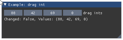
- Parameters:
label (str) – widget label.
value0, value1 (int) – drag values.
change_speed (float) – how fast values change on drag.
min_value (int) – min value allowed by widget.
max_value (int) – max value allowed by widget.
format (str) – display format string as C-style
printfformat string. Warning: highly unsafe. Seedrag_int().flags – SliderFlags flags. See: list of available flags.
- Returns:
tuple – a
(changed, values)tuple that contains indicator of widget state change and the tuple of current drag values.
Wraps API:
bool DragInt4(
    const char* label,
    int v[4],
    float v_speed = 1.0f,
    int v_min = 0.0f,
    int v_max = 0.0f,
    const char* format = "%d",
    ImGuiSliderFlags flags = 0
)
- imgui.core.drag_int_range2(str label, int current_min, int current_max, float speed=1.0, int min_value=0, int max_value=0, str format='%d', str format_max=None, ImGuiSliderFlags flags=0)
Display drag int range widget
- Parameters:
label (str) – widget label
current_min (int) – current value of minimum
current_max (int) – current value of maximum
speed (float) – widget speed of change
min_value (int) – minimal possible value
max_value (int) – maximal possible value
format (str) – display format
format_max (str) – display format for maximum. If None,
formatparameter is used.flags – SliderFlags flags. See: list of available flags.
- Returns:
tuple –
- a (changed, current_min, current_max) tuple, where
changedindicate that the value has been updated.
- a (changed, current_min, current_max) tuple, where
Example:
vmin = 0
vmax = 100

imgui.begin("Example: drag float range")
changed, vmin, vmax = imgui.drag_int_range2( "Drag Range", vmin, vmax )
imgui.text("Changed: %s, Range: (%d, %d)" % (changed, vmin, vmax))
imgui.end()
Outputs: 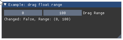
Wraps API:
bool DragIntRange2(
    const char* label,
    int* v_current_min,
    int* v_current_max,
    float v_speed = 1.0f,
    int v_min = 0,
    int v_max = 0,
    const char* format = "%d",
    const char* format_max = NULL,
    ImGuiSliderFlags flags = 0
)
- imgui.core.drag_scalar(str label, ImGuiDataType data_type, bytes data, float change_speed, bytes min_value=None, bytes max_value=None, str format=None, ImGuiSliderFlags flags=0)
Display scalar drag widget. Data is passed via
bytesand the type is separatelly given usingdata_type. This is useful to work with specific types (e.g. unsigned 8bit integer, float, double) like when interfacing with Numpy.- Parameters:
label (str) – widget label
data_type – ImGuiDataType enum, type of the given data
data (bytes) – data value as a bytes array
change_speed (float) – how fast values change on drag
min_value (bytes) – min value allowed by widget
max_value (bytes) – max value allowed by widget
format (str) – display format string as C-style
printfformat string. Warning: highly unsafe. Seedrag_int().flags – ImGuiSlider flags. See: list of available flags.
- Returns:
tuple – a
(changed, value)tuple that contains indicator of drag state change and the current drag content.
Wraps API:
bool DragScalar(
    const char* label,
    ImGuiDataType data_type,
    void* p_data,
    float v_speed,
    const void* p_min = NULL,
    const void* p_max = NULL,
    const char* format = NULL,
    ImGuiSliderFlags flags = 0
)
- imgui.core.drag_scalar_N(str label, ImGuiDataType data_type, bytes data, int components, float change_speed, bytes min_value=None, bytes max_value=None, str format=None, ImGuiSliderFlags flags=0)
Display multiple scalar drag widget. Data is passed via
bytesand the type is separatelly given usingdata_type. This is useful to work with specific types (e.g. unsigned 8bit integer, float, double) like when interfacing with Numpy.- Parameters:
label (str) – widget label
data_type – ImGuiDataType enum, type of the given data
data (bytes) – data value as a bytes array
components (int) – number of widgets
change_speed (float) – how fast values change on drag
min_value (bytes) – min value allowed by widget
max_value (bytes) – max value allowed by widget
format (str) – display format string as C-style
printfformat string. Warning: highly unsafe. Seedrag_int().flags – ImGuiSlider flags. See: list of available flags.
- Returns:
tuple – a
(changed, value)tuple that contains indicator of drag state change and the current drag content.
Wraps API:
bool DragScalarN(
    const char* label,
    ImGuiDataType data_type,
    void* p_data,
    int components,
    float v_speed,
    const void* p_min = NULL,
    const void* p_max = NULL,
    const char* format = NULL,
    ImGuiSliderFlags flags = 0
)
- imgui.core.dummy(width, height)
Add dummy element of given size.
Example:
imgui.begin("Example: dummy elements")

imgui.text("Some text with bullets:")
imgui.bullet_text("Bullet A")
imgui.bullet_text("Bullet B")

imgui.dummy(0, 50)
imgui.bullet_text("Text after dummy")

imgui.end()
Outputs: 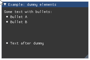
Wraps API:
void Dummy(const ImVec2& size)
- imgui.core.end()
End a window.
This finishes appending to current window, and pops it off the window stack. See:
begin().Wraps API:
void End()
- imgui.core.end_child()
End scrolling region. Only call if
begin_child().visibleis True.Wraps API:
void EndChild()
- imgui.core.end_combo()
End combo box. Only call if
begin_combo().openedis True.Wraps API:
void EndCombo()
- imgui.core.end_drag_drop_source()
End the drag and drop source. Only call if
begin_drag_drop_source().draggingis True.Note: this is a beta API.
For a complete example see
begin_drag_drop_source().Wraps API:
void EndDragDropSource()
- imgui.core.end_drag_drop_target()
End the drag and drop source. Only call this function if
begin_drag_drop_target().hoveredis True.Note: this is a beta API.
For a complete example see
begin_drag_drop_source().Wraps API:
void EndDragDropTarget()
- imgui.core.end_frame()
End a frame.
ends the ImGui frame. automatically called by Render(), so most likely don’t need to ever call that yourself directly. If you don’t need to render you may call end_frame() but you’ll have wasted CPU already. If you don’t need to render, better to not create any imgui windows instead!
Wraps API:
void EndFrame()
- imgui.core.end_group()
End group (see:
begin_group).Wraps API:
void EndGroup()
- imgui.core.end_list_box()
Closing the listbox, previously opened by
begin_list_box(). Only call ifbegin_list_box().openedis True.See
begin_list_box()for usage example.Wraps API:
void EndListBox()
Close main menu bar context.
Only call this function if the
end_main_menu_bar().openedis True.For practical example how to use this function see documentation of
begin_main_menu_bar().Wraps API:
bool EndMainMenuBar()
Close menu context.
Only call this function if
begin_menu().openedreturns True.For practical example how to use this function, please see documentation of
begin_main_menu_bar()orbegin_menu_bar().Wraps API:
void EndMenu()
Close menu bar context.
Only call this function if
begin_menu_bar().openedis True.For practical example how to use this function see documentation of
begin_menu_bar().Wraps API:
void EndMenuBar()
- imgui.core.end_popup()
End a popup window.
Should be called after each XYZPopupXYZ function. Only call this function if
begin_popup_XYZ().openedis True.For practical example how to use this function, please see documentation of
open_popup().Wraps API:
void EndPopup()
- imgui.core.end_tab_bar()
End a previously opened tab bar. Only call this function if
begin_tab_bar().openedis True.Wraps API:
void EndTabBar()
- imgui.core.end_tab_item()
End a previously opened tab item. Only call this function if
begin_tab_item().selectedis True.Wraps API:
void EndTabItem()
- imgui.core.end_table()
End a previously opened table. Only call this function if
begin_table().openedis True.Wraps API:
void EndTable()
- imgui.core.end_tooltip()
End tooltip window.
See
begin_tooltip()for full usage example.Wraps API:
void EndTooltip()
- imgui.core.get_background_draw_list()
This draw list will be the first rendering one. Useful to quickly draw shapes/text behind dear imgui contents.
- Returns:
DrawList*
Wraps API:
ImDrawList* GetBackgroundDrawList()
- imgui.core.get_clipboard_text()
Also see the
log_to_clipboard()function to capture GUI into clipboard, or easily output text data to the clipboard.- Returns:
str – Text content of the clipboard
Wraps API:
const char* GetClipboardText()
- imgui.core.get_color_u32(ImU32 col)
retrieve given style color with style alpha applied and optional extra alpha multiplier
- Returns:
ImU32 – 32-bit RGBA color
Wraps API:
ImU32 GetColorU32(ImU32 col)
- imgui.core.get_color_u32_idx(ImGuiCol idx, float alpha_mul=1.0)
retrieve given style color with style alpha applied and optional extra alpha multiplier
- Returns:
ImU32 – 32-bit RGBA color
Wraps API:
ImU32 GetColorU32(ImGuiCol idx, alpha_mul)
- imgui.core.get_color_u32_rgba(float r, float g, float b, float a)
retrieve given color with style alpha applied
- Returns:
ImU32 – 32-bit RGBA color
Wraps API:
ImU32 GetColorU32(const ImVec4& col)
- imgui.core.get_column_index()
Returns the current column index.
For a complete example see
columns().Legacy Columns API (2020: prefer using Tables!)
- Returns:
int – the current column index.
Wraps API:
int GetColumnIndex()
- imgui.core.get_column_offset(int column_index=-1)
Returns position of column line (in pixels, from the left side of the contents region). Pass -1 to use current column, otherwise 0 to
get_columns_count(). Column 0 is usually 0.0f and not resizable unless you call this method.For a complete example see
columns().Legacy Columns API (2020: prefer using Tables!)
- Parameters:
column_index (int) – index of the column to get the offset for.
- Returns:
float – the position in pixels from the left side.
Wraps API:
float GetColumnOffset(int column_index = -1)
- imgui.core.get_column_width(int column_index=-1)
Return the column width.
For a complete example see
columns().Legacy Columns API (2020: prefer using Tables!)
- Parameters:
column_index (int) – index of the column to get the width for.
Wraps API:
float GetColumnWidth(int column_index = -1)
- imgui.core.get_columns_count()
Get count of the columns in the current table.
For a complete example see
columns().Legacy Columns API (2020: prefer using Tables!)
- Returns:
int – columns count.
Wraps API:
int GetColumnsCount()
- imgui.core.get_content_region_available()
Get available content region.
It is shortcut for:
- Returns:
Vec2 – available content region size two-tuple
(width, height)
Wraps API:
ImVec2 GetContentRegionMax()
- imgui.core.get_content_region_available_width()
Get available content region width.
- Returns:
float – available content region width.
Wraps API:
float GetContentRegionAvailWidth()
- imgui.core.get_content_region_max()
Get current content boundaries in window coordinates.
Typically window boundaries include scrolling, or current column boundaries.
- Returns:
Vec2 – content boundaries two-tuple
(width, height)
Wraps API:
ImVec2 GetContentRegionMax()
- imgui.core.get_current_context()
GetCurrentContext
Wraps API:
ImGuiContext* GetCurrentContext();
- imgui.core.get_cursor_pos()
Get the cursor position.
Wraps API:
ImVec2 GetCursorPos()
- imgui.core.get_cursor_pos_x()
- imgui.core.get_cursor_pos_y()
- imgui.core.get_cursor_position()
get_cursor_pos() Get the cursor position.
Wraps API:
ImVec2 GetCursorPos()
- imgui.core.get_cursor_screen_pos()
Get the cursor position in absolute screen coordinates [0..io.DisplaySize] (useful to work with ImDrawList API)
Wraps API:
ImVec2 GetCursorScreenPos()
- imgui.core.get_cursor_screen_position()
get_cursor_screen_pos() Get the cursor position in absolute screen coordinates [0..io.DisplaySize] (useful to work with ImDrawList API)
Wraps API:
ImVec2 GetCursorScreenPos()
- imgui.core.get_cursor_start_pos()
Get the initial cursor position.
Wraps API:
ImVec2 GetCursorStartPos()
- imgui.core.get_cursor_start_position()
get_cursor_start_pos() Get the initial cursor position.
Wraps API:
ImVec2 GetCursorStartPos()
- imgui.core.get_drag_drop_payload()
Peek directly into the current payload from anywhere. May return NULL.
Todo
Map ImGuiPayload::IsDataType() to test for the payload type.
Wraps API:
const ImGuiPayload* GetDragDropPayload()
- imgui.core.get_draw_data()
Get draw data.
valid after
render()and until the next call tonew_frame(). This is what you have to render.- Returns:
_DrawData – draw data for all draw calls required to display gui
Wraps API:
ImDrawData* GetDrawData()
- imgui.core.get_font_size()
get current font size (= height in pixels) of current font with current scale applied
- Returns:
float – current font size (height in pixels)
Wraps API:
float GetFontSize()
- imgui.core.get_font_tex_uv_white_pixel()
- imgui.core.get_foreground_draw_list()
This draw list will be the last rendered one. Useful to quickly draw shapes/text over dear imgui contents.
- Returns:
DrawList*
Wraps API:
ImDrawList* GetForegroundDrawList()
- imgui.core.get_frame_height()
~ FontSize + style.FramePadding.y * 2
Wraps API:
float GetFrameHeight()
float GetFrameHeightWithSpacing() except +
- imgui.core.get_frame_height_with_spacing()
~ FontSize + style.FramePadding.y * 2 + style.ItemSpacing.y (distance in pixels between 2 consecutive lines of framed widgets)
Wraps API:
float GetFrameHeightWithSpacing()
- imgui.core.get_io()
- imgui.core.get_item_rect_max()
Get bounding rect of the last item in screen space.
- Returns:
Vec2 – item maximum boundaries two-tuple
(width, height)
Wraps API:
ImVec2 GetItemRectMax()
- imgui.core.get_item_rect_min()
Get bounding rect of the last item in screen space.
- Returns:
Vec2 – item minimum boundaries two-tuple
(width, height)
Wraps API:
ImVec2 GetItemRectMin()
- imgui.core.get_item_rect_size()
Get bounding rect of the last item in screen space.
- Returns:
Vec2 – item boundaries two-tuple
(width, height)
Wraps API:
ImVec2 GetItemRectSize()
- imgui.core.get_key_index(int key)
Map ImGuiKey_* values into user’s key index. == io.KeyMap[key]
- Returns:
int – io.KeyMap[key]
Wraps API:
int GetKeyIndex(ImGuiKey imgui_key)
- imgui.core.get_main_viewport()
Currently represents the Platform Window created by the application which is hosting our Dear ImGui windows.
In the future we will extend this concept further to also represent Platform Monitor and support a “no main platform window” operation mode.
- Returns:
_ImGuiViewport – Viewport
Wraps API:
ImGuiViewport* GetMainViewport()
- imgui.core.get_mouse_cursor()
Return the mouse cursor id.
Wraps API:
ImGuiMouseCursor GetMouseCursor()
- imgui.core.get_mouse_drag_delta(int button=0, float lock_threshold=-1.0)
Dragging amount since clicking.
- Parameters:
button (int) – mouse button index.
lock_threshold (float) – if less than -1.0 uses io.MouseDraggingThreshold.
- Returns:
Vec2 – mouse position two-tuple
(x, y)
Wraps API:
ImVec2 GetMouseDragDelta(int button = 0, float lock_threshold = -1.0f)
- imgui.core.get_mouse_pos()
Current mouse position.
- Returns:
Vec2 – mouse position two-tuple
(x, y)
Wraps API:
ImVec2 GetMousePos()
- imgui.core.get_mouse_position()
get_mouse_pos() Current mouse position.
- Returns:
Vec2: mouse position two-tuple
(x, y)
Wraps API:
ImVec2 GetMousePos()
- imgui.core.get_overlay_draw_list()
Get a special draw list that will be drawn last (over all windows).
Useful for drawing overlays.
- Returns:
ImDrawList*
Wraps API:
ImDrawList* GetWindowDrawList()
- imgui.core.get_scroll_max_x()
get maximum scrolling amount ~~ ContentSize.X - WindowSize.X
- Returns:
float – the maximum scroll X amount
Wraps API:
int GetScrollMaxX()
- imgui.core.get_scroll_max_y()
get maximum scrolling amount ~~ ContentSize.X - WindowSize.X
- Returns:
float – the maximum scroll Y amount
Wraps API:
int GetScrollMaxY()
- imgui.core.get_scroll_x()
get scrolling amount [0..GetScrollMaxX()]
- Returns:
float – the current scroll X value
Wraps API:
int GetScrollX()
- imgui.core.get_scroll_y()
get scrolling amount [0..GetScrollMaxY()]
- Returns:
float – the current scroll Y value
Wraps API:
int GetScrollY()
- imgui.core.get_style()
- imgui.core.get_style_color_name(int index)
Get the style color name for a given ImGuiCol index.
Wraps API:
const char* GetStyleColorName(ImGuiCol idx)
- imgui.core.get_style_color_vec_4(ImGuiCol idx)
- imgui.core.get_text_line_height()
Get text line height.
- Returns:
int – text line height.
Wraps API:
void GetTextLineHeight()
- imgui.core.get_text_line_height_with_spacing()
Get text line height, with spacing.
- Returns:
int – text line height, with spacing.
Wraps API:
void GetTextLineHeightWithSpacing()
- imgui.core.get_time()
Seconds since program start.
- Returns:
float – the time (seconds since program start)
Wraps API:
float GetTime()
- imgui.core.get_tree_node_to_label_spacing()
Horizontal distance preceding label when using
tree_node*()orbullet() == (g.FontSize + style.FramePadding.x*2)for a regular unframed TreeNode- Returns:
float – spacing
Example:
imgui.begin("TreeNode")
imgui.text("<- 0px offset here")
if imgui.tree_node("Expand me!", imgui.TREE_NODE_DEFAULT_OPEN):
    imgui.text("<- %.2fpx offset here" % imgui.get_tree_node_to_label_spacing())
    imgui.tree_pop()
imgui.end()
Outputs: 
Wraps API:
float GetTreeNodeToLabelSpacing()
- imgui.core.get_version()
Get the version of Dear ImGui.
Wraps API:
void GetVersion()
- imgui.core.get_window_content_region_max()
Get maximal current window content boundaries in window coordinates.
It translates roughly to:
(0, 0) + Size - Scroll- Returns:
Vec2 – content boundaries two-tuple
(width, height)
Wraps API:
ImVec2 GetWindowContentRegionMin()
- imgui.core.get_window_content_region_min()
Get minimal current window content boundaries in window coordinates.
It translates roughly to:
(0, 0) - Scroll- Returns:
Vec2 – content boundaries two-tuple
(width, height)
Wraps API:
ImVec2 GetWindowContentRegionMin()
- imgui.core.get_window_content_region_width()
Get available current window content region width.
- Returns:
float – available content region width.
Wraps API:
float GetWindowContentRegionWidth()
- imgui.core.get_window_draw_list()
Get the draw list associated with the window, to append your own drawing primitives
It may be useful if you want to do your own drawing via the
_DrawListAPI.Example:
pos_x = 10
pos_y = 10
sz = 20

draw_list = imgui.get_window_draw_list()

for i in range(0, imgui.COLOR_COUNT):
    name = imgui.get_style_color_name(i);
    draw_list.add_rect_filled(pos_x, pos_y, pos_x+sz, pos_y+sz, imgui.get_color_u32_idx(i));
    imgui.dummy(sz, sz);
    imgui.same_line();

rgba_color = imgui.get_color_u32_rgba(1, 1, 0, 1);
draw_list.add_rect_filled(pos_x, pos_y, pos_x+sz, pos_y+sz, rgba_color);
Outputs: 
- Returns:
ImDrawList*
Wraps API:
ImDrawList* GetWindowDrawList()
- imgui.core.get_window_height()
Get current window height.
- Returns:
float – height of current window.
Wraps API:
float GetWindowHeight()
- imgui.core.get_window_position()
Get current window position.
It may be useful if you want to do your own drawing via the DrawList api.
- Returns:
Vec2 – two-tuple of window coordinates in screen space.
Wraps API:
ImVec2 GetWindowPos()
- imgui.core.get_window_size()
Get current window size.
- Returns:
Vec2 – two-tuple of window dimensions.
Wraps API:
ImVec2 GetWindowSize()
- imgui.core.get_window_width()
Get current window width.
- Returns:
float – width of current window.
Wraps API:
float GetWindowWidth()
- imgui.core.image(texture_id, float width, float height, tuple uv0=(0, 0), tuple uv1=(1, 1), tuple tint_color=(1, 1, 1, 1), tuple border_color=(0, 0, 0, 0))
Display image.
Example:
texture_id = imgui.get_io().fonts.texture_id

imgui.begin("Example: image display")
imgui.image(texture_id, 512, 64, border_color=(1, 0, 0, 1))
imgui.end()
Outputs: 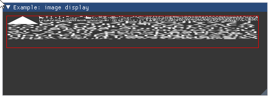
- Parameters:
texture_id (object) – user data defining texture id. Argument type is implementation dependent. For OpenGL it is usually an integer.
size (Vec2) – image display size two-tuple.
uv0 (Vec2) – UV coordinates for 1st corner (lower-left for OpenGL). Defaults to
(0, 0).uv1 (Vec2) – UV coordinates for 2nd corner (upper-right for OpenGL). Defaults to
(1, 1).tint_color (Vec4) – Image tint color. Defaults to white.
border_color (Vec4) – Image border color. Defaults to transparent.
Wraps API:
void Image(
    ImTextureID user_texture_id,
    const ImVec2& size,
    const ImVec2& uv0 = ImVec2(0,0),
    const ImVec2& uv1 = ImVec2(1,1),
    const ImVec4& tint_col = ImVec4(1,1,1,1),
    const ImVec4& border_col = ImVec4(0,0,0,0)
)
- imgui.core.image_button(texture_id, float width, float height, tuple uv0=(0, 0), tuple uv1=(1, 1), tuple tint_color=(1, 1, 1, 1), tuple border_color=(0, 0, 0, 0), int frame_padding=-1)
Display image.
Todo
add example with some preconfigured image
- Parameters:
texture_id (object) – user data defining texture id. Argument type is implementation dependent. For OpenGL it is usually an integer.
size (Vec2) – image display size two-tuple.
uv0 (Vec2) – UV coordinates for 1st corner (lower-left for OpenGL). Defaults to
(0, 0).uv1 (Vec2) – UV coordinates for 2nd corner (upper-right for OpenGL). Defaults to
(1, 1).tint_color (Vec4) – Image tint color. Defaults to white.
border_color (Vec4) – Image border color. Defaults to transparent.
frame_padding (int) – Frame padding (
0: no padding,<0default padding).
- Returns:
bool – True if clicked.
Wraps API:
bool ImageButton(
    ImTextureID user_texture_id,
    const ImVec2& size,
    const ImVec2& uv0 = ImVec2(0,0),
    const ImVec2& uv1 = ImVec2(1,1),
    int frame_padding = -1,
    const ImVec4& bg_col = ImVec4(0,0,0,0),
    const ImVec4& tint_col = ImVec4(1,1,1,1)
)
- imgui.core.indent(float width=0.0)
Move content to right by indent width.
Example:
imgui.begin("Example: item indenting")

imgui.text("Some text with bullets:")

imgui.bullet_text("Bullet A")
imgui.indent()
imgui.bullet_text("Bullet B (first indented)")
imgui.bullet_text("Bullet C (indent continues)")
imgui.unindent()
imgui.bullet_text("Bullet D (indent cleared)")

imgui.end()
Outputs: 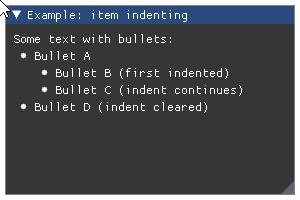
- Parameters:
width (float) – fixed width of indent. If less or equal 0 it defaults to global indent spacing or value set using style value stack (see
push_style_var).
Wraps API:
void Indent(float indent_w = 0.0f)
- imgui.core.input_double(str label, double value, double step=0.0, double step_fast=0.0, str format='%.6f', ImGuiInputTextFlags flags=0)
Display double input widget.
Example:
double_val = 3.14159265358979323846
imgui.begin("Example: double input")
changed, double_val = imgui.input_double('Type multiplier:', double_val)
imgui.text('You wrote: %i' % double_val)
imgui.end()
Outputs: 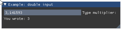
- Parameters:
label (str) – widget label.
value (double) – textbox value
step (double) – incremental step
step_fast (double) – fast incremental step
format = (str) – format string
flags – InputText flags. See: list of available flags.
- Returns:
tuple – a
(changed, value)tuple that contains indicator of textbox state change and the current textbox content.
Wraps API:
bool InputDouble(
    const char* label,
    double* v,
    double step = 0.0,
    double step_fast = 0.0,
    _bytes(format),
    ImGuiInputTextFlags extra_flags = 0
)
- imgui.core.input_float(str label, float value, float step=0.0, float step_fast=0.0, str format='%.3f', ImGuiInputTextFlags flags=0)
Display float input widget.
Example:
float_val = 0.4
imgui.begin("Example: float input")
changed, float_val = imgui.input_float('Type coefficient:', float_val)
imgui.text('You wrote: %f' % float_val)
imgui.end()
Outputs: 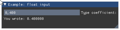
- Parameters:
label (str) – widget label.
value (float) – textbox value
step (float) – incremental step
step_fast (float) – fast incremental step
format = (str) – format string
flags – InputText flags. See: list of available flags.
- Returns:
tuple – a
(changed, value)tuple that contains indicator of textbox state change and the current textbox content.
Wraps API:
bool InputFloat(
    const char* label,
    float* v,
    float step = 0.0f,
    float step_fast = 0.0f,
    const char* format = "%.3f",
    ImGuiInputTextFlags extra_flags = 0
)
- imgui.core.input_float2(str label, float value0, float value1, str format='%.3f', ImGuiInputTextFlags flags=0)
Display two-float input widget.
Example:
values = 0.4, 3.2
imgui.begin("Example: two float inputs")
changed, values = imgui.input_float2('Type here:', *values)
imgui.text("Changed: %s, Values: %s" % (changed, values))
imgui.end()
Outputs: 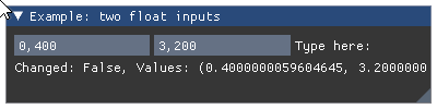
- Parameters:
label (str) – widget label.
value0, value1 (float) – input values.
format = (str) – format string
flags – InputText flags. See: list of available flags.
- Returns:
tuple – a
(changed, values)tuple that contains indicator of textbox state change and the tuple of current values.
Wraps API:
bool InputFloat2(
    const char* label,
    float v[2],
    const char* format = "%.3f",
    ImGuiInputTextFlags extra_flags = 0
)
- imgui.core.input_float3(str label, float value0, float value1, float value2, str format='%.3f', ImGuiInputTextFlags flags=0)
Display three-float input widget.
Example:
values = 0.4, 3.2, 29.3
imgui.begin("Example: three float inputs")
changed, values = imgui.input_float3('Type here:', *values)
imgui.text("Changed: %s, Values: %s" % (changed, values))
imgui.end()
Outputs: 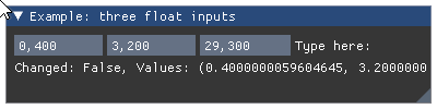
- Parameters:
label (str) – widget label.
value0, value1, value2 (float) – input values.
format = (str) – format string
flags – InputText flags. See: list of available flags.
- Returns:
tuple – a
(changed, values)tuple that contains indicator of textbox state change and the tuple of current values.
Wraps API:
bool InputFloat3(
    const char* label,
    float v[3],
    const char* format = "%.3f",
    ImGuiInputTextFlags extra_flags = 0
)
- imgui.core.input_float4(str label, float value0, float value1, float value2, float value3, str format='%.3f', ImGuiInputTextFlags flags=0)
Display four-float input widget.
Example:
values = 0.4, 3.2, 29.3, 12.9
imgui.begin("Example: four float inputs")
changed, values = imgui.input_float4('Type here:', *values)
imgui.text("Changed: %s, Values: %s" % (changed, values))
imgui.end()
Outputs: 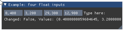
- Parameters:
label (str) – widget label.
value0, value1, value2, value3 (float) – input values.
format = (str) – format string
flags – InputText flags. See: list of available flags.
- Returns:
tuple – a
(changed, values)tuple that contains indicator of textbox state change and the tuple of current values.
Wraps API:
bool InputFloat4(
    const char* label,
    float v[4],
    const char* format = "%.3f",
    ImGuiInputTextFlags extra_flags = 0
)
- imgui.core.input_int(str label, int value, int step=1, int step_fast=100, ImGuiInputTextFlags flags=0)
Display integer input widget.
Example:
int_val = 3
imgui.begin("Example: integer input")
changed, int_val = imgui.input_int('Type multiplier:', int_val)
imgui.text('You wrote: %i' % int_val)
imgui.end()
Outputs: 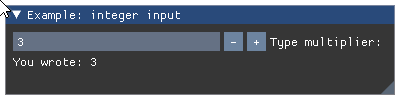
- Parameters:
label (str) – widget label.
value (int) – textbox value
step (int) – incremental step
step_fast (int) – fast incremental step
flags – InputText flags. See: list of available flags.
- Returns:
tuple – a
(changed, value)tuple that contains indicator of textbox state change and the current textbox content.
Wraps API:
bool InputInt(
    const char* label,
    int* v,
    int step = 1,
    int step_fast = 100,
    ImGuiInputTextFlags extra_flags = 0
)
- imgui.core.input_int2(str label, int value0, int value1, ImGuiInputTextFlags flags=0)
Display two-integer input widget.
Example:
values = 4, 12
imgui.begin("Example: two int inputs")
changed, values = imgui.input_int2('Type here:', *values)
imgui.text("Changed: %s, Values: %s" % (changed, values))
imgui.end()
Outputs: 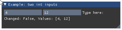
- Parameters:
label (str) – widget label.
value0, value1 (int) – textbox values
flags – InputText flags. See: list of available flags.
- Returns:
tuple – a
(changed, value)tuple that contains indicator of textbox state change and the current textbox content.
Wraps API:
bool InputInt2(
    const char* label,
    int v[2],
    ImGuiInputTextFlags extra_flags = 0
)
- imgui.core.input_int3(str label, int value0, int value1, int value2, ImGuiInputTextFlags flags=0)
Display three-integer input widget.
Example:
values = 4, 12, 28
imgui.begin("Example: three int inputs")
changed, values = imgui.input_int3('Type here:', *values)
imgui.text("Changed: %s, Values: %s" % (changed, values))
imgui.end()
Outputs: 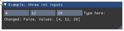
- Parameters:
label (str) – widget label.
value0, value1, value2 (int) – textbox values
flags – InputText flags. See: list of available flags.
- Returns:
tuple – a
(changed, value)tuple that contains indicator of textbox state change and the current textbox content.
Wraps API:
bool InputInt3(
    const char* label,
    int v[3],
    ImGuiInputTextFlags extra_flags = 0
)
- imgui.core.input_int4(str label, int value0, int value1, int value2, int value3, ImGuiInputTextFlags flags=0)
Display four-integer input widget.
Example:
values = 4, 12, 28, 73
imgui.begin("Example: four int inputs")
changed, values = imgui.input_int4('Type here:', *values)
imgui.text("Changed: %s, Values: %s" % (changed, values))
imgui.end()
Outputs: 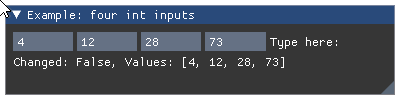
- Parameters:
label (str) – widget label.
value0, value1, value2, value3 (int) – textbox values
flags – InputText flags. See: list of available flags.
- Returns:
tuple – a
(changed, value)tuple that contains indicator of textbox state change and the current textbox content.
Wraps API:
bool InputInt4(
    const char* label,
    int v[4],
    ImGuiInputTextFlags extra_flags = 0
)
- imgui.core.input_scalar(str label, ImGuiDataType data_type, bytes data, bytes step=None, bytes step_fast=None, str format=None, ImGuiInputTextFlags flags=0)
Display scalar input widget. Data is passed via
bytesand the type is separatelly given usingdata_type. This is useful to work with specific types (e.g. unsigned 8bit integer, float, double) like when interfacing with Numpy.- Parameters:
label (str) – widget label
data_type – ImGuiDataType enum, type of the given data
data (bytes) – data value as a bytes array
step (bytes) – incremental step
step_fast (bytes) – fast incremental step
format (str) – format string
flags – InputText flags. See: list of available flags.
- Returns:
tuple – a
(changed, value)tuple that contains indicator of input state change and the current input content.
Wraps API:
bool InputScalar(
    const char* label,
    ImGuiDataType data_type,
    void* p_data,
    const void* p_step = NULL,
    const void* p_step_fast = NULL,
    const char* format = NULL,
    ImGuiInputTextFlags flags = 0
)
- imgui.core.input_scalar_N(str label, ImGuiDataType data_type, bytes data, int components, bytes step=None, bytes step_fast=None, str format=None, ImGuiInputTextFlags flags=0)
Display multiple scalar input widget. Data is passed via
bytesand the type is separatelly given usingdata_type. This is useful to work with specific types (e.g. unsigned 8bit integer, float, double) like when interfacing with Numpy.- Parameters:
label (str) – widget label
data_type – ImGuiDataType enum, type of the given data
data (bytes) – data value as a bytes array
components (int) – number of components to display
step (bytes) – incremental step
step_fast (bytes) – fast incremental step
format (str) – format string
flags – InputText flags. See: list of available flags.
- Returns:
tuple – a
(changed, value)tuple that contains indicator of input state change and the current input content.
Wraps API:
bool InputScalarN(
    const char* label,
    ImGuiDataType data_type,
    void* p_data,
    int components,
    const void* p_step = NULL,
    const void* p_step_fast = NULL,
    const char* format = NULL,
    ImGuiInputTextFlags flags = 0
)
- imgui.core.input_text(str label, str value, int buffer_length=-1, ImGuiInputTextFlags flags=0, callback=None, user_data=None)
Display text input widget.
The
buffer_lengthis the maximum allowed length of the content. It is the size in bytes, which may not correspond to the number of characters. If set to -1, the internal buffer will have an adaptive size, which is equivalent to using theimgui.INPUT_TEXT_CALLBACK_RESIZEflag. When a callback is provided, it is called after the internal buffer has been resized.Example:
text_val = 'Please, type the coefficient here.'
imgui.begin("Example: text input")
changed, text_val = imgui.input_text('Coefficient:', text_val)
imgui.text('You wrote:')
imgui.same_line()
imgui.text(text_val)
imgui.end()
Outputs: 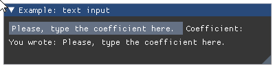
- Parameters:
label (str) – widget label.
value (str) – textbox value
buffer_length (int) – length of the content buffer
flags – InputText flags. See: list of available flags.
callback (callable) – a callable that is called depending on choosen flags. Callable takes an imgui._ImGuiInputTextCallbackData object as argument Callable should return None or integer
user_data – Any data that the user want to use in the callback.
- Returns:
tuple – a
(changed, value)tuple that contains indicator of textbox state change and the current text contents.
Wraps API:
bool InputText(
    const char* label,
    char* buf,
    size_t buf_size,
    ImGuiInputTextFlags flags = 0,
    ImGuiInputTextCallback callback = NULL,
    void* user_data = NULL
)
- imgui.core.input_text_multiline(str label, str value, int buffer_length=-1, float width=0, float height=0, ImGuiInputTextFlags flags=0, callback=None, user_data=None)
Display multiline text input widget.
The
buffer_lengthis the maximum allowed length of the content. It is the size in bytes, which may not correspond to the number of characters. If set to -1, the internal buffer will have an adaptive size, which is equivalent to using theimgui.INPUT_TEXT_CALLBACK_RESIZEflag. When a callback is provided, it is called after the internal buffer has been resized.Example:
text_val = 'Type the your message here.'
imgui.begin("Example: text input")
changed, text_val = imgui.input_text_multiline(
    'Message:',
    text_val,
    2056
)
imgui.text('You wrote:')
imgui.same_line()
imgui.text(text_val)
imgui.end()
Outputs: 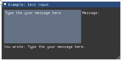
- Parameters:
label (str) – widget label.
value (str) – textbox value
buffer_length (int) – length of the content buffer
width (float) – width of the textbox
height (float) – height of the textbox
flags – InputText flags. See: list of available flags.
callback (callable) – a callable that is called depending on choosen flags. Callable takes an imgui._ImGuiInputTextCallbackData object as argument Callable should return None or integer
user_data – Any data that the user want to use in the callback.
- Returns:
tuple – a
(changed, value)tuple that contains indicator of textbox state change and the current text contents.
Wraps API:
bool InputTextMultiline(
    const char* label,
    char* buf,
    size_t buf_size,
    const ImVec2& size = ImVec2(0,0),
    ImGuiInputTextFlags flags = 0,
    ImGuiInputTextCallback callback = NULL,
    void* user_data = NULL
)
- imgui.core.input_text_with_hint(str label, str hint, str value, int buffer_length=-1, ImGuiInputTextFlags flags=0, callback=None, user_data=None)
Display a text box, if the text is empty a hint on how to fill the box is given.
The
buffer_lengthis the maximum allowed length of the content. It is the size in bytes, which may not correspond to the number of characters. If set to -1, the internal buffer will have an adaptive size, which is equivalent to using theimgui.INPUT_TEXT_CALLBACK_RESIZEflag. When a callback is provided, it is called after the internal buffer has been resized.- Parameters:
label (str) – Widget label
hing (str) – Hint displayed if text value empty
value (str) – Text value
buffer_length (int) – Length of the content buffer
flags – InputText flags. See: list of available flags.
callback (callable) – a callable that is called depending on choosen flags. Callable takes an imgui._ImGuiInputTextCallbackData object as argument Callable should return None or integer
user_data – Any data that the user want to use in the callback.
- Returns:
tuple – a
(changed, value)tuple that contains indicator of textbox state change and the current text contents.
Example:
text_val = ''
imgui.begin("Example Text With hing")
changed, text_val = imgui.input_text_with_hint(
    'Email', 'your@email.com',
    text_val, 255)
imgui.end()
Outputs: 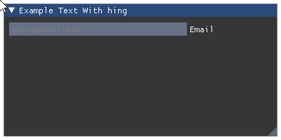
Wraps API:
bool InputTextWithHint(
    const char* label,
    const char* hint,
    char* buf,
    size_t buf_size,
    ImGuiInputTextFlags flags = 0,
    ImGuiInputTextCallback callback = NULL,
    void* user_data = NULL
)
- imgui.core.invisible_button(str identifier, float width, float height, ImGuiButtonFlags flags=0)
Create invisible button.
Flexible button behavior without the visuals, frequently useful to build custom behaviors using the public api (along with IsItemActive, IsItemHovered, etc.)
Example:
imgui.begin("Example: invisible button :)")
imgui.invisible_button("Button 1", 200, 200)
imgui.small_button("Button 2")
imgui.end()
Outputs: 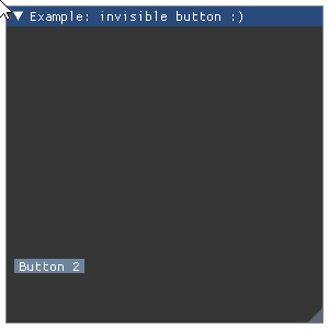
- Parameters:
identifier (str) – Button identifier. Like label on
button()but it is not displayed.width (float) – button width.
height (float) – button height.
flags – ImGuiButtonFlags
- Returns:
bool – True if button is clicked.
Wraps API:
bool InvisibleButton(const char* str_id, const ImVec2& size, ImGuiButtonFlags flags = 0)
- imgui.core.is_any_item_active()
Was any of the items active.
- Returns:
bool – True if any item is active, otherwise False.
Wraps API:
bool IsAnyItemActive()
- imgui.core.is_any_item_focused()
Is any of the items focused.
- Returns:
bool – True if any item is focused, otherwise False.
Wraps API:
bool IsAnyItemFocused()
- imgui.core.is_any_item_hovered()
Was any of the items hovered.
- Returns:
bool – True if any item is hovered, otherwise False.
Wraps API:
bool IsAnyItemHovered()
- imgui.core.is_item_activated()
Was the last item just made active (item was previously inactive)?
- Returns:
bool – True if item was just made active
Wraps API:
bool IsItemActivated()
- imgui.core.is_item_active()
Was the last item active? For ex. button being held or text field being edited. Items that don’t interact will always return false.
- Returns:
bool – True if item is active, otherwise False.
Wraps API:
bool IsItemActive()
- imgui.core.is_item_clicked(ImGuiMouseButton mouse_button=0)
Was the last item hovered and mouse clicked on? Button or node that was just being clicked on.
- Parameters:
mouse_button – ImGuiMouseButton
- Returns:
bool – True if item is clicked, otherwise False.
Wraps API:
bool IsItemClicked(int mouse_button = 0)
- imgui.core.is_item_deactivated()
Was the last item just made inactive (item was previously active)? Useful for Undo/Redo patterns with widgets that requires continuous editing.
- Results:
bool: True if item just made inactive
- imgui.core.is_item_deactivated_after_edit()
Was the last item just made inactive and made a value change when it was active? (e.g. Slider/Drag moved). Useful for Undo/Redo patterns with widgets that requires continuous editing. Note that you may get false positives (some widgets such as Combo()/ListBox()/Selectable() will return true even when clicking an already selected item).
- Results:
bool: True if item just made inactive after an edition
Wraps API:
bool IsItemDeactivatedAfterEdit()
- imgui.core.is_item_edited()
Did the last item modify its underlying value this frame? or was pressed? This is generally the same as the “bool” return value of many widgets.
- Returns:
bool – True if item is edited, otherwise False.
Wraps API:
bool IsItemEdited()
- imgui.core.is_item_focused()
Check if the last item is focused
- Returns:
bool – True if item is focused, otherwise False.
Wraps API:
bool IsItemFocused()
- imgui.core.is_item_hovered(ImGuiHoveredFlags flags=0)
Check if the last item is hovered by mouse.
- Returns:
bool – True if item is hovered by mouse, otherwise False.
Wraps API:
bool IsItemHovered(ImGuiHoveredFlags flags = 0)
- imgui.core.is_item_toggled_open()
Was the last item open state toggled? set by TreeNode().
Wraps API:
bool IsItemToggledOpen()
- imgui.core.is_item_visible()
Was the last item visible? Aka not out of sight due to clipping/scrolling.
- Returns:
bool – True if item is visible, otherwise False.
Wraps API:
bool IsItemVisible()
- imgui.core.is_key_down(int key_index)
- Returns if key is being held – io.KeysDown[user_key_index].
Note that imgui doesn’t know the semantic of each entry of io.KeysDown[]. Use your own indices/enums according to how your backend/engine stored them into io.KeysDown[]!
- Returns:
bool – True if specified key is being held.
Wraps API:
bool IsKeyDown(int user_key_index)
- imgui.core.is_key_pressed(int key_index, bool repeat=False)
- Was key pressed (went from !Down to Down).
If repeat=true, uses io.KeyRepeatDelay / KeyRepeatRate
- Returns:
bool – True if specified key was pressed this frame
Wraps API:
bool IsKeyPressed(int user_key_index)
- imgui.core.is_mouse_clicked(int button=0, bool repeat=False)
Returns if the mouse was clicked this frame.
- Parameters:
button (int) – mouse button index.
repeat (float)
- Returns:
bool – if the mouse was clicked this frame.
Wraps API:
bool IsMouseClicked(int button, bool repeat = false)
- imgui.core.is_mouse_double_clicked(int button=0)
Return True if mouse was double-clicked.
Note: A double-click returns false in IsMouseClicked().
- Parameters:
button (int) – mouse button index.
- Returns:
bool – if mouse is double clicked.
Wraps API:
bool IsMouseDoubleClicked(int button);
- imgui.core.is_mouse_down(int button=0)
Returns if the mouse is down.
- Parameters:
button (int) – mouse button index.
- Returns:
bool – if the mouse is down.
Wraps API:
bool IsMouseDown(int button)
- imgui.core.is_mouse_dragging(int button, float lock_threshold=-1.0)
Returns if mouse is dragging.
- Parameters:
button (int) – mouse button index.
lock_threshold (float) – if less than -1.0 uses io.MouseDraggingThreshold.
- Returns:
bool – if mouse is dragging.
Wraps API:
bool IsMouseDragging(int button = 0, float lock_threshold = -1.0f)
- imgui.core.is_mouse_hovering_rect(float r_min_x, float r_min_y, float r_max_x, float r_max_y, bool clip=True)
Test if mouse is hovering rectangle with given coordinates.
- Parameters:
r_min_x, r_min_y (float) – x,y coordinate of the upper-left corner
r_max_x, r_max_y (float) – x,y coordinate of the lower-right corner
- Returns:
bool – True if mouse is hovering the rectangle.
Wraps API:
bool IsMouseHoveringRect(
    const ImVec2& r_min,
    const ImVec2& r_max,
    bool clip = true
)
- imgui.core.is_mouse_released(int button=0)
Returns if the mouse was released this frame.
- Parameters:
button (int) – mouse button index.
- Returns:
bool – if the mouse was released this frame.
Wraps API:
bool IsMouseReleased(int button)
- imgui.core.is_popup_open(str label, ImGuiPopupFlags flags=0)
Popups: test function
is_popup_open()with POPUP_ANY_POPUP_ID: return true if any popup is open at the current BeginPopup() level of the popup stack.is_popup_open()with POPUP_ANY_POPUP_ID + POPUP_ANY_POPUP_LEVEL: return true if any popup is open.
- Returns:
bool – True if the popup is open at the current
begin_popup()level of the popup stack.
Wraps API:
bool IsPopupOpen(const char* str_id, ImGuiPopupFlags flags = 0)
- imgui.core.is_rect_visible(float size_width, float size_height)
Test if a rectangle of the given size, starting from the cursor position is visible (not clipped).
- Parameters:
size_width (float) – width of the rect
size_height (float) – height of the rect
- Returns:
bool – True if rect is visible, otherwise False.
Wraps API:
bool IsRectVisible(const ImVec2& size)
- imgui.core.is_window_appearing()
Check if current window is appearing.
- Returns:
bool – True if window is appearing
- imgui.core.is_window_collapsed()
Check if current window is collapsed.
- Returns:
bool – True if window is collapsed
- imgui.core.is_window_focused(ImGuiHoveredFlags flags=0)
Is current window focused.
- Returns:
bool – True if current window is on focus, otherwise False.
Wraps API:
bool IsWindowFocused(ImGuiFocusedFlags flags = 0)
- imgui.core.is_window_hovered(ImGuiHoveredFlags flags=0)
Is current window hovered and hoverable (not blocked by a popup). Differentiate child windows from each others.
- Returns:
bool – True if current window is hovered, otherwise False.
Wraps API:
bool IsWindowHovered(ImGuiFocusedFlags flags = 0)
- imgui.core.label_text(str label, str text)
Display text+label aligned the same way as value+label widgets.
Example:
imgui.begin("Example: text with label")
imgui.label_text("my label", "my text")
imgui.end()
Outputs: 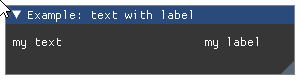
- Parameters:
label (str) – label to display.
text (str) – text to display.
Wraps API:
void LabelText(const char* label, const char* fmt, ...)
- imgui.core.listbox(str label, int current, list items, int height_in_items=-1)
Show listbox widget.
Example:
current = 2
imgui.begin("Example: listbox widget")

clicked, current = imgui.listbox(
    "List", current, ["first", "second", "third"]
)

imgui.end()
Outputs: 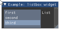
- Parameters:
label (str) – The label.
current (int) – index of selected item.
items (list) – list of string labels for items.
height_in_items (int) – height of dropdown in items. Defaults to -1 (autosized).
- Returns:
tuple – a
(changed, current)tuple indicating change of selection and current index of selected item.
Wraps API:
bool ListBox(
    const char* label,
    int* current_item,
    const char* items[],
    int items_count,
    int height_in_items = -1
)
Obsoleted in imgui v1.81 from February 2021, refer to :func:`end_list_box()`
Closing the listbox, previously opened by
listbox_header().See
listbox_header()for usage example.Wraps API:
void ListBoxFooter()
- imgui.core.listbox_header(str label, width=0, height=0)
Obsoleted in imgui v1.81 from February 2021, refer to :func:`begin_list_box()`
For use if you want to reimplement
listbox()with custom data or interactions. You need to calllistbox_footer()at the end.- Parameters:
label (str) – The label.
width (float) – button width.
height (float) – button height.
- Returns:
opened (bool) – If the item is opened or closed.
Wraps API:
bool ListBoxHeader(
    const char* label,
    const ImVec2& size = ImVec2(0,0)
)
- imgui.core.load_ini_settings_from_disk(str ini_file_name)
Call after
create_context()and before the first call tonew_frame().new_frame()automatically callsload_ini_settings_from_disk(io.ini_file_name).- Parameters:
ini_file_name (str) – Filename to load settings from.
Wraps API:
void LoadIniSettingsFromDisk(const char* ini_filename)
- imgui.core.load_ini_settings_from_memory(str ini_data)
Call after
create_context()and before the first call tonew_frame()to provide .ini data from your own data source.Wraps API:
void LoadIniSettingsFromMemory(const char* ini_data, size_t ini_size=0)
Create a menu item.
Item shortcuts are displayed for convenience but not processed by ImGui at the moment. Using
selectedargument it is possible to show and trigger a check mark next to the menu item label.For practical example how to use this function, please see documentation of
begin_main_menu_bar()orbegin_menu_bar().- Parameters:
label (str) – label of the menu item.
shortcut (str) – shortcut text of the menu item.
selected (bool) – define if menu item is selected.
enabled (bool) – define if menu item is enabled or disabled.
- Returns:
tuple – a
(clicked, state)two-tuple indicating if item was clicked by the user and the current state of item (visibility of the check mark).
Wraps API:
MenuItem(
    const char* label,
    const char* shortcut,
    bool* p_selected,
    bool enabled = true
)
- imgui.core.new_frame()
Start a new frame.
After calling this you can submit any command from this point until next
new_frame()orrender().Wraps API:
void NewFrame()
- imgui.core.new_line()
Undo
same_line()call.Wraps API:
void NewLine()
- imgui.core.next_column()
Move to the next column drawing.
For a complete example see
columns().Legacy Columns API (2020: prefer using Tables!)
Wraps API:
void NextColumn()
- imgui.core.open_popup(str label, ImGuiPopupFlags flags=0)
Open a popup window.
Marks a popup window as open. Popups are closed when user click outside, or activate a pressable item, or
close_current_popup()is called within abegin_popup()/end_popup()block. Popup identifiers are relative to the current ID-stack (soopen_popup()andbegin_popup()needs to be at the same level).Example:
imgui.begin("Example: simple popup")
if imgui.button('Toggle..'):
    imgui.open_popup("toggle")
if imgui.begin_popup("toggle"):
    if imgui.begin_menu('Sub-menu'):
        _, _ = imgui.menu_item('Click me')
        imgui.end_menu()
    imgui.end_popup()
imgui.end()
Outputs:
- Parameters:
label (str) – label of the modal window.
Wraps API:
void OpenPopup(
    const char* str_id,
    ImGuiPopupFlags popup_flags = 0
)
- imgui.core.open_popup_on_item_click(str label=None, ImGuiPopupFlags popup_flags=1)
Helper to open popup when clicked on last item. (note: actually triggers on the mouse _released_ event to be consistent with popup behaviors)
- Parameters:
label (str) – label of the modal window
flags – ImGuiWindowFlags
Wraps API:
void OpenPopupOnItemClick(const char* str_id = NULL, ImGuiPopupFlags popup_flags = 1)
- imgui.core.plot_histogram(str label, const float[:] values, int values_count=-1, int values_offset=0, str overlay_text=None, float scale_min=FLT_MAX, float scale_max=FLT_MAX, graph_size=(0, 0), int stride=<???>)
Plot a histogram of float values.
- Parameters:
label (str) – A plot label that will be displayed on the plot’s right side. If you want the label to be invisible, add
"##"before the label’s text:"my_label" -> "##my_label"values (array of floats) – the y-values. It must be a type that supports Cython’s Memoryviews, (See: http://docs.cython.org/en/latest/src/userguide/memoryviews.html) for example a numpy array.
overlay_text (str or None, optional) – Overlay text.
scale_min (float, optional) – y-value at the bottom of the plot.
scale_max (float, optional) – y-value at the top of the plot.
graph_size (tuple of two floats, optional) – plot size in pixels. Note: In ImGui 1.49, (-1,-1) will NOT auto-size the plot. To do that, use
get_content_region_available()and pass in the right size.
Note: These low-level parameters are exposed if needed for performance:
values_offset (int): Index of first element to display
- values_count (int): Number of values to display. -1 will use the
entire array.
stride (int): Number of bytes to move to read next element.
Example:
from array import array
from random import random

# NOTE: this example will not work under py27 due do incompatible
# implementation of array and memoryview().
histogram_values = array('f', [random() for _ in range(20)])

imgui.begin("Plot example")
imgui.plot_histogram("histogram(random())", histogram_values)
imgui.end()
Outputs: 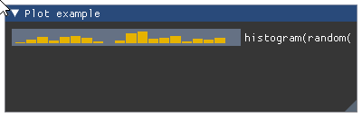
Wraps API:
void PlotHistogram(
    const char* label, const float* values, int values_count,
    # note: optional
    int values_offset,
    const char* overlay_text,
    float scale_min,
    float scale_max,
    ImVec2 graph_size,
    int stride
)
- imgui.core.plot_lines(str label, const float[:] values, int values_count=-1, int values_offset=0, str overlay_text=None, float scale_min=FLOAT_MAX, float scale_max=FLOAT_MAX, graph_size=(0, 0), int stride=<???>)
Plot a 1D array of float values.
- Parameters:
label (str) – A plot label that will be displayed on the plot’s right side. If you want the label to be invisible, add
"##"before the label’s text:"my_label" -> "##my_label"values (array of floats) – the y-values. It must be a type that supports Cython’s Memoryviews, (See: http://docs.cython.org/en/latest/src/userguide/memoryviews.html) for example a numpy array.
overlay_text (str or None, optional) – Overlay text.
scale_min (float, optional) – y-value at the bottom of the plot.
scale_max (float, optional) – y-value at the top of the plot.
graph_size (tuple of two floats, optional) – plot size in pixels. Note: In ImGui 1.49, (-1,-1) will NOT auto-size the plot. To do that, use
get_content_region_available()and pass in the right size.
Note: These low-level parameters are exposed if needed for performance:
values_offset (int): Index of first element to display
- values_count (int): Number of values to display. -1 will use the
entire array.
stride (int): Number of bytes to move to read next element.
Example:
from array import array
from math import sin
# NOTE: this example will not work under py27 due do incompatible
# implementation of array and memoryview().
plot_values = array('f', [sin(x * 0.1) for x in range(100)])

imgui.begin("Plot example")
imgui.plot_lines("Sin(t)", plot_values)
imgui.end()
Outputs: 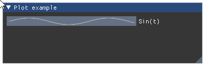
Wraps API:
void PlotLines(
    const char* label, const float* values, int values_count,

    int values_offset = 0,
    const char* overlay_text = NULL,
    float scale_min = FLT_MAX,
    float scale_max = FLT_MAX,
    ImVec2 graph_size = ImVec2(0,0),
    int stride = sizeof(float)
)
- imgui.core.pop_allow_keyboard_focus()
- imgui.core.pop_button_repeat()
- imgui.core.pop_clip_rect()
Pop the last clip region from the stack. See:
push_clip_rect().Wraps API:
void PopClipRect()
- imgui.core.pop_font()
Pop font on a stack.
For example usage see
push_font().- Parameters:
font (_Font) – font object retrieved from
add_font_from_file_ttf.
Wraps API:
void PopFont()
- imgui.core.pop_id()
Pop from the ID stack
- wraps::
PopID()
- imgui.core.pop_item_width()
Reset width back to the default width.
Note: This implementation guards you from segfaults caused by redundant stack pops (raises exception if this happens) but generally it is safer and easier to use
styled()oristyled()context managers. See:push_item_width().Wraps API:
void PopItemWidth()
- imgui.core.pop_style_color(unsigned int count=1)
Pop style color from stack.
Note: This implementation guards you from segfaults caused by redundant stack pops (raises exception if this happens) but generally it is safer and easier to use
styled()oristyled()context managers. See:push_style_color().- Parameters:
count (int) – number of variables to pop from style color stack.
Wraps API:
void PopStyleColor(int count = 1)
- imgui.core.pop_style_var(unsigned int count=1)
Pop style variables from stack.
Note: This implementation guards you from segfaults caused by redundant stack pops (raises exception if this happens) but generally it is safer and easier to use
styled()oristyled()context managers. See:push_style_var().- Parameters:
count (int) – number of variables to pop from style variable stack.
Wraps API:
void PopStyleVar(int count = 1)
- imgui.core.pop_text_wrap_pos()
Pop the text wrapping position from the stack.
Note: This implementation guards you from segfaults caused by redundant stack pops (raises exception if this happens) but generally it is safer and easier to use
styled()oristyled()context managers. See:push_text_wrap_pos().Wraps API:
void PopTextWrapPos()
- imgui.core.pop_text_wrap_position()
pop_text_wrap_pos() Pop the text wrapping position from the stack.
Note: This implementation guards you from segfaults caused by redundant stack pops (raises exception if this happens) but generally it is safer and easier to use
styled()oristyled()context managers. See:push_text_wrap_pos().Wraps API:
void PopTextWrapPos()
- imgui.core.progress_bar(float fraction, size=(-FLOAT_MIN, 0), str overlay='')
Show a progress bar
Example:
imgui.begin("Progress bar example")
imgui.progress_bar(0.7, (100,20), "Overlay text")
imgui.end()
Outputs: 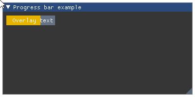
- Parameters:
fraction (float) – A floating point number between 0.0 and 1.0 0.0 means no progress and 1.0 means progress is completed
size – a tuple (width, height) that sets the width and height of the progress bar
overlay (str) – Optional text that will be shown in the progress bar
Wraps API:
void ProgressBar(
    float fraction,
    const ImVec2& size_arg = ImVec2(-FLT_MIN, 0),
    const char* overlay = NULL
)
- imgui.core.push_allow_keyboard_focus(bool allow_focus)
- imgui.core.push_button_repeat(bool repeat)
- imgui.core.push_clip_rect(float clip_rect_min_x, float clip_rect_min_y, float clip_rect_max_x, float clip_rect_max_y, bool intersect_with_current_clip_rect=False)
Push the clip region, i.e. the area of the screen to be rendered,on the stack. If
intersect_with_current_clip_rectisTrue, the intersection between pushed clip region and previous one is added on the stack. See:pop_clip_rect()- Parameters:
clip_rect_min_x, clip_rect_min_y (float) – Position of the minimum point of the rectangle
clip_rect_max_x, clip_rect_max_y (float) – Position of the maximum point of the rectangle
intersect_with_current_clip_rect (bool) – If True, intersection with current clip region is pushed on stack.
Example:
imgui.begin("Example Cliprect")

winpos = imgui.get_window_position()
imgui.push_clip_rect(0+winpos.x,0+winpos.y,100+winpos.x,100+winpos.y)
imgui.push_clip_rect(50+winpos.x,50+winpos.y,100+winpos.x,100+winpos.y, True)

imgui.text('Lorem ipsum dolor sit amet, consectetur adipiscing elit.')
imgui.text('Vivamus mattis velit ac ex auctor gravida.')
imgui.text('Quisque varius erat finibus porta interdum.')
imgui.text('Nam neque magna, dapibus placerat urna eget, facilisis malesuada ipsum.')

imgui.pop_clip_rect()
imgui.pop_clip_rect()

imgui.end()
Outputs: 
Wraps API:
void PushClipRect(
    const ImVec2& clip_rect_min,
    const ImVec2& clip_rect_max,
    bool intersect_with_current_clip_rect
)
- imgui.core.push_font(_Font font)
Push font on a stack.
Example:
io = imgui.get_io()

new_font = io.fonts.add_font_from_file_ttf(
    "DroidSans.ttf", 20,
)
impl.refresh_font_texture()

# later in frame code

imgui.begin("Default Window")

imgui.text("Text displayed using default font")

imgui.push_font(new_font)
imgui.text("Text displayed using custom font")
imgui.pop_font()

imgui.end()
Outputs: 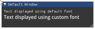
Note: Pushed fonts should be poped with
pop_font()within the same frame. In order to avoid manual push/pop functions you can use thefont()context manager.- Parameters:
font (_Font) – font object retrieved from
add_font_from_file_ttf.
Wraps API:
void PushFont(ImFont*)
- imgui.core.push_id(str str_id)
Push an ID into the ID stack
- Parameters:
str_id (str) – ID to push
- wraps::
PushID(const char* str_id)
- imgui.core.push_item_width(float item_width)
Push item width in the stack.
Note: sizing of child region allows for three modes:
0.0- default to ~2/3 of windows width>0.0- width in pixels<0.0- align xx pixels to the right of window (so -FLOAT_MIN always align width to the right side)
Note: width pushed on stack need to be poped using
pop_item_width()or it will be applied to all subsequent children components.Example:
imgui.begin("Example: item width")

# custom width
imgui.push_item_width(imgui.get_window_width() * 0.33)
imgui.text('Lorem Ipsum ...')
imgui.slider_float('float slider', 10.2, 0.0, 20.0, '%.2f', 1.0)
imgui.pop_item_width()

# default width
imgui.text('Lorem Ipsum ...')
imgui.slider_float('float slider', 10.2, 0.0, 20.0, '%.2f', 1.0)

imgui.end()
Outputs: 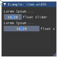
- Parameters:
item_width (float) – width of the component
Wraps API:
void PushItemWidth(float item_width)
- imgui.core.push_style_color(ImGuiCol variable, float r, float g, float b, float a=1.)
Push style color on stack.
Note: variables pushed on stack need to be popped using
pop_style_color()until the end of current frame. This implementation guards you from segfaults caused by redundant stack pops (raises exception if this happens) but generally it is safer and easier to usestyled()oristyled()context managers.Example:
imgui.begin("Example: Color variables")
imgui.push_style_color(imgui.COLOR_TEXT, 1.0, 0.0, 0.0)
imgui.text("Colored text")
imgui.pop_style_color(1)
imgui.end()
Outputs: 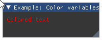
- Parameters:
variable – imgui style color constant
r (float) – red color intensity.
g (float) – green color intensity.
b (float) – blue color instensity.
a (float) – alpha intensity.
Wraps API:
PushStyleColor(ImGuiCol idx, const ImVec4& col)
- imgui.core.push_style_var(ImGuiStyleVar variable, value)
Push style variable on stack.
This function accepts both float and float two-tuples as
valueargument. ImGui core implementation will verify if passed value has type compatibile with given style variable. If not, it will raise exception.Note: variables pushed on stack need to be poped using
pop_style_var()until the end of current frame. This implementation guards you from segfaults caused by redundant stack pops (raises exception if this happens) but generally it is safer and easier to usestyled()oristyled()context managers.Example:
imgui.begin("Example: style variables")
imgui.push_style_var(imgui.STYLE_ALPHA, 0.2)
imgui.text("Alpha text")
imgui.pop_style_var(1)
imgui.end()
Outputs: 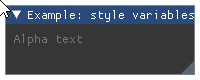
- Parameters:
variable – imgui style variable constant
value (float or two-tuple) – style variable value
Wraps API:
PushStyleVar(ImGuiStyleVar idx, float val)
- imgui.core.push_text_wrap_pos(float wrap_pos_x=0.0)
Word-wrapping function for text*() commands.
Note: wrapping position allows these modes: *
0.0- wrap to end of window (or column) *>0.0- wrap at ‘wrap_pos_x’ position in window local space *<0.0- no wrapping- Parameters:
wrap_pos_x (float) – calculated item width.
Wraps API:
float PushTextWrapPos(float wrap_pos_x = 0.0f)
- imgui.core.push_text_wrap_position()
push_text_wrap_pos(float wrap_pos_x=0.0) Word-wrapping function for text*() commands.
Note: wrapping position allows these modes: *
0.0- wrap to end of window (or column) *>0.0- wrap at ‘wrap_pos_x’ position in window local space *<0.0- no wrapping- Args:
wrap_pos_x (float): calculated item width.
Wraps API:
float PushTextWrapPos(float wrap_pos_x = 0.0f)
- imgui.core.radio_button(str label, bool active)
Display radio button widget
Example:
# note: the variable that contains the state of the radio_button, should be initialized
#       outside of the main interaction loop
radio_active = True

imgui.begin("Example: radio buttons")

if imgui.radio_button("Radio button", radio_active):
    radio_active = not radio_active

imgui.end()
Outputs: 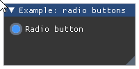
- Parameters:
label (str) – button label.
active (bool) – state of the radio button.
- Returns:
bool – True if clicked.
Wraps API:
bool RadioButton(const char* label, bool active)
- imgui.core.render()
Finalize frame, set rendering data, and run render callback (if set).
Wraps API:
void Render()
- imgui.core.reset_mouse_drag_delta(int button=0)
Reset the mouse dragging delta.
- Parameters:
button (int) – mouse button index.
Wraps API:
void ResetMouseDragDelta(int button = 0)
- imgui.core.same_line(float position=0.0, float spacing=-1.0)
Call between widgets or groups to layout them horizontally.
Example:
imgui.begin("Example: same line widgets")

imgui.text("same_line() with defaults:")
imgui.button("yes"); imgui.same_line()
imgui.button("no")

imgui.text("same_line() with fixed position:")
imgui.button("yes"); imgui.same_line(position=50)
imgui.button("no")

imgui.text("same_line() with spacing:")
imgui.button("yes"); imgui.same_line(spacing=50)
imgui.button("no")

imgui.end()
Outputs: 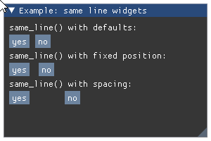
- Parameters:
position (float) – fixed horizontal position position.
spacing (float) – spacing between elements.
Wraps API:
void SameLine(float pos_x = 0.0f, float spacing_w = -1.0f)
- imgui.core.save_ini_settings_to_disk(str ini_file_name)
This is automatically called (if
io.ini_file_nameis not empty) a few seconds after any modification that should be reflected in the .ini file (and also bydestroy_context).- Parameters:
ini_file_name (str) – Filename to save settings to.
Wraps API:
void SaveIniSettingsToDisk(const char* ini_filename)
- imgui.core.save_ini_settings_to_memory()
Return a string with the .ini data which you can save by your own mean. Call when
io.want_save_ini_settingsis set, then save data by your own mean and cleario.want_save_ini_settings.- Returns:
str – Settings data
Wraps API:
const char* SaveIniSettingsToMemory(size_t* out_ini_size = NULL)
- imgui.core.selectable(str label, selected=False, ImGuiTreeNodeFlags flags=0, width=0, height=0)
Selectable text. Returns ‘true’ if the item is pressed.
Width of 0.0 will use the available width in the parent container. Height of 0.0 will use the available height in the parent container.
Example:
selected = [False, False]
imgui.begin("Example: selectable")
_, selected[0] = imgui.selectable(
    "1. I am selectable", selected[0]
)
_, selected[1] = imgui.selectable(
    "2. I am selectable too", selected[1]
)
imgui.text("3. I am not selectable")
imgui.end()
Outputs: 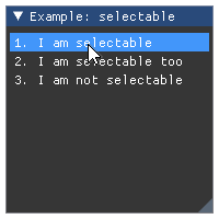
- Parameters:
label (str) – The label.
selected (bool) – defines if item is selected or not.
flags – Selectable flags. See: list of available flags.
width (float) – button width.
height (float) – button height.
- Returns:
tuple – a
(opened, selected)two-tuple indicating if item was clicked by the user and the current state of item.
Wraps API:
bool Selectable(
    const char* label,
    bool selected = false,
    ImGuiSelectableFlags flags = 0,
    const ImVec2& size = ImVec2(0,0)
)

bool Selectable(
    const char* label,
    bool* selected,
    ImGuiSelectableFlags flags = 0,
    const ImVec2& size = ImVec2(0,0)
)
- imgui.core.separator()
Add vertical line as a separator beween elements.
Example:
imgui.begin("Example: separators")

imgui.text("Some text with bullets")
imgui.bullet_text("Bullet A")
imgui.bullet_text("Bullet A")

imgui.separator()

imgui.text("Another text with bullets")
imgui.bullet_text("Bullet A")
imgui.bullet_text("Bullet A")

imgui.end()
Outputs: 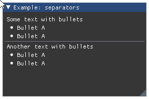
Wraps API:
void Separator()
- imgui.core.set_clipboard_text(str text)
Set the clipboard content
- Parameters:
text (str) – Text to copy in clipboard
- imgui.core.set_column_offset(int column_index, float offset_x)
Set the position of column line (in pixels, from the left side of the contents region). Pass -1 to use current column.
For a complete example see
columns().Legacy Columns API (2020: prefer using Tables!)
- Parameters:
column_index (int) – index of the column to get the offset for.
offset_x (float) – offset in pixels.
Wraps API:
void SetColumnOffset(int column_index, float offset_x)
- imgui.core.set_column_width(int column_index, float width)
Set the position of column line (in pixels, from the left side of the contents region). Pass -1 to use current column.
For a complete example see
columns().Legacy Columns API (2020: prefer using Tables!)
- Parameters:
column_index (int) – index of the column to set the width for.
width (float) – width in pixels.
Wraps API:
void SetColumnWidth(int column_index, float width)
- imgui.core.set_current_context(_ImGuiContext ctx)
SetCurrentContext
Wraps API:
SetCurrentContext(
        ImGuiContext *ctx);
- imgui.core.set_cursor_pos(local_pos)
Set the cursor position in local coordinates [0..<window size>] (useful to work with ImDrawList API)
Wraps API:
ImVec2 SetCursorScreenPos(const ImVec2& screen_pos)
- imgui.core.set_cursor_pos_x(float x)
- imgui.core.set_cursor_pos_y(float y)
- imgui.core.set_cursor_position()
set_cursor_pos(local_pos) Set the cursor position in local coordinates [0..<window size>] (useful to work with ImDrawList API)
Wraps API:
ImVec2 SetCursorScreenPos(const ImVec2& screen_pos)
- imgui.core.set_cursor_screen_pos(screen_pos)
Set the cursor position in absolute screen coordinates [0..io.DisplaySize] (useful to work with ImDrawList API)
Wraps API:
ImVec2 SetCursorScreenPos(const ImVec2& screen_pos)
- imgui.core.set_cursor_screen_position()
set_cursor_screen_pos(screen_pos) Set the cursor position in absolute screen coordinates [0..io.DisplaySize] (useful to work with ImDrawList API)
Wraps API:
ImVec2 SetCursorScreenPos(const ImVec2& screen_pos)
- imgui.core.set_drag_drop_payload(str type, bytes data, ImGuiCond condition=0)
Set the payload for a drag and drop source. Only call after
begin_drag_drop_source()returns True.Note: this is a beta API.
For a complete example see
begin_drag_drop_source().- Parameters:
type (str) – user defined type with maximum 32 bytes.
data (bytes) – the data for the payload; will be copied and stored internally.
condition (condition flag) – defines on which condition value should be set. Defaults to
imgui.ALWAYS.
Wraps API:
bool SetDragDropPayload(const char* type, const void* data, size_t size, ImGuiCond cond = 0)
- imgui.core.set_item_allow_overlap()
Allow last item to be overlapped by a subsequent item. Sometimes useful with invisible buttons, selectables, etc. to catch unused area.
Wraps API:
void SetItemAllowOverlap()
- imgui.core.set_item_default_focus()
Make last item the default focused item of a window. Please use instead of “if (is_window_appearing()) set_scroll_here()” to signify “default item”.
Wraps API:
void SetItemDefaultFocus()
- imgui.core.set_keyboard_focus_here(int offset=0)
Focus keyboard on the next widget. Use positive ‘offset’ to access sub components of a multiple component widget. Use -1 to access previous widget.
Wraps API:
void SetKeyboardFocusHere(int offset = 0)
- imgui.core.set_mouse_cursor(ImGuiMouseCursor mouse_cursor_type)
Set the mouse cursor id.
- Parameters:
mouse_cursor_type (ImGuiMouseCursor) – mouse cursor type.
Wraps API:
void SetMouseCursor(ImGuiMouseCursor type)
- imgui.core.set_next_item_open(bool is_open, ImGuiCond condition=0)
Set next TreeNode/CollapsingHeader open state.
- Parameters:
is_open (bool)
condition (condition flag) – defines on which condition value should be set. Defaults to
imgui.NONE.
Wraps API:
void SetNextItemOpen(bool is_open, ImGuiCond cond = 0)
- imgui.core.set_next_item_width(float item_width)
Set width of the _next_ common large “item+label” widget. *
>0.0- width in pixels *<0.0- align xx pixels to the right of window (so -FLOAT_MIN always align width to the right side)Helper to avoid using
push_item_width()/pop_item_width()for single items.- Parameters:
item_width (float) – width of the component
Example:
imgui.begin("Exemple: Next item width")
imgui.set_next_item_width(imgui.get_window_width() * 0.33)
imgui.slider_float('Slider 1', 10.2, 0.0, 20.0, '%.2f', 1.0)
imgui.slider_float('Slider 2', 10.2, 0.0, 20.0, '%.2f', 1.0)
imgui.end()
Outputs: 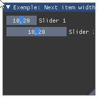
Wraps API:
void SetNextItemWidth(float item_width)
- imgui.core.set_next_window_bg_alpha(float alpha)
set next window background color alpha. helper to easily modify ImGuiCol_WindowBg/ChildBg/PopupBg.
Wraps API:
void SetNextWindowBgAlpha(float)
- imgui.core.set_next_window_collapsed(bool collapsed, ImGuiCond condition=ALWAYS)
Set next window collapsed state.
Example:
imgui.set_next_window_collapsed(True)
imgui.begin("Example: collapsed window")
imgui.end()
Outputs: 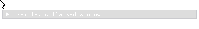
- Parameters:
collapsed (bool) – set to True if window has to be collapsed.
condition (condition flag) – defines on which condition value should be set. Defaults to
imgui.ALWAYS.
Wraps API:
void SetNextWindowCollapsed(
    bool collapsed, ImGuiCond cond = 0
)
- imgui.core.set_next_window_content_size(float width, float height)
- Set content size of the next window. Show scrollbars
if content doesn’t fit in the window
Call before
begin().- Parameters:
width (float) – width of the content area
height (float) – height of the content area
Example:
imgui.set_window_size(20,20)
imgui.set_next_window_content_size(100,100)

imgui.begin("Window", True)
imgui.text("Some example text")
imgui.end()
Outputs: 
Wraps API:
void SetNextWindowContentSize(
    const ImVec2& size
)
- imgui.core.set_next_window_focus()
Set next window to be focused (most front).
Wraps API:
void SetNextWindowFocus()
- imgui.core.set_next_window_position(float x, float y, ImGuiCond condition=ALWAYS, float pivot_x=0, float pivot_y=0)
Set next window position.
Call before
begin().- Parameters:
x (float) – x window coordinate
y (float) – y window coordinate
condition (condition flag) – defines on which condition value should be set. Defaults to
imgui.ALWAYS.pivot_x (float) – pivot x window coordinate
pivot_y (float) – pivot y window coordinate
Example:
imgui.set_next_window_size(20, 20)

for index in range(5):
    imgui.set_next_window_position(index * 40, 5)
    imgui.begin(str(index))
    imgui.end()
Outputs: 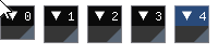
Wraps API:
void SetNextWindowPos(
    const ImVec2& pos,
    ImGuiCond cond = 0,
    const ImVec2& pivot = ImVec2(0,0)
)
- imgui.core.set_next_window_size(float width, float height, ImGuiCond condition=ALWAYS)
Set next window size.
Call before
begin().- Parameters:
width (float) – window width. Value 0.0 enables autofit.
height (float) – window height. Value 0.0 enables autofit.
condition (condition flag) – defines on which condition value should be set. Defaults to
imgui.ALWAYS.
Example:
imgui.set_next_window_position(io.display_size.x * 0.5, io.display_size.y * 0.5, 1, pivot_x = 0.5, pivot_y = 0.5)

imgui.set_next_window_size(80, 180)
imgui.begin("High")
imgui.end()
Outputs: 
Wraps API:
void SetNextWindowSize( const ImVec2& size, ImGuiCond cond = 0 )
- imgui.core.set_next_window_size_constraints(tuple size_min, tuple size_max, callback=None, user_data=None)
Set next window size limits. use -1,-1 on either X/Y axis to preserve the current size. Sizes will be rounded down.
Call before
begin().- Parameters:
size_min (tuple) – Minimum window size, use -1 to conserve current size
size_max (tuple) – Maximum window size, use -1 to conserve current size
callback (callable) – a callable. Callable takes an imgui._ImGuiSizeCallbackData object as argument Callable should return None
user_data – Any data that the user want to use in the callback.
Example:
imgui.set_next_window_size_constraints((175,50), (200, 100)) imgui.begin("Constrained Window") imgui.text("...") imgui.end()
Outputs: 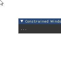
Wraps API:
void SetNextWindowSizeConstraints( const ImVec2& size_min, const ImVec2& size_max, ImGuiSizeCallback custom_callback = NULL, void* custom_callback_user_data = NULL )
- imgui.core.set_scroll_from_pos_x(float local_x, float center_x_ratio=0.5)
Set scroll from position X
Adjust scrolling amount to make given position visible. Generally GetCursorStartPos() + offset to compute a valid position.
- Parameters:
float local_x
float center_x_ratio = 0.5f
Wraps API:
void SetScrollFromPosX(float local_x, float center_x_ratio = 0.5f)
- imgui.core.set_scroll_from_pos_y(float local_y, float center_y_ratio=0.5)
Set scroll from position Y
Adjust scrolling amount to make given position visible. Generally GetCursorStartPos() + offset to compute a valid position.
- Parameters:
float local_y
float center_y_ratio = 0.5f
Wraps API:
void SetScrollFromPosY(float local_y, float center_y_ratio = 0.5f)
- imgui.core.set_scroll_here_x(float center_x_ratio=0.5)
Set scroll here X.
Adjust scrolling amount to make current cursor position visible. center_x_ratio = 0.0: left, 0.5: center, 1.0: right.
When using to make a “default/current item” visible, consider using SetItemDefaultFocus() instead.
- Parameters:
float center_x_ratio = 0.5f
Wraps API:
void SetScrollHereX(float center_x_ratio = 0.5f)
- imgui.core.set_scroll_here_y(float center_y_ratio=0.5)
Set scroll here Y.
Adjust scrolling amount to make current cursor position visible. center_y_ratio = 0.0: top, 0.5: center, 1.0: bottom.
When using to make a “default/current item” visible, consider using SetItemDefaultFocus() instead.
- Parameters:
float center_y_ratio = 0.5f
Wraps API:
void SetScrollHereY(float center_y_ratio = 0.5f)
- imgui.core.set_scroll_x(float scroll_x)
set scrolling amount [0..SetScrollMaxX()]
Wraps API:
int SetScrollX(float)
- imgui.core.set_scroll_y(float scroll_y)
set scrolling amount [0..SetScrollMaxY()]
Wraps API:
int SetScrollY(flot)
- imgui.core.set_tab_item_closed(str tab_or_docked_window_label)
Notify TabBar or Docking system of a closed tab/window ahead (useful to reduce visual flicker on reorderable tab bars). For tab-bar: call after BeginTabBar() and before Tab submissions. Otherwise call with a window name.
- Parameters:
tab_or_docked_window_label (str) – Label of the targeted tab or docked window
- imgui.core.set_tooltip(str text)
Set tooltip under mouse-cursor.
Usually used with
is_item_hovered(). For a complex tooltip window seebegin_tooltip().Example:
imgui.begin("Example: tooltip") imgui.button("Hover me!") if imgui.is_item_hovered(): imgui.set_tooltip("Please?") imgui.end()
Outputs: 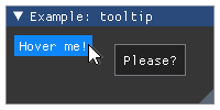
Wraps API:
void SetTooltip(const char* fmt, ...)
- imgui.core.set_window_collapsed(bool collapsed, ImGuiCond condition=ALWAYS)
Set the current window to be collapsed
Call inside: func: ‘begin()’
- Parameters:
collapsed (bool) – set boolean for collapsing the window. Set True for closed
condition (condition flag) – defines on which condition value should be set. Defaults to
imgui.ALWAYS.
Example:
imgui.begin("Window 1") imgui.set_window_collapsed(True) imgui.end()
Outputs: 
Wraps API:
void SetWindowCollapsed( bool collapsed, ImGuiCond cond )
- imgui.core.set_window_collapsed_labeled(str label, bool collapsed, ImGuiCond condition=ALWAYS)
Set window with label to collapse
- Parameters:
label (string) – name of the window
collapsed (bool) – set boolean for collapsing the window. Set True for closed
condition (condition flag) – defines on which condition value should be set. Defaults to
imgui.ALWAYS.
Example:
imgui.set_window_collapsed_labeled("Window 1", True) imgui.begin("Window 1") imgui.end()
Outputs:
Wraps API:
void SetWindowCollapsed( const char* name, bool collapsed, ImGuiCond cond )
- imgui.core.set_window_focus()
Set window to be focused
Call inside
begin().Example:
imgui.begin("Window 1") imgui.end() imgui.begin("Window 2") imgui.set_window_focus() imgui.end()
Outputs: 
Wraps API:
void SetWindowFocus()
- imgui.core.set_window_focus_labeled(str label)
Set focus to the window named label
- Parameters:
label (string) – the name of the window that will be focused
Example:
imgui.set_window_focus_labeled("Window 2") imgui.begin("Window 1", True) imgui.text("Apples") imgui.end() imgui.begin("Window 2", True) imgui.text("Orange") imgui.end() imgui.begin("Window 3", True) imgui.text("Mango") imgui.end()
Outputs:
Wraps API:
void SetWindowFocus( const char* name )
- imgui.core.set_window_font_scale(float scale)
Adjust per-window font scale for current window.
Function should be called inside window context so after calling
begin().Note: use
get_io().font_global_scaleif you want to scale all windows.Example:
imgui.begin("Example: font scale") imgui.set_window_font_scale(2.0) imgui.text("Bigger font") imgui.end()
Outputs: 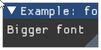
- Parameters:
scale (float) – font scale
Wraps API:
void SetWindowFontScale(float scale)
- imgui.core.set_window_position(float x, float y, ImGuiCond condition=ALWAYS)
Set the size of the current window
Call inside: func: ‘begin()’
- Parameters:
x (float) – position on the x axis
y (float) – position on the y axis
condition (condition flag) – defines on which condition value should be set. Defaults to
imgui.ALWAYS.
Example:
imgui.begin("Window 1") imgui.set_window_position(20,20) imgui.end() imgui.begin("Window 2") imgui.set_window_position(20,50) imgui.end()
Outputs: 
Wraps API:
void SetWindowPos( const ImVec2& pos, ImGuiCond cond )
- imgui.core.set_window_position_labeled(str label, float x, float y, ImGuiCond condition=ALWAYS)
Set the size of the window with label
- Parameters:
label (str) – name of the window to be resized
x (float) – position on the x axis
y (float) – position on the y axis
condition (condition flag) – defines on which condition value should be set. Defaults to
imgui.ALWAYS.
Example:
imgui.set_window_position_labeled("Window 1", 20, 50) imgui.set_window_position_labeled("Window 2", 20, 100) imgui.begin("Window 1") imgui.end() imgui.begin("Window 2") imgui.end()
Outputs:
Wraps API:
void SetWindowPos( const char* name, const ImVec2& pos, ImGuiCond cond )
- imgui.core.set_window_size(float width, float height, ImGuiCond condition=ONCE)
Set window size
Call inside
begin().Note: usage of this function is not recommended. prefer using
set_next_window_size()as this may incur tearing and minor side-effects.- Parameters:
width (float) – window width. Value 0.0 enables autofit.
height (float) – window height. Value 0.0 enables autofit.
condition (condition flag) – defines on which condition value should be set. Defaults to
imgui.ONCE.
Example:
imgui.begin("Window size") imgui.set_window_size(80, 180) imgui.end()
Outputs:
Wraps API:
void SetWindowSize( const ImVec2& size, ImGuiCond cond = 0, )
- imgui.core.set_window_size_named(str label, float width, float height, ImGuiCond condition=ONCE)
Set the window with label to some size
- Parameters:
label (string) – name of the window
width (float) – new width of the window
height (float) – new height of the window
condition (condition flag) – defines on which condition value should be set. Defaults to
imgui.ONCE.
Example:
imgui.set_window_size_named("Window 1",100,100) imgui.set_window_size_named("Window 2",100,200) imgui.begin("Window 1") imgui.end() imgui.begin("Window 2") imgui.end()
Outputs: 
Wraps API:
void SetWindowSize( const char* name, const ImVec2& size, ImGuiCond cond )
- imgui.core.show_about_window(closable=False)
Create About window. Display Dear ImGui version, credits and build/system information.
- Parameters:
closable (bool) – define if window is closable
- Returns:
bool – True if window is not closed (False trigerred by close button).
Wraps API:
void ShowAboutWindow(bool* p_open = NULL)
- imgui.core.show_demo_window(closable=False)
Show ImGui demo window.
Example:
imgui.show_demo_window()
Outputs: 
- Parameters:
closable (bool) – define if window is closable.
- Returns:
bool – True if window is not closed (False trigerred by close button).
Wraps API:
void ShowDemoWindow(bool* p_open = NULL)
- imgui.core.show_font_selector(str label)
- imgui.core.show_metrics_window(closable=False)
Show ImGui metrics window.
Example:
imgui.show_metrics_window()
Outputs: 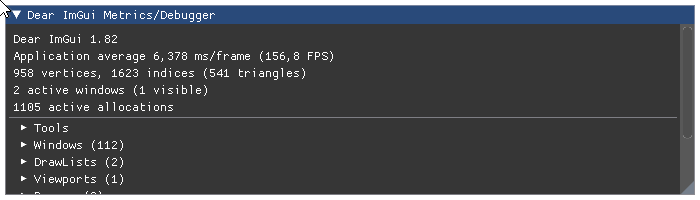
- Parameters:
closable (bool) – define if window is closable.
- Returns:
bool – True if window is not closed (False trigerred by close button).
Wraps API:
void ShowMetricsWindow(bool* p_open = NULL)
- imgui.core.show_style_editor(GuiStyle style=None)
Show ImGui style editor.
Example:
imgui.begin("Example: my style editor") imgui.show_style_editor() imgui.end()
Outputs: 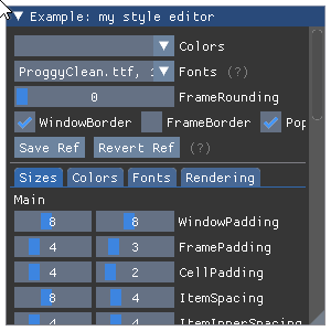
- Parameters:
style (GuiStyle) – style editor state container.
Wraps API:
void ShowStyleEditor(ImGuiStyle* ref = NULL)
- imgui.core.show_style_selector(str label)
- imgui.core.show_test_window()
Show ImGui demo window.
Example:
imgui.show_test_window()
Outputs: 
Wraps API:
void ShowDemoWindow()
- imgui.core.show_user_guide()
Show ImGui user guide editor.
Example:
imgui.begin("Example: user guide") imgui.show_user_guide() imgui.end()
Outputs: 
Wraps API:
void ShowUserGuide()
- imgui.core.slider_angle(str label, float rad_value, float value_degrees_min=-360.0, float value_degrees_max=360, str format='%.0f deg', ImGuiSliderFlags flags=0)
Display angle slider widget.
Example:
radian = 3.1415/4 imgui.begin("Example: slider angle") changed, radian = imgui.slider_angle( "slider angle", radian, value_degrees_min=0.0, value_degrees_max=180.0) imgui.text("Changed: %s, Value: %s" % (changed, radian)) imgui.end()
Outputs: 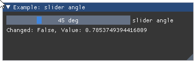
- Parameters:
labal (str) – widget label
rad_value (float) – slider value in radian
value_degrees_min (float) – min value allowed in degrees
value_degrees_max (float) – max value allowed in degrees
format (str) – display format string as C-style
printfformat string. Warning: highly unsafe.flags – SliderFlags flags. See: list of available flags.
- Returns:
tuple – a
(changed, rad_value)tuple that contains indicator of widget state change and the current slider value in radian.
Wraps API:
bool SliderAngle( const char* label, float* v_rad, float v_degrees_min = -360.0f, float v_degrees_max = +360.0f, const char* format = "%.0f deg", ImGuiSliderFlags flags = 0 )
- imgui.core.slider_float(str label, float value, float min_value, float max_value, str format='%.3f', ImGuiSliderFlags flags=0, float power=1.0)
Display float slider widget. Manually input values aren’t clamped and can go off-bounds.
Example:
value = 88.2 imgui.begin("Example: slider float") changed, value = imgui.slider_float( "slide floats", value, min_value=0.0, max_value=100.0, format="%.0f" ) imgui.text("Changed: %s, Value: %s" % (changed, value)) imgui.end()
Outputs: 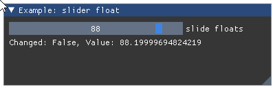
- Parameters:
label (str) – widget label.
value (float) – slider values.
min_value (float) – min value allowed by widget.
max_value (float) – max value allowed by widget.
format (str) – display format string as C-style
printfformat string. Warning: highly unsafe. Seeslider_float().flags – SliderFlags flags. See: list of available flags.
power (float) – OBSOLETED in ImGui 1.78 (from June 2020)
- Returns:
tuple – a
(changed, values)tuple that contains indicator of widget state change and the current slider value.
Wraps API:
bool SliderFloat( const char* label, float v, float v_min, float v_max, const char* format = "%.3f", ImGuiSliderFlags flags = 0 )
- imgui.core.slider_float2(str label, float value0, float value1, float min_value, float max_value, str format='%.3f', ImGuiSliderFlags flags=0, float power=1.0)
Display float slider widget with 2 values. Manually input values aren’t clamped and can go off-bounds.
Example:
values = 88.2, 42.6 imgui.begin("Example: slider float2") changed, values = imgui.slider_float2( "slide floats", *values, min_value=0.0, max_value=100.0, format="%.0f" ) imgui.text("Changed: %s, Values: %s" % (changed, values)) imgui.end()
Outputs: 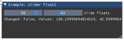
- Parameters:
label (str) – widget label.
value0, value1 (float) – slider values.
min_value (float) – min value allowed by widget.
max_value (float) – max value allowed by widget.
format (str) – display format string as C-style
printfformat string. Warning: highly unsafe. Seeslider_float().flags – SliderFlags flags. See: list of available flags.
power (float) – OBSOLETED in ImGui 1.78 (from June 2020)
- Returns:
tuple – a
(changed, values)tuple that contains indicator of widget state change and the tuple of current slider values.
Wraps API:
bool SliderFloat2( const char* label, float v[2], float v_min, float v_max, const char* format = "%.3f", ImGuiSliderFlags flags = 0 )
- imgui.core.slider_float3(str label, float value0, float value1, float value2, float min_value, float max_value, str format='%.3f', ImGuiSliderFlags flags=0, float power=1.0)
Display float slider widget with 3 values. Manually input values aren’t clamped and can go off-bounds.
Example:
values = 88.2, 42.6, 69.1 imgui.begin("Example: slider float3") changed, values = imgui.slider_float3( "slide floats", *values, min_value=0.0, max_value=100.0, format="%.0f" ) imgui.text("Changed: %s, Values: %s" % (changed, values)) imgui.end()
Outputs: 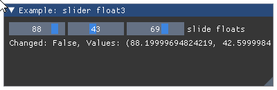
- Parameters:
label (str) – widget label.
value0, value1, value2 (float) – slider values.
min_value (float) – min value allowed by widget.
max_value (float) – max value allowed by widget.
format (str) – display format string as C-style
printfformat string. Warning: highly unsafe. Seeslider_float().flags – SliderFlags flags. See: list of available flags.
power (float) – OBSOLETED in ImGui 1.78 (from June 2020)
- Returns:
tuple – a
(changed, values)tuple that contains indicator of widget state change and the tuple of current slider values.
Wraps API:
bool SliderFloat3( const char* label, float v[3], float v_min, float v_max, const char* format = "%.3f", ImGuiSliderFlags flags = 0 )
- imgui.core.slider_float4(str label, float value0, float value1, float value2, float value3, float min_value, float max_value, str format='%.3f', ImGuiSliderFlags flags=0, float power=1.0)
Display float slider widget with 4 values. Manually input values aren’t clamped and can go off-bounds.
Example:
values = 88.2, 42.6, 69.1, 0.3 imgui.begin("Example: slider float4") changed, values = imgui.slider_float4( "slide floats", *values, min_value=0.0, max_value=100.0, format="%.0f" ) imgui.text("Changed: %s, Values: %s" % (changed, values)) imgui.end()
Outputs: 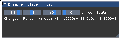
- Parameters:
label (str) – widget label.
value0, value1, value2, value3 (float) – slider values.
min_value (float) – min value allowed by widget.
max_value (float) – max value allowed by widget.
format (str) – display format string as C-style
printfformat string. Warning: highly unsafe. Seeslider_float().flags – SliderFlags flags. See: list of available flags.
power (float) – OBSOLETED in ImGui 1.78 (from June 2020)
- Returns:
tuple – a
(changed, values)tuple that contains indicator of widget state change and the tuple of current slider values.
Wraps API:
bool SliderFloat4( const char* label, float v[4], float v_min, float v_max, const char* format = "%.3f", ImGuiSliderFlags flags = 0 )
- imgui.core.slider_int(str label, int value, int min_value, int max_value, str format='%.f', ImGuiSliderFlags flags=0)
Display int slider widget
Example:
value = 88 imgui.begin("Example: slider int") changed, values = imgui.slider_int( "slide ints", value, min_value=0, max_value=100, format="%d" ) imgui.text("Changed: %s, Values: %s" % (changed, value)) imgui.end()
Outputs: 
- Parameters:
label (str) – widget label.
value (int) – slider value.
min_value (int) – min value allowed by widget.
max_value (int) – max value allowed by widget.
format (str) – display format string as C-style
printfformat string. Warning: highly unsafe. Seeslider_int().flags – SliderFlags flags. See: list of available flags.
- Returns:
tuple – a
(changed, value)tuple that contains indicator of widget state change and the slider value.
Wraps API:
bool SliderInt( const char* label, int v, int v_min, int v_max, const char* format = "%.3f", ImGuiSliderFlags flags = 0 )
- imgui.core.slider_int2(str label, int value0, int value1, int min_value, int max_value, str format='%.f', ImGuiSliderFlags flags=0)
Display int slider widget with 2 values.
Example:
values = 88, 27 imgui.begin("Example: slider int2") changed, values = imgui.slider_int2( "slide ints2", *values, min_value=0, max_value=100, format="%d" ) imgui.text("Changed: %s, Values: %s" % (changed, values)) imgui.end()
Outputs: 
- Parameters:
label (str) – widget label.
value0, value1 (int) – slider values.
min_value (int) – min value allowed by widget.
max_value (int) – max value allowed by widget.
format (str) – display format string as C-style
printfformat string. Warning: highly unsafe. Seeslider_int().flags – SliderFlags flags. See: list of available flags.
- Returns:
tuple – a
(changed, values)tuple that contains indicator of widget state change and the tuple of current slider values.
Wraps API:
bool SliderInt2( const char* label, int v[2], int v_min, int v_max, const char* format = "%.3f", ImGuiSliderFlags flags = 0 )
- imgui.core.slider_int3(str label, int value0, int value1, int value2, int min_value, int max_value, str format='%.f', ImGuiSliderFlags flags=0)
Display int slider widget with 3 values.
Example:
values = 88, 27, 3 imgui.begin("Example: slider int3") changed, values = imgui.slider_int3( "slide ints3", *values, min_value=0, max_value=100, format="%d" ) imgui.text("Changed: %s, Values: %s" % (changed, values)) imgui.end()
Outputs: 
- Parameters:
label (str) – widget label.
value0, value1, value2 (int) – slider values.
min_value (int) – min value allowed by widget.
max_value (int) – max value allowed by widget.
format (str) – display format string as C-style
printfformat string. Warning: highly unsafe. Seeslider_int().flags – SliderFlags flags. See: list of available flags.
- Returns:
tuple – a
(changed, values)tuple that contains indicator of widget state change and the tuple of current slider values.
Wraps API:
bool SliderInt3( const char* label, int v[3], int v_min, int v_max, const char* format = "%.3f", ImGuiSliderFlags flags = 0 )
- imgui.core.slider_int4(str label, int value0, int value1, int value2, int value3, int min_value, int max_value, str format='%.f', ImGuiSliderFlags flags=0)
Display int slider widget with 4 values.
Example:
values = 88, 42, 69, 0 imgui.begin("Example: slider int4") changed, values = imgui.slider_int4( "slide ints", *values, min_value=0, max_value=100, format="%d" ) imgui.text("Changed: %s, Values: %s" % (changed, values)) imgui.end()
Outputs: 
- Parameters:
label (str) – widget label.
value0, value1, value2, value3 (int) – slider values.
min_value (int) – min value allowed by widget.
max_value (int) – max value allowed by widget.
format (str) – display format string as C-style
printfformat string. Warning: highly unsafe. Seeslider_int().flags – SliderFlags flags. See: list of available flags.
- Returns:
tuple – a
(changed, values)tuple that contains indicator of widget state change and the tuple of current slider values.
Wraps API:
bool SliderInt4( const char* label, int v[4], int v_min, int v_max, const char* format = "%.3f", ImGuiSliderFlags flags = 0 )
- imgui.core.slider_scalar(str label, ImGuiDataType data_type, bytes data, bytes min_value, bytes max_value, str format=None, ImGuiSliderFlags flags=0)
Display scalar slider widget. Data is passed via
bytesand the type is separatelly given usingdata_type. This is useful to work with specific types (e.g. unsigned 8bit integer, float, double) like when interfacing with Numpy.- Parameters:
label (str) – widget label
data_type – ImGuiDataType enum, type of the given data
data (bytes) – data value as a bytes array
min_value (bytes) – min value allowed by widget
max_value (bytes) – max value allowed by widget
format (str) – display format string as C-style
printfformat string. Warning: highly unsafe. Seedrag_int().flags – ImGuiSlider flags. See: list of available flags.
- Returns:
tuple – a
(changed, value)tuple that contains indicator of slider state change and the current slider content.
Wraps API:
bool SliderScalar( const char* label, ImGuiDataType data_type, void* p_data, const void* p_min, const void* p_max, const char* format = NULL, ImGuiSliderFlags flags = 0 )
- imgui.core.slider_scalar_N(str label, ImGuiDataType data_type, bytes data, int components, bytes min_value, bytes max_value, str format=None, ImGuiSliderFlags flags=0)
Display multiple scalar slider widget. Data is passed via
bytesand the type is separatelly given usingdata_type. This is useful to work with specific types (e.g. unsigned 8bit integer, float, double) like when interfacing with Numpy.- Parameters:
label (str) – widget label
data_type – ImGuiDataType enum, type of the given data
data (bytes) – data value as a bytes array
components (int) – number of widgets
min_value (bytes) – min value allowed by widget
max_value (bytes) – max value allowed by widget
format (str) – display format string as C-style
printfformat string. Warning: highly unsafe. Seedrag_int().flags – ImGuiSlider flags. See: list of available flags.
- Returns:
tuple – a
(changed, value)tuple that contains indicator of slider state change and the current slider content.
Wraps API:
bool SliderScalarN( const char* label, ImGuiDataType data_type, void* p_data, int components, const void* p_min, const void* p_max, const char* format = NULL, ImGuiSliderFlags flags = 0 )
- imgui.core.small_button(str label)
Display small button (with 0 frame padding).
Example:
imgui.begin("Example: button") imgui.small_button("Button 1") imgui.small_button("Button 2") imgui.end()
Outputs: 
- Parameters:
label (str) – button label.
- Returns:
bool – True if clicked.
Wraps API:
bool SmallButton(const char* label)
- imgui.core.spacing()
Add vertical spacing beween elements.
Example:
imgui.begin("Example: vertical spacing") imgui.text("Some text with bullets:") imgui.bullet_text("Bullet A") imgui.bullet_text("Bullet A") imgui.spacing(); imgui.spacing() imgui.text("Another text with bullets:") imgui.bullet_text("Bullet A") imgui.bullet_text("Bullet A") imgui.end()
Outputs: 
Wraps API:
void Spacing()
- imgui.core.style_colors_classic(GuiStyle dst=None)
Set the style to Classic.
classic imgui style.
Wraps API:
void StyleColorsClassic(ImGuiStyle* dst = NULL)
- imgui.core.style_colors_dark(GuiStyle dst=None)
Set the style to Dark.
new, recommended style (default)
Wraps API:
void StyleColorsDark(ImGuiStyle* dst = NULL)
- imgui.core.style_colors_light(GuiStyle dst=None)
Set the style to Light.
best used with borders and a custom, thicker font
Wraps API:
void StyleColorsLight(ImGuiStyle* dst = NULL)
- imgui.core.tab_item_button(str label, ImGuiTabItemFlags flags=0)
Create a Tab behaving like a button. Cannot be selected in the tab bar.
- Parameters:
label (str) – Label of the button
flags – ImGuiTabItemFlags flags. See: list of available flags.
- Returns:
(bool) – Return true when clicked.
Wraps API:
bool TabItemButton(const char* label, ImGuiTabItemFlags flags = 0)
- imgui.core.table_get_column_count()
Wraps API:
int TableGetColumnCount()
- imgui.core.table_get_column_flags(int column_n=-1)
Wraps API:
ImGuiTableColumnFlags TableGetColumnFlags( int column_n = -1 )
- imgui.core.table_get_column_index()
Wraps API:
int TableGetColumnIndex()
- imgui.core.table_get_column_name(int column_n=-1)
Wraps API:
const char* TableGetColumnName( int column_n = -1 )
- imgui.core.table_get_row_index()
Wraps API:
int TableGetRowIndex()
- imgui.core.table_get_sort_specs()
Wraps API:
ImGuiTableSortSpecs* TableGetSortSpecs()
- imgui.core.table_header(str label)
Wraps API:
void TableHeader(const char* label)
- imgui.core.table_headers_row()
Wraps API:
void TableHeadersRow()
- imgui.core.table_next_column()
Wraps API:
bool TableNextColumn()
- imgui.core.table_next_row(ImGuiTableRowFlags row_flags=0, float min_row_height=0.0)
Wraps API:
void TableNextRow( ImGuiTableRowFlags row_flags = 0, float min_row_height = 0.0f )
- imgui.core.table_set_background_color(ImGuiTableBgTarget target, ImU32 color, int column_n=-1)
Wraps API:
void TableSetBgColor( ImGuiTableBgTarget target, ImU32 color, int column_n = -1 )
- imgui.core.table_set_column_index(int column_n)
Wraps API:
bool TableSetColumnIndex(int column_n)
- imgui.core.table_setup_column(str label, ImGuiTableColumnFlags flags=0, float init_width_or_weight=0.0, ImU32 user_id=0)
Wraps API:
void TableSetupColumn( const char* label, ImGuiTableColumnFlags flags = 0, float init_width_or_weight = 0.0f, ImU32 user_id = 0 )
- imgui.core.table_setup_scroll_freeze(int cols, int rows)
Wraps API:
void TableSetupScrollFreeze(int cols, int rows)
- imgui.core.text(str text)
Add text to current widget stack.
Example:
imgui.begin("Example: simple text") imgui.text("Simple text") imgui.end()
Outputs: 
- Parameters:
text (str) – text to display.
Wraps API:
Text(const char* fmt, ...)
- imgui.core.text_colored(str text, float r, float g, float b, float a=1.)
Add colored text to current widget stack.
It is a shortcut for:
imgui.push_style_color(imgui.COLOR_TEXT, r, g, b, a) imgui.text(text) imgui.pop_style_color()
Example:
imgui.begin("Example: colored text") imgui.text_colored("Colored text", 1, 0, 0) imgui.end()
Outputs: 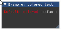
- Parameters:
text (str) – text to display.
r (float) – red color intensity.
g (float) – green color intensity.
b (float) – blue color instensity.
a (float) – alpha intensity.
Wraps API:
TextColored(const ImVec4& col, const char* fmt, ...)
- imgui.core.text_disabled(str text)
Add disabled(grayed out) text to current widget stack.
Example:
imgui.begin("Example: disabled text") imgui.text_disabled("Disabled text") imgui.end()
Outputs: 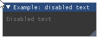
- Parameters:
text (str) – text to display.
Wraps API:
TextDisabled(const char*, ...)
- imgui.core.text_unformatted(str text)
Big area text display - the size is defined by it’s container. Recommended for long chunks of text.
Example:
imgui.begin("Example: unformatted text") imgui.text_unformatted("Really ... long ... text") imgui.end()
Outputs:
- Parameters:
text (str) – text to display.
Wraps API:
TextUnformatted(const char* text, const char* text_end = NULL)
- imgui.core.text_wrapped(str text)
Add wrappable text to current widget stack.
Example:
imgui.begin("Text wrap") # Resize the window to see text wrapping imgui.text_wrapped("This text will wrap around.") imgui.end()
Outputs: 
- Parameters:
text (str) – text to display
Wraps API:
TextWrapped(const char* fmt, ...)
- imgui.core.tree_node(str text, ImGuiTreeNodeFlags flags=0)
Draw a tree node.
Returns ‘true’ if the node is drawn, call
tree_pop()to finish.Example:
imgui.begin("Example: tree node") if imgui.tree_node("Expand me!", imgui.TREE_NODE_DEFAULT_OPEN): imgui.text("Lorem Ipsum") imgui.tree_pop() imgui.end()
Outputs: 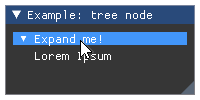
- Parameters:
text (str) – Tree node label
flags – TreeNode flags. See: list of available flags.
- Returns:
bool – True if tree node is displayed (opened).
Wraps API:
bool TreeNode(const char* label) bool TreeNodeEx(const char* label, ImGuiTreeNodeFlags flags = 0)
- imgui.core.tree_pop()
Called to clear the tree nodes stack and return back the identation.
For a tree example see
tree_node(). Same as calls tounindent()andpop_id().Wraps API:
void TreePop()
- imgui.core.unindent(float width=0.0)
Move content to left by indent width.
Example:
imgui.begin("Example: item unindenting") imgui.text("Some text with bullets:") imgui.bullet_text("Bullet A") imgui.unindent(10) imgui.bullet_text("Bullet B (first unindented)") imgui.bullet_text("Bullet C (unindent continues)") imgui.indent(10) imgui.bullet_text("Bullet C (unindent cleared)") imgui.end()
Outputs: 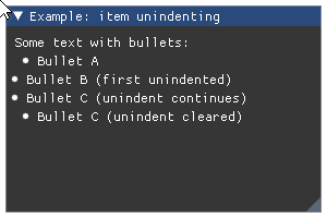
- Parameters:
width (float) – fixed width of indent. If less or equal 0 it defaults to global indent spacing or value set using style value stack (see
push_style_var).
Wraps API:
void Unindent(float indent_w = 0.0f)
- imgui.core.v_slider_float(str label, float width, float height, float value, float min_value, float max_value, str format='%.f', ImGuiSliderFlags flags=0)
Display vertical float slider widget with the specified width and height.
Example:
width = 20 height = 100 value = 88 imgui.begin("Example: vertical slider float") changed, values = imgui.v_slider_float( "vertical slider float", width, height, value, min_value=0, max_value=100, format="%0.3f", flags=imgui.SLIDER_FLAGS_NONE ) imgui.text("Changed: %s, Values: %s" % (changed, values)) imgui.end()
Outputs: 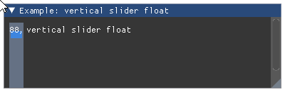
- Parameters:
label (str) – widget label.
value (float) – slider value.
min_value (float) – min value allowed by widget.
max_value (float) – max value allowed by widget.
format (str) – display format string as C-style
printfformat string. Warning: highly unsafe. Seeslider_float().flags – SliderFlags flags. See: list of available flags.
- Returns:
tuple – a
(changed, value)tuple that contains indicator of widget state change and the slider value.
Wraps API:
bool VSliderFloat( const char* label, const ImVec2& size, float v, float v_min, floatint v_max, const char* format = "%.3f", ImGuiSliderFlags flags = 0 )
- imgui.core.v_slider_int(str label, float width, float height, int value, int min_value, int max_value, str format='%d', ImGuiSliderFlags flags=0)
Display vertical int slider widget with the specified width and height.
Example:
width = 20 height = 100 value = 88 imgui.begin("Example: vertical slider int") changed, values = imgui.v_slider_int( "vertical slider int", width, height, value, min_value=0, max_value=100, format="%d" ) imgui.text("Changed: %s, Values: %s" % (changed, values)) imgui.end()
Outputs: 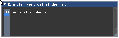
- Parameters:
label (str) – widget label.
value (int) – slider value.
min_value (int) – min value allowed by widget.
max_value (int) – max value allowed by widget.
format (str) – display format string as C-style
printfformat string. Warning: highly unsafe. Seeslider_int().flags – SliderFlags flags. See: list of available flags.
- Returns:
tuple – a
(changed, value)tuple that contains indicator of widget state change and the slider value.
Wraps API:
bool VSliderInt( const char* label, const ImVec2& size, int v, int v_min, int v_max, const char* format = "%.3f", ImGuiSliderFlags flags = 0 )
- imgui.core.v_slider_scalar(str label, float width, float height, ImGuiDataType data_type, bytes data, bytes min_value, bytes max_value, str format=None, ImGuiSliderFlags flags=0)
Display vertical scalar slider widget. Data is passed via
bytesand the type is separatelly given usingdata_type. This is useful to work with specific types (e.g. unsigned 8bit integer, float, double) like when interfacing with Numpy.- Parameters:
label (str) – widget label
width (float) – width of the slider
height (float) – height of the slider
data_type – ImGuiDataType enum, type of the given data
data (bytes) – data value as a bytes array
min_value (bytes) – min value allowed by widget
max_value (bytes) – max value allowed by widget
format (str) – display format string as C-style
printfformat string. Warning: highly unsafe. Seedrag_int().flags – ImGuiSlider flags. See: list of available flags.
- Returns:
tuple – a
(changed, value)tuple that contains indicator of slider state change and the current slider content.
Wraps API:
bool VSliderScalar( const char* label, const ImVec2& size, ImGuiDataType data_type, void* p_data, const void* p_min, const void* p_max, const char* format = NULL, ImGuiSliderFlags flags = 0 )